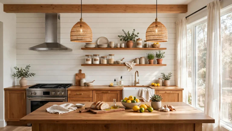
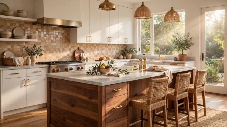
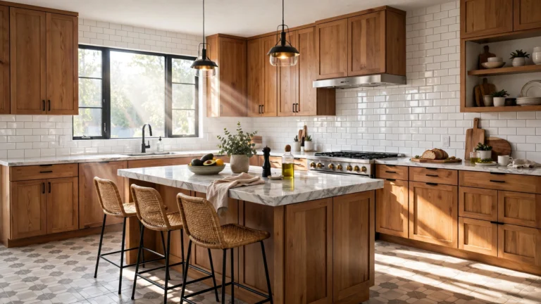
10 Stunning Kitchen Space Ideas That Make Your Kitchen Look More Expensive

A kitchen does not need a bigger footprint or a five-figure renovation to feel expensive. Some of the priciest-looking kitchens are actually modest spaces where every inch has been planned with intention, the sightlines stay open, and the eye reads “spacious” long before it reads “small.” The secret is rarely square footage — it is how cleverly that footage is used.
The good news is that most of these upgrades are weekend-friendly and renter-safe, and many cost less than a single new appliance. A glass-front cabinet here, a continuous floor there, a banquette that swallows clutter — each one stretches the room visually while adding a layer of polish. Ready to see how a few smart space tricks can make your kitchen look twice its size and ten times its budget?
1. Open Up the Cabinets with Glass Fronts

Solid cabinet doors can make a kitchen wall feel like a flat, heavy block. Swapping a few uppers for glass-front doors breaks up that mass instantly, letting light pass through and giving the eye somewhere to travel. The depth of the cabinet itself becomes part of the room, which is exactly why designers reach for glass in small, high-end kitchens.
You do not need custom cabinetry to get the look. Many stock cabinets accept replacement glass inserts, and a glazier can cut panes for existing frames for surprisingly little. Fluted or seeded glass is the forgiving middle ground: it keeps the airy feel while softly blurring whatever is behind it.
Inside, keep the styling disciplined — stacks of white dishes, matching glassware, a few jars in a row. The glass only reads “expensive” when what it shows off looks curated, so treat those shelves like a boutique display. Expect to spend a modest amount per door, and allow an afternoon for the swap.
Tip: If full glass feels too revealing, start with just the two cabinets flanking the window. The same see-through trick that works in stylish balcony door ideas for small spaces applies here — anywhere glass replaces a solid panel, the whole area feels bigger and more inviting.
2. Run One Floor Finish Through the Whole Space
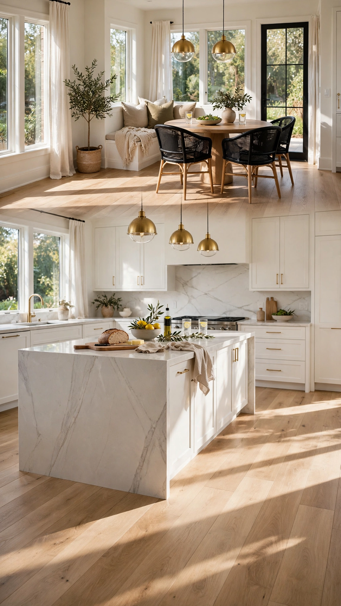
Every time the flooring changes, the eye registers a boundary — and boundaries shrink a space. Running one continuous finish from the kitchen into the dining area or hallway erases those visual stops, so the whole zone reads as one generous room. It is one of the oldest tricks in the expensive-kitchen playbook.
Wide-plank luxury vinyl or engineered oak is the practical route: waterproof, warm underfoot, and convincing enough to pass for real timber at a glance. Lay planks lengthwise along the longest sightline to stretch the room even further, and keep grout lines or transitions to an absolute minimum.
Budget-wise, this is a phased project — you can start with the kitchen itself and extend the same product later, since most ranges stay in production for years. Even a single unbroken run under the island and out to the door makes the footprint feel planned rather than patched together.
Tip: Before committing, lay sample planks across the threshold at different times of day, because light changes everything underfoot. For more continuous-floor inspiration, browse these stylish balcony flooring ideas — the same unbroken-surface principle makes any compact area feel like one elegant escape.
3. Ground the Galley with a Vintage Runner

A long, low-pile runner does two jobs at once: it pulls the eye down the length of the kitchen, making the room feel longer, and it adds the layered, collected texture that expensive spaces always have. Bare floors read “unfinished”; a well-chosen rug reads “designed.”
Look for vintage or vintage-look patterns in muted, sun-faded tones — they hide crumbs and splashes far better than a solid color, and the worn palette feels intentional rather than tired. Washable flatweaves are the smart buy for a working kitchen, and a slim non-slip pad underneath keeps everything safe and quietly plush.
Size matters more than pattern. The runner should span most of the walkway, stopping a few inches short of the cabinets at each end. Too short looks like a doormat; long and lean looks like a boutique hotel corridor in the best possible way.
Tip: Take your color cue from the cabinets and repeat one rug tone in a towel or vase to tie the room together. The layering logic is identical to these stunning balcony rug ideas, where one good rug makes the whole space feel bigger and more inviting.
4. Grow a Vertical Herb Wall
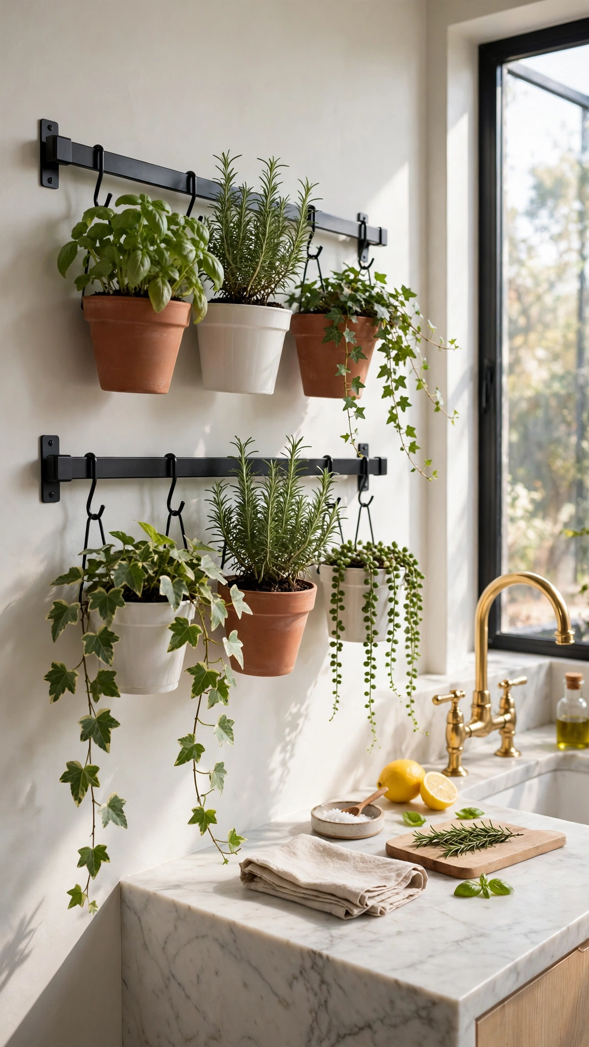
Counter space is precious, but wall space is usually wasted. Moving the herb garden up onto a rail or a slim grid of wall planters frees the worktop while adding a living, textural feature that reads like a chef’s kitchen in a design magazine. Greenery at eye level also softens all the hard kitchen surfaces around it.
A simple rail system with hanging pots is the cheapest entry point, and it installs in under an hour. Choose herbs you actually cook with — basil, rosemary, thyme, mint — so the display earns its keep, and mix pot finishes sparingly: one metal, one ceramic tone, repeated.
Keep the wall near a window or add a slim grow light under the cabinet above; herbs that struggle look scruffy, and scruffy is the opposite of expensive. Water on a schedule, pinch regularly, and the wall will look fuller and lusher within weeks.
Tip: Odd numbers photograph and display best — group pots in threes along each rail. If you love the living-wall effect, these stunning balcony plant wall ideas show how to scale the same idea into a full green feature.
5. Turn the Window into a Green Focal Point

Every room needs one moment that draws the eye, and in a kitchen the window is the natural candidate. A sill dressed with layered plants, a small vase, and one beautiful object gives visitors a focal point — and a room with a focal point always feels more designed than a room without one.
Work in heights: a trailing plant at one end, mid-height herbs in the middle, something tall and sculptural at the other end. Keep the palette tight — terracotta, white ceramic, clear glass — so the arrangement looks collected rather than cluttered, and leave breathing room between pieces.
This is the cheapest idea on the list. A few pots, a cutting from a friend’s plant, and ten minutes of styling can transform the sink area from purely practical into the prettiest corner of the kitchen. Rotate pieces seasonally to keep the view feeling fresh.
Tip: Mirror the arrangement’s colors somewhere else in the room — a terracotta utensil crock, a green linen towel — so the corner feels connected. For more ways to make plants the main event, take a look at these stunning balcony plant ideas and borrow their grouping tricks indoors.
6. Pick Slim Seating That Tucks Away

Bulky stools with backs and arms chew up visual space even when nobody is sitting on them. Slim, backless stools that slide fully under the island overhang keep the floor clear and the sightlines open — and a clear floor is one of the strongest “this kitchen is spacious” signals there is.
Woven rush, saddle leather, or simple molded wood seats all bring warmth without weight. Whatever you choose, repeat the material once elsewhere — rush seats with a woven pendant, oak stools with oak open shelves — so the seating feels woven into the scheme rather than parked in it.
Measure before you buy: you want at least a couple of inches of clearance so stools glide in without scuffing the island panels. Three stools that disappear beat four that crowd, every single time.
Tip: Test the tuck with one stool before ordering the full set, and check knee clearance from the seated position. The same discipline shapes these gorgeous balcony seating ideas, where every piece has to earn its footprint to make the whole space feel put together.
7. Build In a Banquette for a Custom Feel

Nothing says “custom kitchen” like built-in seating. A banquette tucked into a corner seats more people than freestanding chairs in the same footprint, pushes the table closer to the wall, and — with a hinged lid — hides a whole bench-worth of clutter, from table linens to small appliances.
A simple version is within DIY reach: a plywood bench box, foam and fabric on top, painted to match the cabinets so it reads as architecture rather than furniture. Upholstery in a performance fabric keeps it practical, and a couple of throw pillows in the room’s accent color finish the café-corner look.
Pair it with a round or oval pedestal table. With no legs at the corners, sliding in and out is easy, and the soft silhouette breaks up the kitchen’s grid of straight lines in a way that feels quietly luxurious.
Tip: Paint the bench the exact shade of your lower cabinets and it will look like it was always there. Corner seating inspiration travels well — these stylish balcony seat ideas prove how much comfort a small built-in corner can hold.
8. Swap the Island for a Statement Table
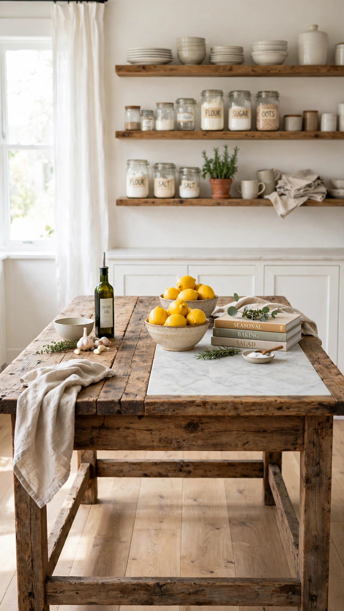
A solid island is a space hog: one big block that stops light and blocks the view of the floor. A leggy work table in its place does the same prep-and-gather job while letting light and sightlines pass underneath, which makes the whole kitchen breathe. Many designer kitchens in old European homes work exactly this way.
Look for a sturdy farmhouse table, a vintage workbench, or a simple frame topped with stone offcut. Because you can see the floor beneath it, the room’s footprint suddenly feels larger, and the open base doubles as flexible storage for baskets, a stool, or the dog’s bed.
It is also the budget hero of this list. A secondhand table plus a stone remnant often costs less than the delivery fee on a flat-pack island, and it can move with you or be repurposed later. Add locking casters if you want the layout to flex for parties.
Tip: Keep the top styled in zones — one prep area, one display stack, one empty stretch — so it reads as a work table, not a dumping ground. These stylish balcony table ideas follow the same logic: the right table creates a beautiful small-space escape instead of eating the room.
9. Zone the Space with a Glass Partition

Open-plan is lovely until cooking smells colonize the sofa. A steel-framed glass partition — the Crittall look — zones the kitchen without closing it off, keeping light, views, and conversation flowing while the room gains the architectural detail that expensive homes are full of.
Fluted glass is the forgiving choice, blurring the view of dishes in the sink while still glowing with light. Black frames give crisp, tailored lines; brass or white frames soften the effect. Even a half-height glass screen beside the island can suggest a boundary and make both zones feel more deliberate.
This is the splurge of the list, but a single fixed panel is far cheaper than a full wall of doors, and local fabricators often beat the big-name systems on price. Renters can fake the geometry with a black-framed open shelving unit used as a divider instead.
Tip: Repeat the frame color in your hardware or lighting so the partition belongs to the scheme. Screening without darkness is the whole art — these creative balcony privacy screen ideas show the same balance of separation and light on a smaller scale.
10. Steal Every Inch with Smart Layout Tricks

The most expensive-looking kitchens share one trait: nothing is wasted and nothing is left out. Slim pull-outs in the six-inch gap beside the fridge, drawers hidden in the toe-kick, a rail inside a cabinet door — these micro-moves clear the counters, and clear counters are the fastest route to “luxury” there is.
Start with an honest audit. Anything on the counter that is not used daily gets a new home in one of these stolen inches. Then look up: a shelf or rail above the window, hooks under the uppers, and the dead space above the cabinets all hold more than you would guess.
Most of these fixes are inexpensive hardware-store buys that install in an afternoon. The payoff compounds, too — once every item has a hidden place, the whole kitchen stays effortlessly tidy, which is the real secret behind those serene magazine photos.
Tip: Tackle one gap at a time and live with it for a week before buying for the next; needs reveal themselves in use. If small-space squeezing is your sport, these creative balcony small ideas are packed with ways to make any compact area feel bigger and more inviting.
Conclusion
An expensive-looking kitchen is rarely about size — it is about openness, continuity, and intention. Glass where solid panels used to block the light, one floor running unbroken, seating that tucks away or builds in, and storage stolen from forgotten inches: stack a few of these space ideas together and your kitchen will feel larger, calmer, and far more luxurious than its measurements suggest.