16 Beautiful Kitchen Design Layout Ideas That Give Your Kitchen a Designer Look
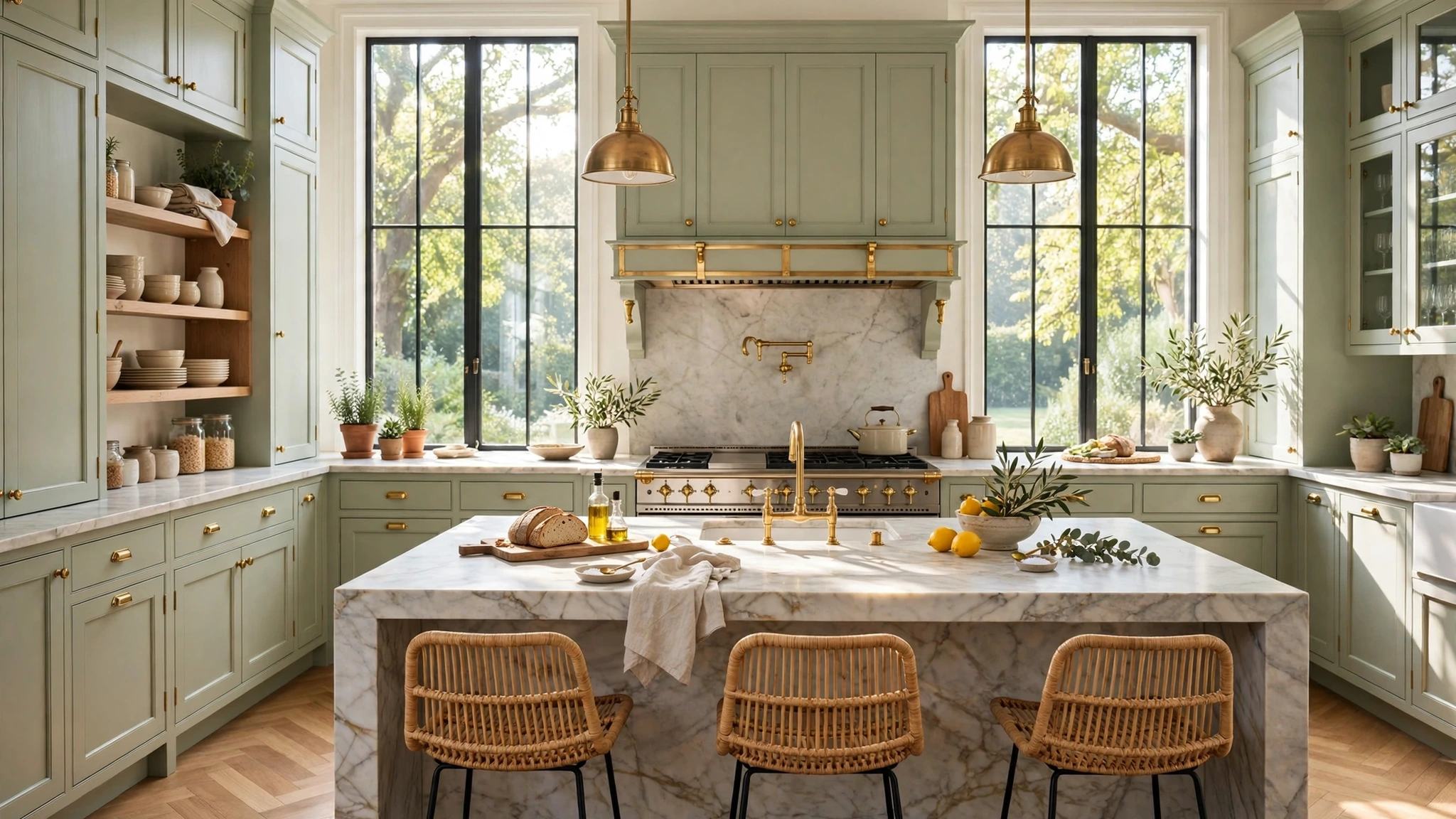
A beautiful kitchen is rarely beautiful by accident. The rooms that look like they belong in a designer portfolio share one secret: the layout was planned before the finishes were chosen. When the sink, stove, and fridge sit in the right relationship, everything else — the cabinets, the lighting, the decor — falls into place almost effortlessly.
Whether you are remodeling from scratch or simply rearranging what you already have, a smart layout can make a small kitchen feel generous and a large one feel warm and intentional. Ready to see how designers actually plan a kitchen that works as beautifully as it looks?
1. Anchor the Room Around a Work Triangle
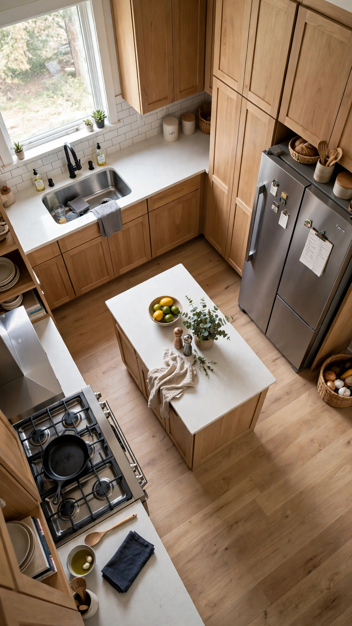
The classic work triangle connects the sink, the stove, and the refrigerator, and it remains the backbone of good kitchen design for a simple reason: it shortens every trip you make while cooking. When those three points sit close together with clear paths between them, you stop crossing the room a dozen times for one meal.
Aim for each leg of the triangle to measure between four and nine feet, with no major obstacle cutting through it. In an open-plan home, a kitchen island can serve as one corner of the triangle without blocking movement, as long as you leave at least 42 inches of walkway around it.
This is a layout change you can test before spending anything — sketch your triangle on paper, walk it in your head, and notice where you would bump into a door swing or a trash pull-out. Getting this right costs nothing and improves everything else.
Tip: If your layout feels cramped, borrow the same clutter-clearing logic from our guide to smart garage storage shelves — clearing what you do not use daily makes any work triangle feel wider instantly.
2. Choose an L-Shape for Open Flow
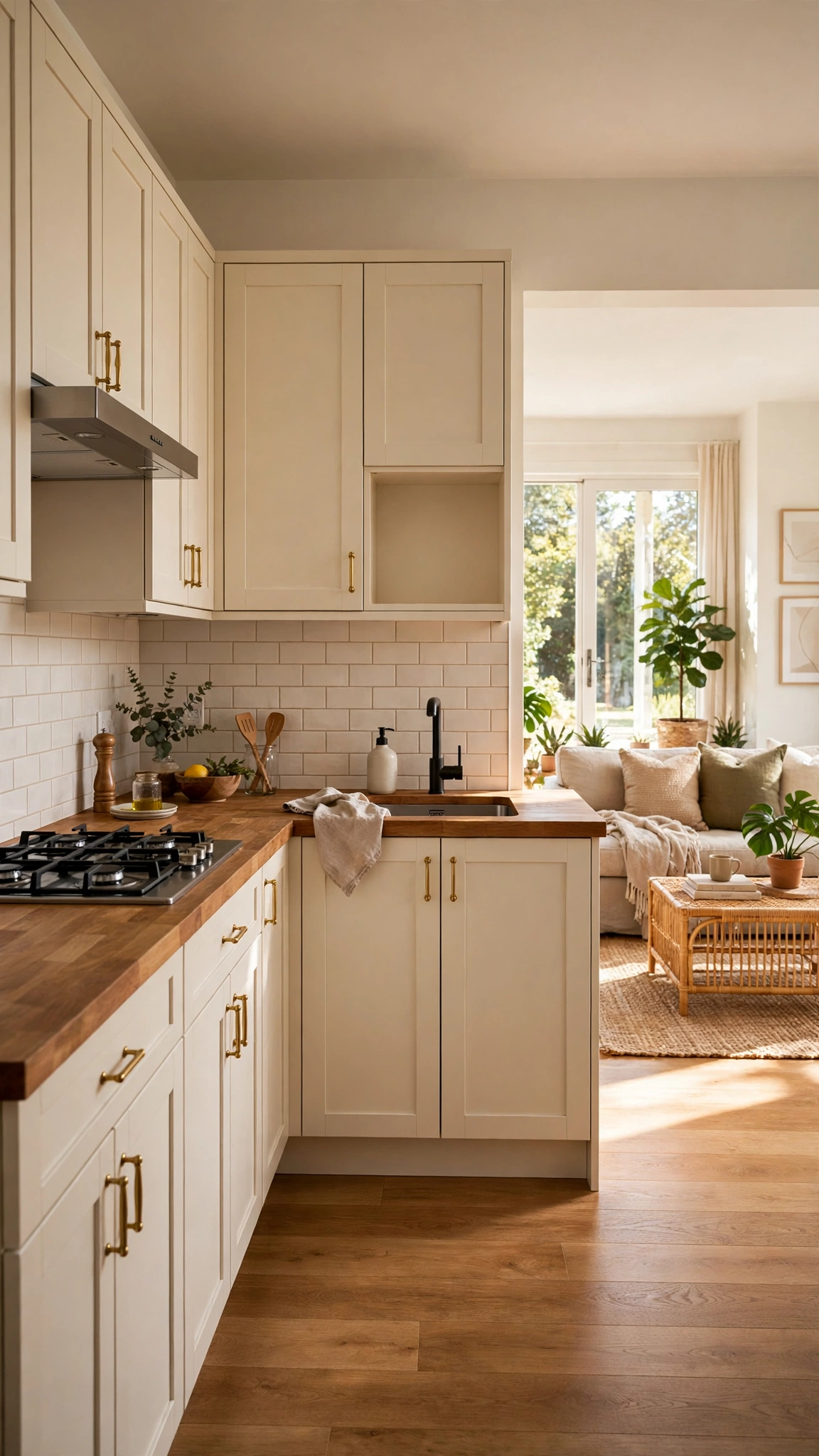
The L-shape is the most forgiving layout in kitchen design because it hugs two walls and leaves the rest of the room open. It works in tiny apartments and sprawling homes alike, and it naturally creates a corner where the work triangle can live without feeling boxed in.
One of the biggest advantages is flexibility: the open side can hold a dining table, an island, or simply breathing room. Families love it because someone can cook while others pass through without crowding the cook.
Watch the corner, though — it can become dead space. A lazy Susan, a pull-out corner drawer, or a diagonal sink cabinet turns that awkward angle into genuinely useful storage.
Tip: Plan your open side like a living space, not leftover space — our creative kitchen living room ideas show how to blend the two rooms so the whole area feels designed, not divided.
3. Add a Statement Island
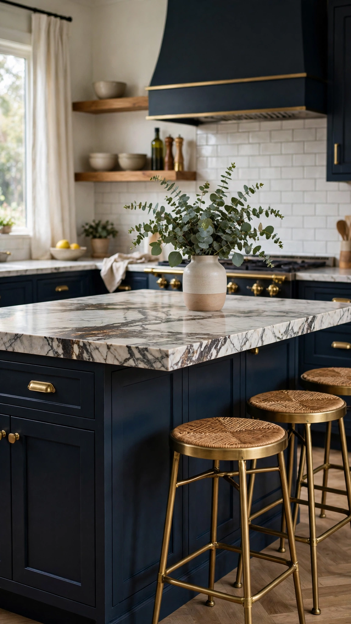
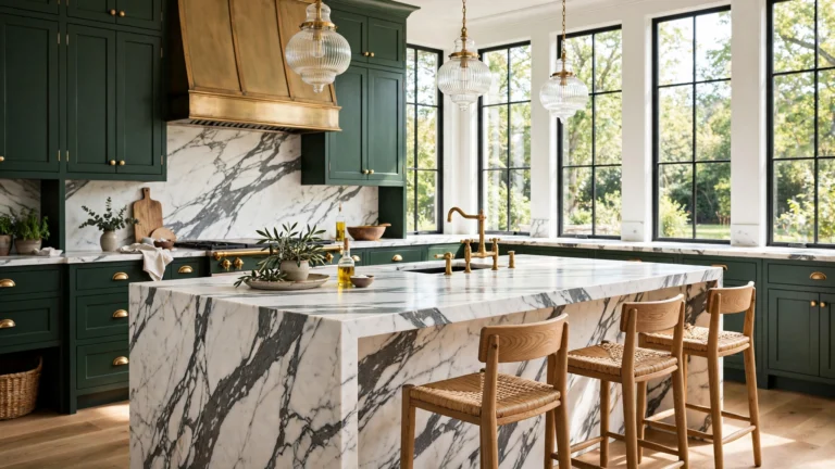
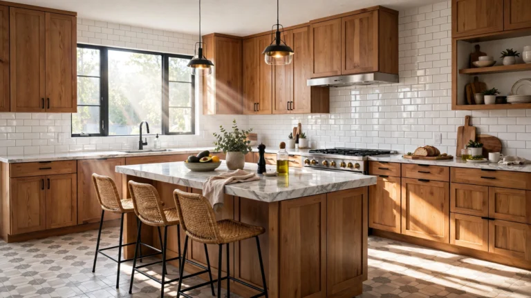
An island is the single most transformative piece of furniture a kitchen can have. It adds prep space, storage, and seating in one move, and it gives the room a natural gathering point that guests drift toward without being asked.
Size matters more than style here. A good rule is at least 36 inches of clear walkway on every side, and an island that is at least 24 inches deep if you want seating. Too big and the kitchen feels crowded; too small and it becomes a glorified table.
Consider giving your island a different finish from the perimeter cabinets — a walnut top, a painted base, or a waterfall edge. That contrast is what makes it look like a deliberate design choice rather than an afterthought.
Tip: Dress the island like you would a small outdoor retreat — a trailing plant or two, the way balcony planter ideas use greenery to soften hard surfaces, keeps a big slab of stone from feeling cold.
4. Zone the Kitchen by Task
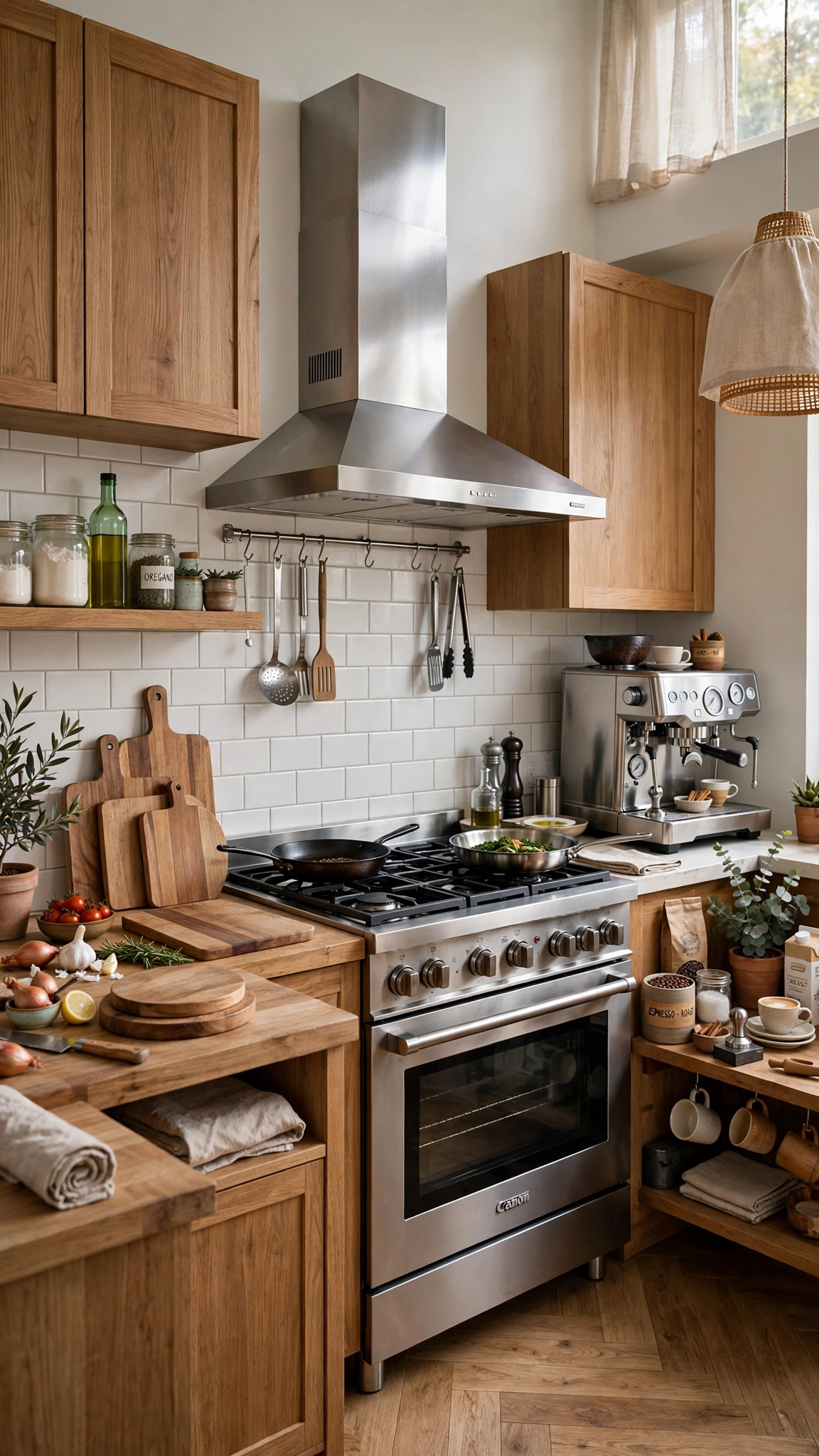
Designers increasingly plan kitchens in zones rather than one long run of cabinets: a prep zone, a cooking zone, a cleaning zone, and a storage zone. Each zone holds exactly the tools it needs, so you stop walking across the kitchen for a peeler or a pan.
The payoff is quiet but huge. Breakfast happens without waking the cook, kids can grab snacks from their own zone, and two people can work at once without colliding.
Start by listing what you actually do most — baking, morning coffee, big family dinners — and give each activity a home. A baking zone near the oven with flour, bowls, and a mixer lift beats a generic cabinet every time.
Tip: Zone planning is really about making a space feel cozy and intentional — the same principle behind balcony decoration ideas that turn a bare slab into a room you actually want to spend time in.
5. Let the Sink Face the View
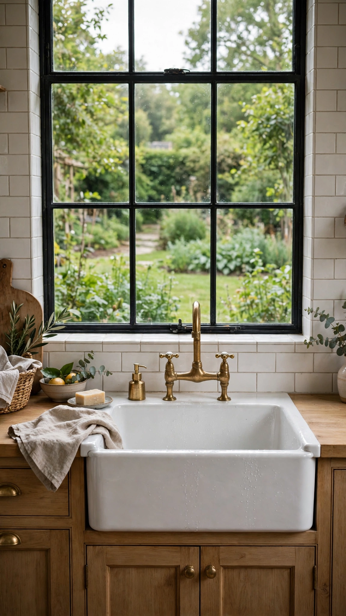
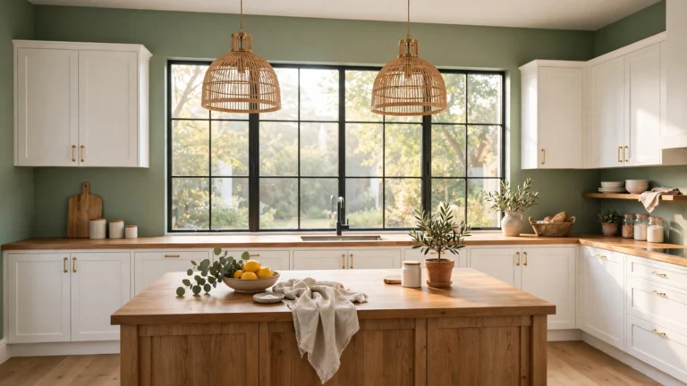
If you have a window, put the sink under it. It sounds simple, but it is the detail people mention most when they fall in love with a kitchen. Washing dishes stops feeling like a chore when you are looking at a garden instead of a wall.
A window sink also pulls natural light deep into the room, which makes the whole kitchen feel larger and cleaner. If your plumbing cannot move, even a mirror or a piece of art above the sink can fake the effect of a view.
Pair the sink window with a deep basin and a high-arc faucet, and suddenly the least glamorous job in the kitchen gets the best seat in the house.
Tip: Frame that window like a tiny escape — sheer linen and a potted herb, inspired by balcony decorating ideas for a small-space escape, turn an ordinary sink view into a daily mood lift.
6. Build in a Breakfast Nook
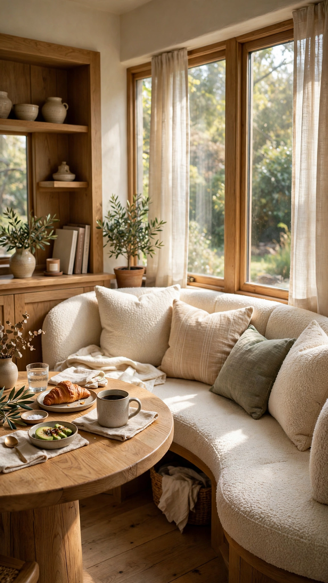
A breakfast nook turns an awkward corner or a bay window into the most-used seat in the house. Banquette seating hugs the wall, so it takes up far less floor space than a table with four chairs, and it invites lingering in a way a formal dining room rarely does.
Built-in benches also hide storage underneath — perfect for table linens, board games, or the kids’ art supplies. Add a pedestal table so nobody has to climb over chair legs, and the nook works for homework, coffee, and lazy Sunday mornings alike.
Keep the palette soft and the cushions washable, and this little corner will earn its keep every single day.
Tip: Think of the nook as a miniature garden room — the cozy-retreat thinking in balcony garden ideas works beautifully for making a small eating corner feel like a destination.
7. Go Galley for Small Spaces
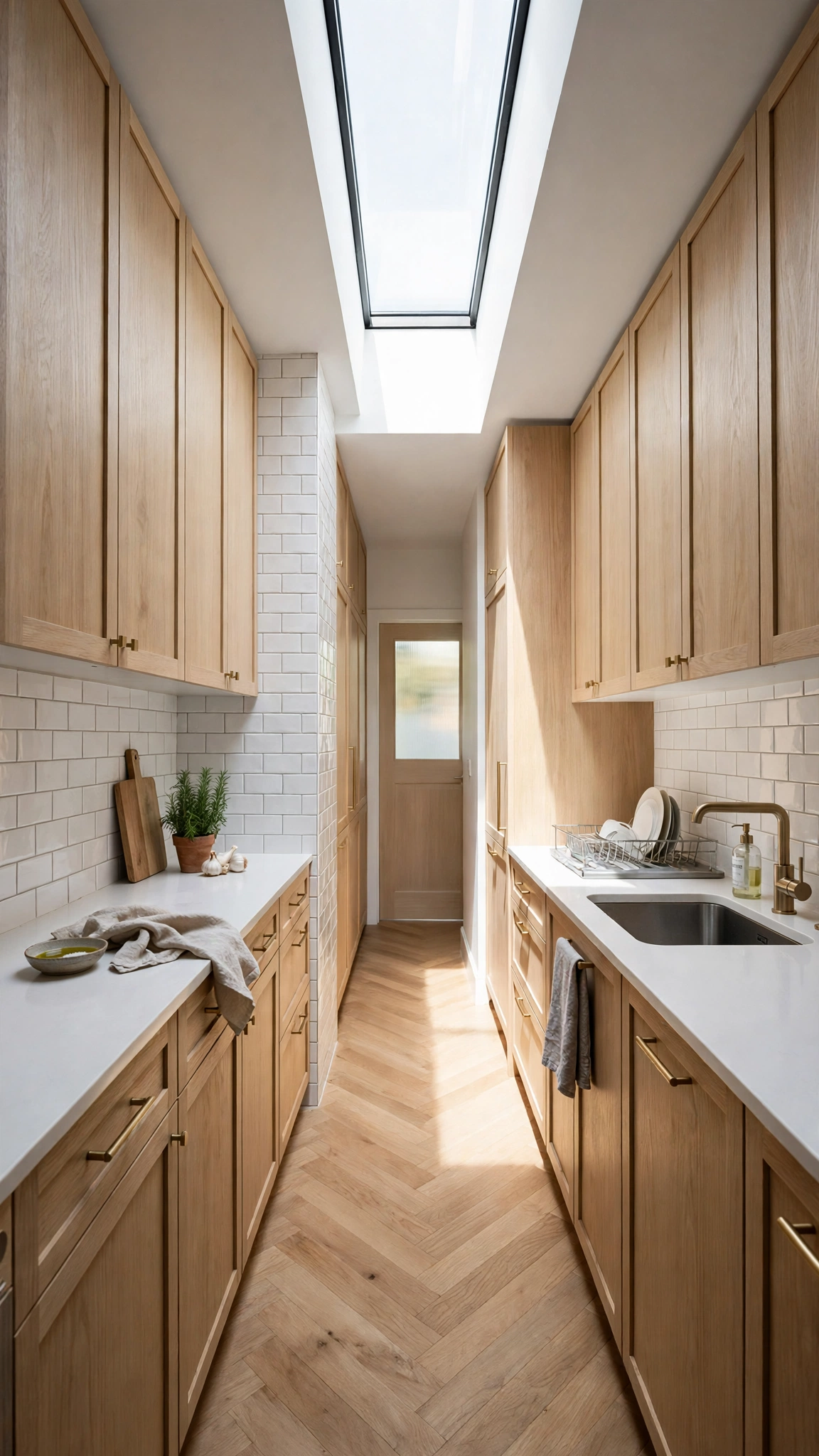
The galley layout — two parallel counters with a walkway between — is the most efficient shape ever designed for cooking. Professional restaurant kitchens use it for a reason: everything is within arm’s reach, and nothing is wasted.
Small kitchens benefit most, but the galley also shines in larger homes when one wall opens to a living area. Keep the walkway between 42 and 48 inches wide, and avoid placing the fridge directly opposite the stove, which creates a bottleneck.
Light is the galley’s best friend. Pale cabinets, a glossy backsplash, and one strong overhead light source stop the corridor from feeling like a tunnel.
Tip: Small-space tricks translate across rooms — clever balcony ideas for apartments prove that a tight footprint can still feel bigger and more inviting with the right choices.
8. Float a Peninsula Instead of a Wall
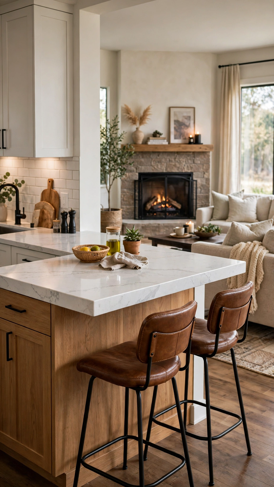
A peninsula is an island attached at one end, and it is the perfect compromise when a full island will not fit. It gives you extra counter space and seating while keeping the kitchen open to the rest of the home.
Peninsulas also solve the wall problem: instead of a solid partition between kitchen and living room, you get a counter that connects them. The cook stays part of the conversation, and guests have a natural place to perch with a glass of wine.
Make the overhang at least 12 inches deep for comfortable seating, and consider a raised bar level if you want to hide prep mess from the living room side.
Tip: A peninsula is a mini-renovation with major impact — the same designer-inspired thinking in garage upgrade ideas shows how one smart structural change can transform a whole space.
9. Layer a Walk-In Pantry
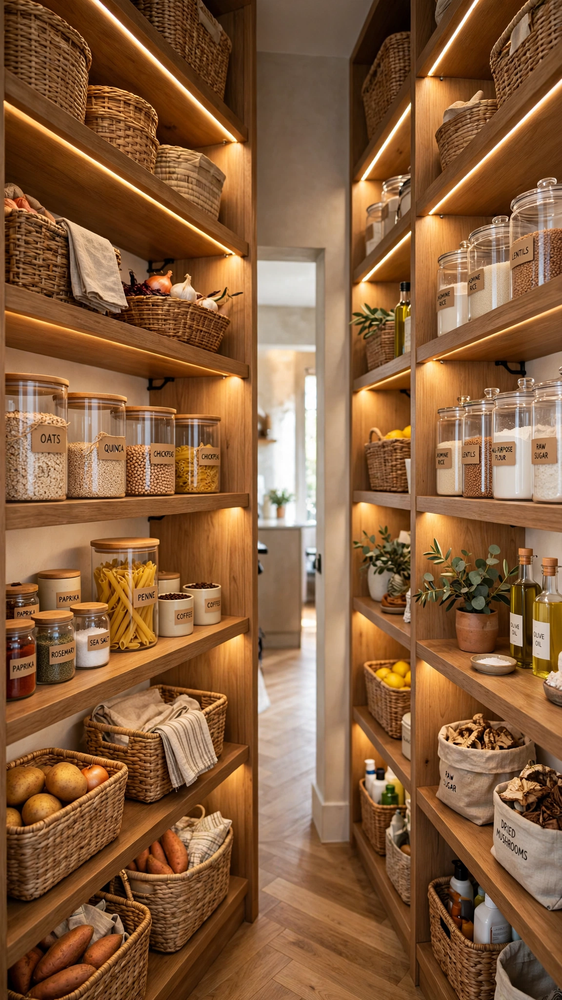
A walk-in pantry is the luxury that actually pays for itself. By moving bulk food, small appliances, and rarely used gadgets out of the main kitchen, your everyday cabinets stay calm and your counters stay clear.
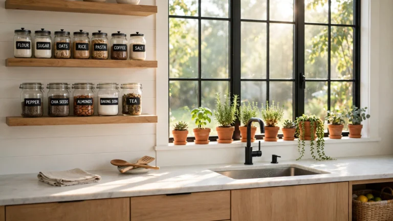
You do not need a huge room — even a shallow closet-depth pantry with shelves on three sides can hold more than a wall of deep cabinets. The trick is visibility: open shelves, clear containers, and labels mean you can see everything at a glance.
If a full walk-in is out of reach, a tall pull-out pantry cabinet delivers most of the benefit in a fraction of the space, and it fits into almost any layout.
Tip: Treat the pantry like a hardworking utility zone — the clutter-to-useful transformation in garage exterior ideas is the same mindset that turns a chaotic pantry into a space that serves you.
10. Frame the Range as a Focal Point
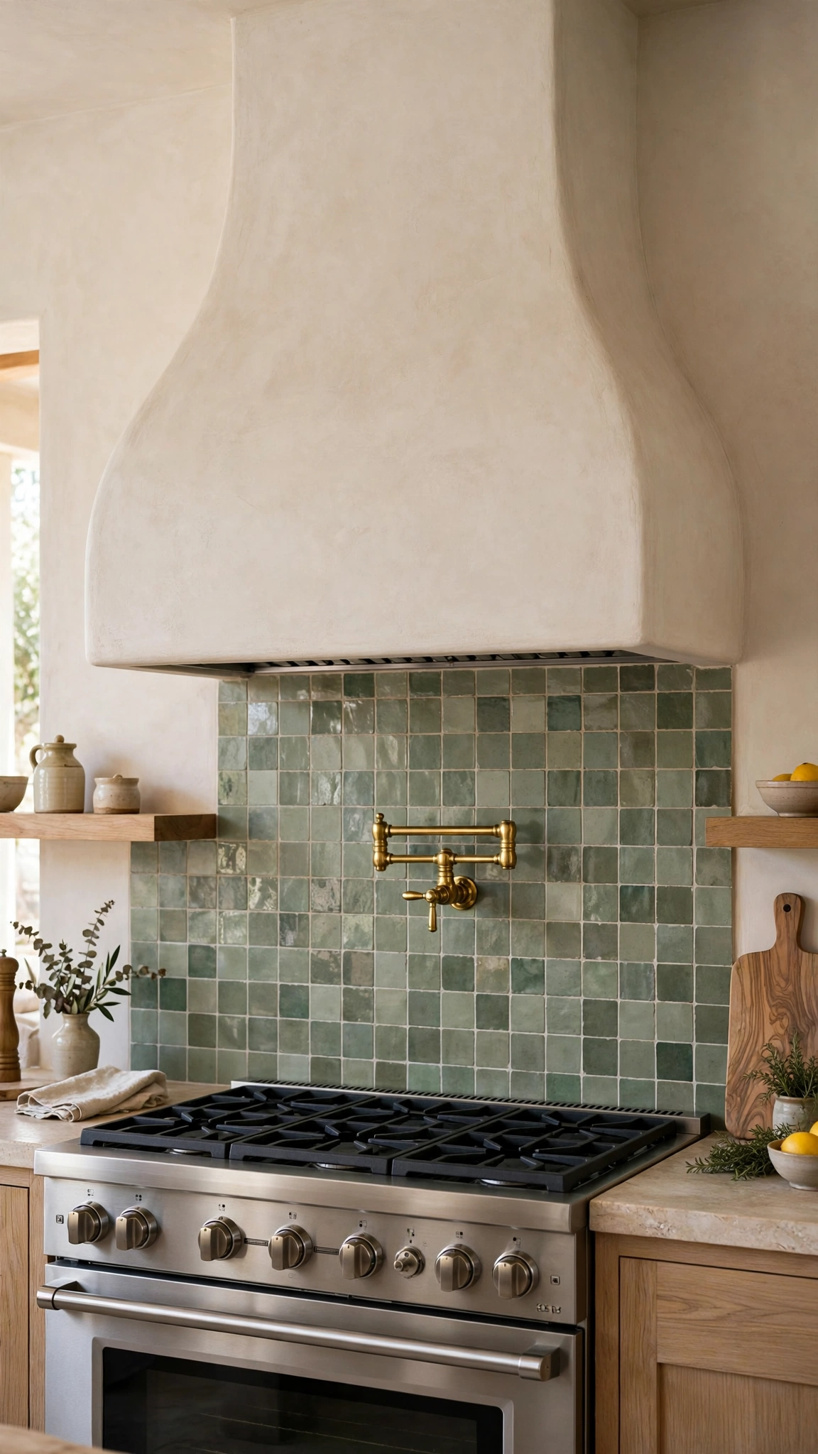
Every great kitchen has a focal point, and the range wall is the natural candidate. A beautiful hood, a distinctive tile, or a bold color on this one wall gives the whole room a sense of intention.
Designers often spend more on this wall than any other because it anchors the eye. A plaster hood, a slab backsplash, or open shelving flanking the range all create that wow moment without redoing the entire kitchen.
Keep the rest of the room quieter so the focal wall can shine — too many competing features cancel each other out.
Tip: A focal wall is about making a space feel put together — the same finishing-touch logic in balcony inspo ideas shows how one styled moment can pull an entire area together.
11. Create a Coffee and Baking Station
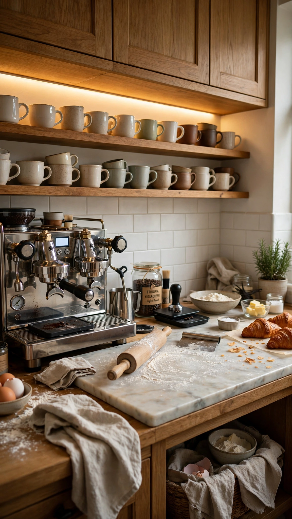
A dedicated station for coffee or baking keeps the main counters clear and turns a daily ritual into a pleasure. One stretch of counter with its own storage for beans, mugs, or baking trays means the morning routine never collides with dinner prep.
The best stations sit slightly apart from the work triangle — a corner of the kitchen, a hutch wall, or even a converted closet. Add an outlet or two, a small shelf for supplies, and a tray to corral everything.
This is also one of the cheapest layout upgrades: no plumbing, no demolition, just intention and a little styling.
Tip: Style the station like a cozy outdoor nook — the retreat-making ideas in balcony outdoor ideas translate perfectly to a corner that invites you to slow down.
12. Mix Open Shelving with Closed Cabinets
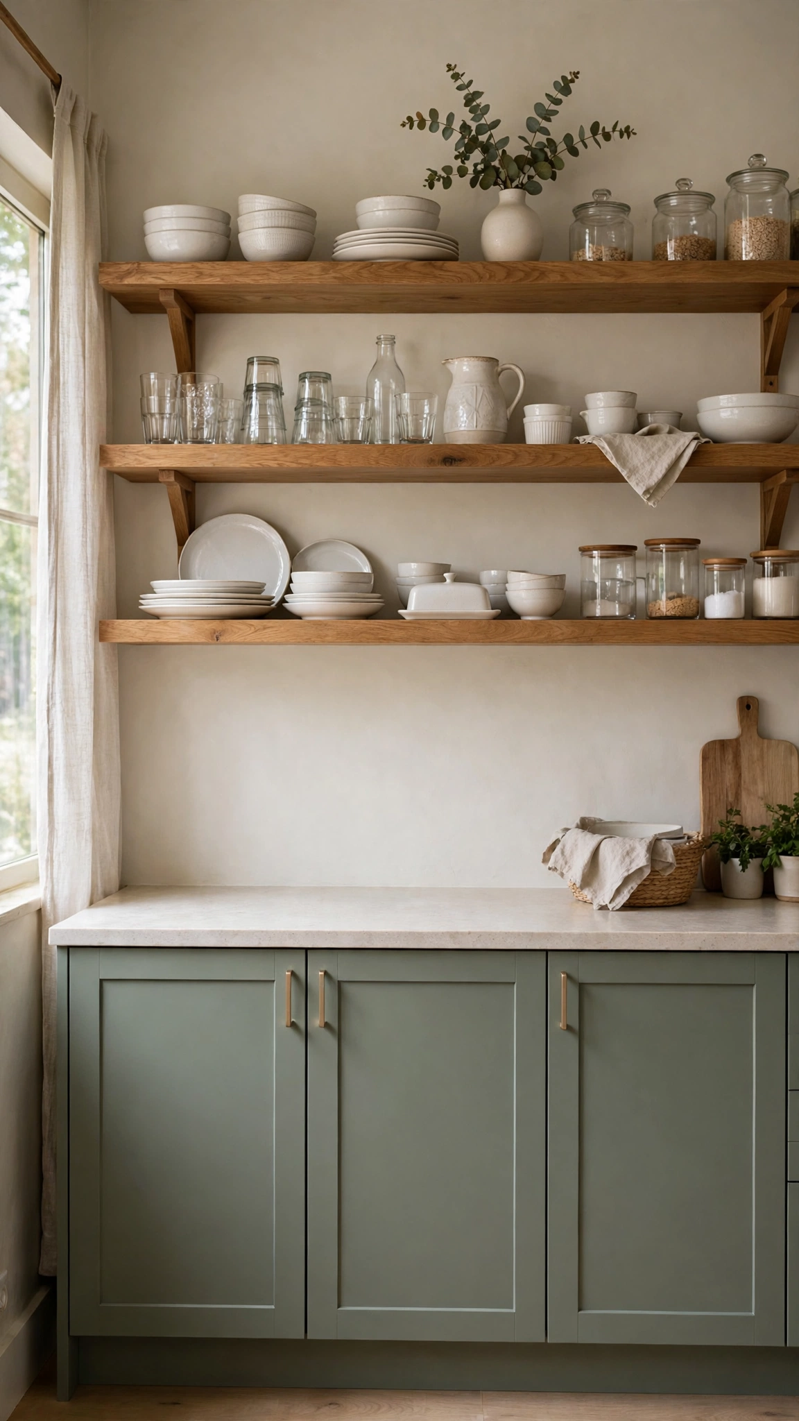
All-open shelving looks gorgeous in photos and exhausting in real life; all-closed cabinets can feel heavy and dull. The designer sweet spot is a mix: open shelves for the pretty everyday pieces, closed storage for everything else.
Try open shelving on one short run — beside the sink, above a coffee station, or flanking the range — and keep the rest closed. You get the airy, curated look without the daily dusting marathon.
Stick to a tight color palette on the open shelves so they read as styling, not clutter: white dishes, wooden boards, and a few plants do the job beautifully.
Tip: Greenery on open shelves instantly softens a kitchen — borrow the planting approach from balcony planting ideas and let herbs and trailing plants do the decorating for you.
13. Carve Out a Dining Zone
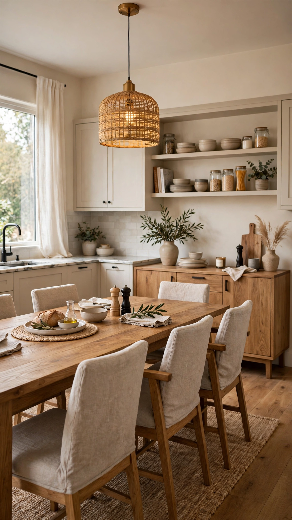
In open-plan homes, the dining area often ends up as leftover space between the kitchen and the sofa. Give it a real identity instead: a rug to anchor it, a pendant to define it, and a table sized for the way you actually eat.
A rug under the table is the fastest way to say “this is a room.” Choose one large enough that chairs stay on it when pulled out, and pick a low-pile weave that handles crumbs without drama.
When the dining zone feels deliberate, the whole open plan feels calmer — each area has a job, and none of them compete.
Tip: Choose the table like you would a small-space hero piece — stylish balcony tables ideas show how the right table can make even a modest corner feel like a beautiful escape.
14. Design for Two Cooks
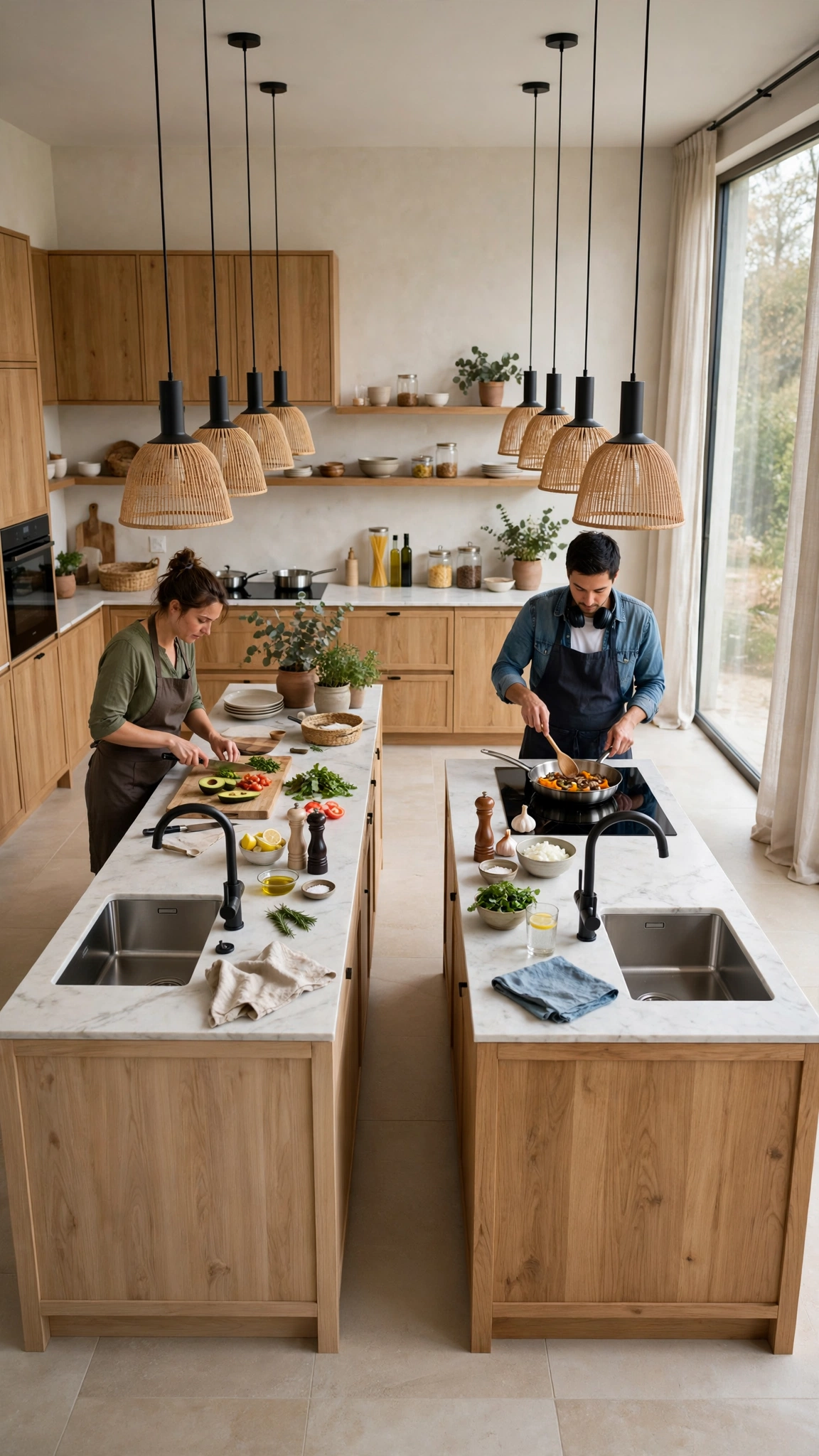
If two people regularly cook together, the standard one-cook triangle starts to fail. Elbow room, a second sink, and separate landing zones for hot pans turn cooking from a dance of dodging into a genuinely shared pleasure.
A double island or an extra-long island is the classic solution, giving each cook their own stretch of counter. A second prep sink is a smaller investment with an outsized payoff — one person rinses while the other chops, no waiting.
Widen walkways to 48 inches where two cooks pass each other, and place the dishwasher where it does not block the second cook’s path when open.
Tip: Comfort matters as much as counters — the seating-first thinking in gorgeous balcony seating ideas is a reminder that a kitchen people linger in needs places to sit and breathe.
15. Use Lighting to Define Zones
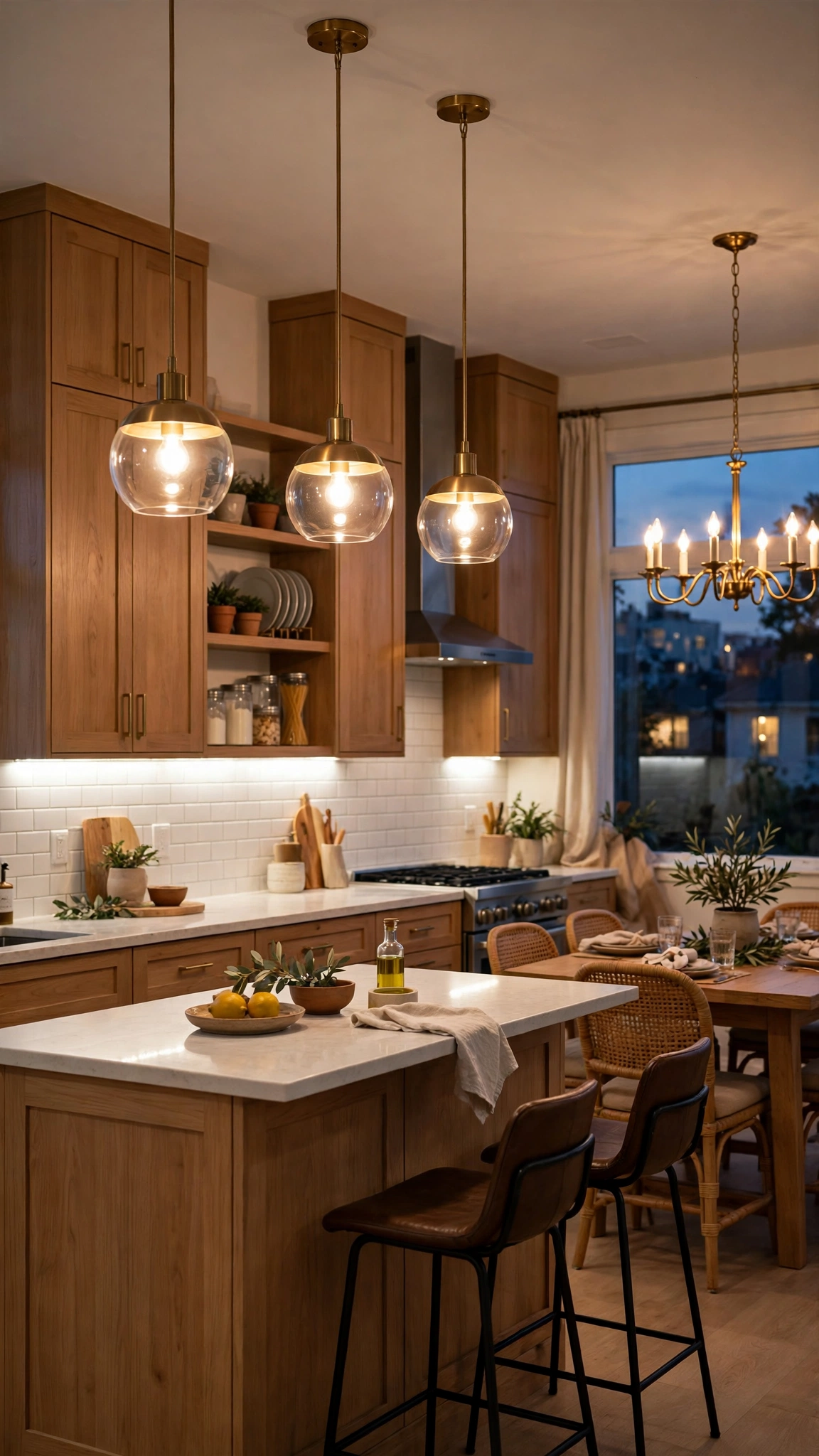
Lighting is the cheapest way to make a layout feel designed. Three layers — ambient, task, and accent — let each zone of the kitchen have its own mood, and dimmers let one room shift from cooking bright to dinner soft in seconds.
Pendants over the island mark it as the gathering spot. Under-cabinet strips make counters usable after dark. A single statement fixture over the dining table tells everyone where to sit.
Plan lighting with the layout, not after it: a pendant hung off-center over an island is the detail that quietly ruins an otherwise perfect kitchen.
Tip: Think of lighting as the interior-design layer that ties zones together — balcony house ideas show how thoughtful finishing turns separate corners into one cozy, cohesive home.
16. Borrow Space from the Living Room
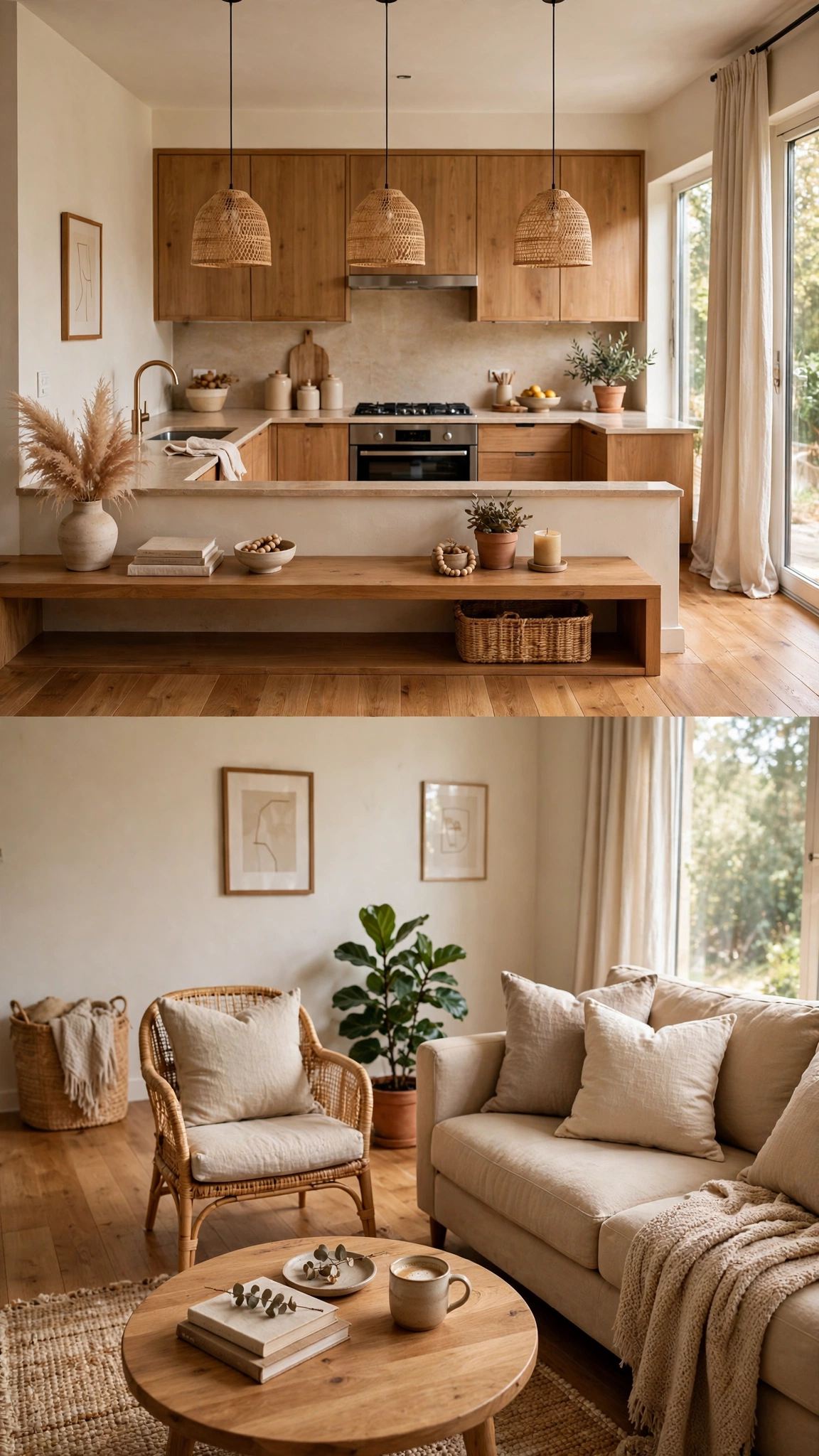
Sometimes the best kitchen layout move is not in the kitchen at all. Removing a non-load-bearing wall, widening a doorway, or simply matching the flooring can borrow visual space from the living room and make the kitchen feel twice as big.
The key is continuity: same floor, same ceiling height, and a shared color palette blur the boundary between rooms. A low console or a change in rug marks the transition without building a wall back up.
Before knocking anything down, check whether the wall is structural and where the plumbing and wiring run — a quick professional opinion here saves a very expensive surprise.
Tip: Continuity is what makes open plans feel intentional — the cohesive small-space approach in stylish balcony patio interior design ideas shows how one palette can unify separate areas into a single beautiful space.
Conclusion
A designer kitchen is not about the most expensive cabinets or the trendiest faucet — it is about a layout that respects how you actually live. Pick one or two of these ideas, sketch them into your own space, and watch how quickly the room starts to feel like it was made for you.