17 Gorgeous Kitchen Wall Color Ideas for a Designer-Look Palette
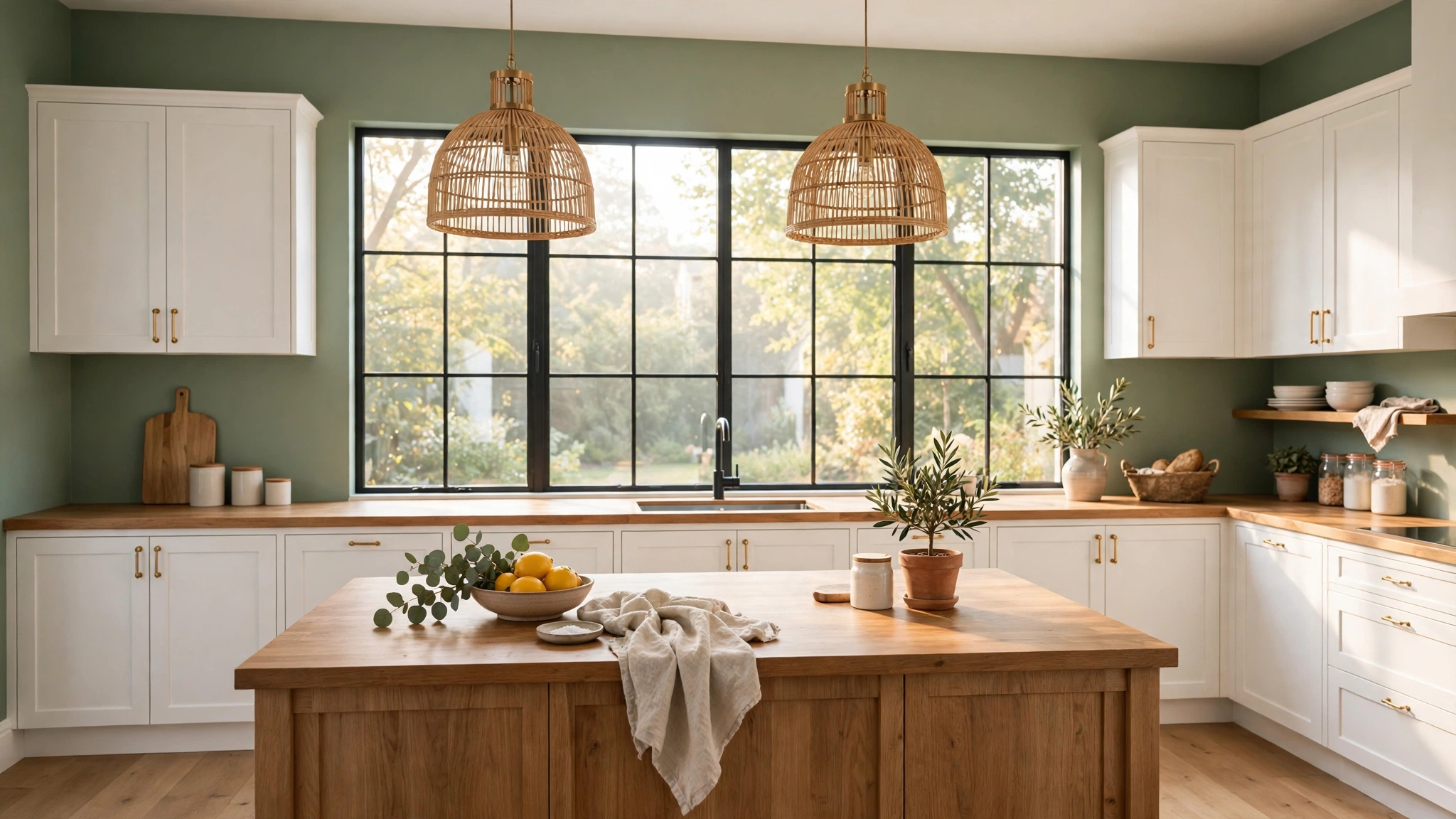
Kitchen walls do more than hold up cabinets — they set the mood for every meal, every morning coffee, and every gathering. The right paint color can make a cramped kitchen feel airy, a dark kitchen feel brighter, and a plain kitchen feel like it was designed by a professional.
The secret is choosing a shade that works with your cabinets, countertops, and light rather than fighting them. Ready to find the wall color that turns your kitchen into a space you genuinely love spending time in?
1. Paint the Walls Soft Sage Green
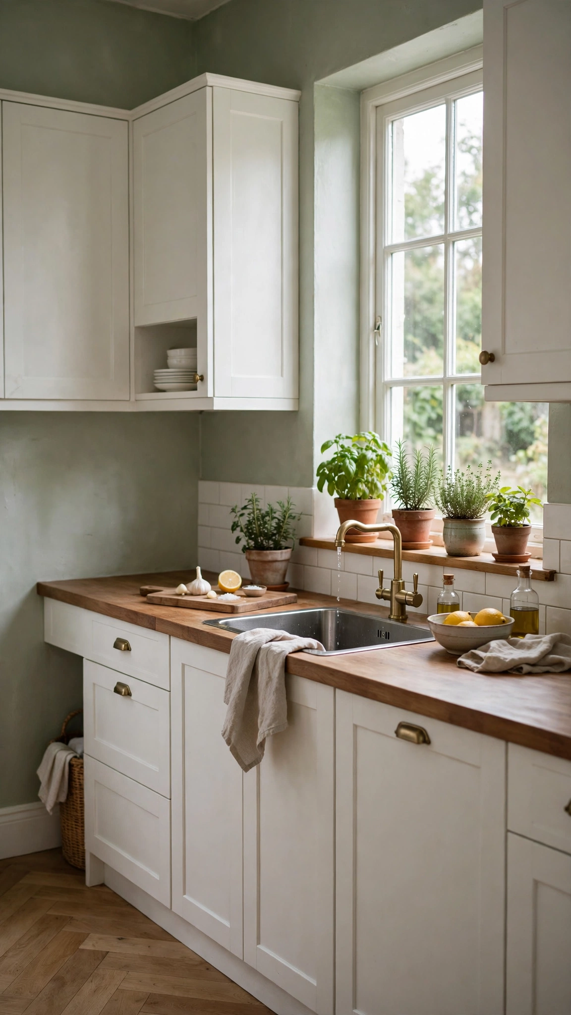
Sage green is the color designers reach for when a kitchen needs to feel calm without feeling cold. It sits beautifully between gray and green, so it flatters both warm wood and cool white cabinetry.
This shade works especially well in kitchens that get plenty of natural light, where it reads fresh and leafy rather than muddy. Pair it with cream trim and brass hardware for a soft, collected look.
If your kitchen faces north and light is limited, pick a sage with warm undertones rather than a gray-heavy one. Test a swatch on two walls first, since sage can shift dramatically between morning and evening light.
Tip: Sage pairs beautifully with natural touches, so bring in the same leafy softness found in 20 Stylish Balcony Hanging Plants Ideas That Turn a Small Outdoor Space Into a Cozy Retreat by adding a few trailing plants near the window.
2. Brighten the Room with Warm Cream
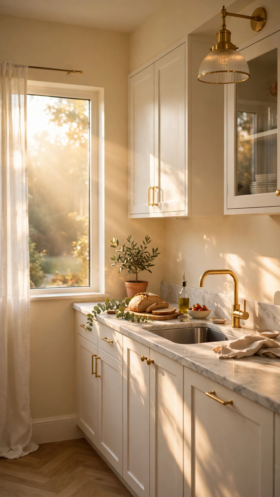
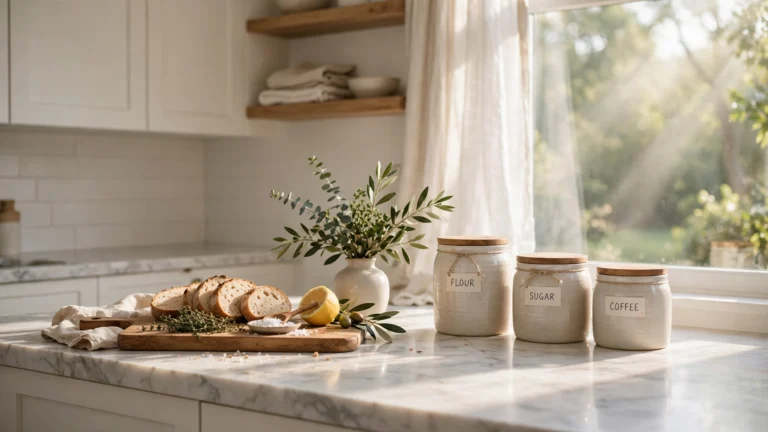
Warm cream is the safest way to brighten a kitchen without the starkness of pure white. It reflects light, makes small rooms feel larger, and gives every other element in the room room to shine.
Cream works with nearly any cabinet color, from dark walnut to pale oak to navy. It is also forgiving on imperfect walls, since its softness hides minor flaws better than a crisp white would.
Choose a cream with a hint of yellow or peach if your kitchen has warm wood floors, and a cooler cream if your fixtures are chrome or stainless steel. The undertone is what keeps it from looking dingy.
Tip: A cream backdrop makes a tight space feel open, the same space-stretching trick used in 18 Creative Balcony Small Ideas That Make Your Balcony Feel Bigger and More Inviting to open up a compact balcony.
3. Go Bold with Deep Navy Blue

Deep navy brings instant drama and sophistication to a kitchen, and it pairs beautifully with white cabinets, marble, and brass. It feels designer-led without needing a full renovation.
Navy works best as a full-wall color in kitchens with good light or high ceilings. In a smaller, darker kitchen, try it on a single accent wall or below a chair rail so the room still feels open.
Balance the depth with light countertops and pale flooring, and add warm metals to keep the navy from feeling cold. A navy wall with gold or brass accents reads rich rather than heavy.
Tip: Navy needs a strong foundation beneath it, so ground the room the way 11 Stylish Balcony Floor Ideas That Make Your Balcony Feel Bigger and More Inviting grounds an outdoor space with the right floor choice.
4. Warm Things Up with Terracotta
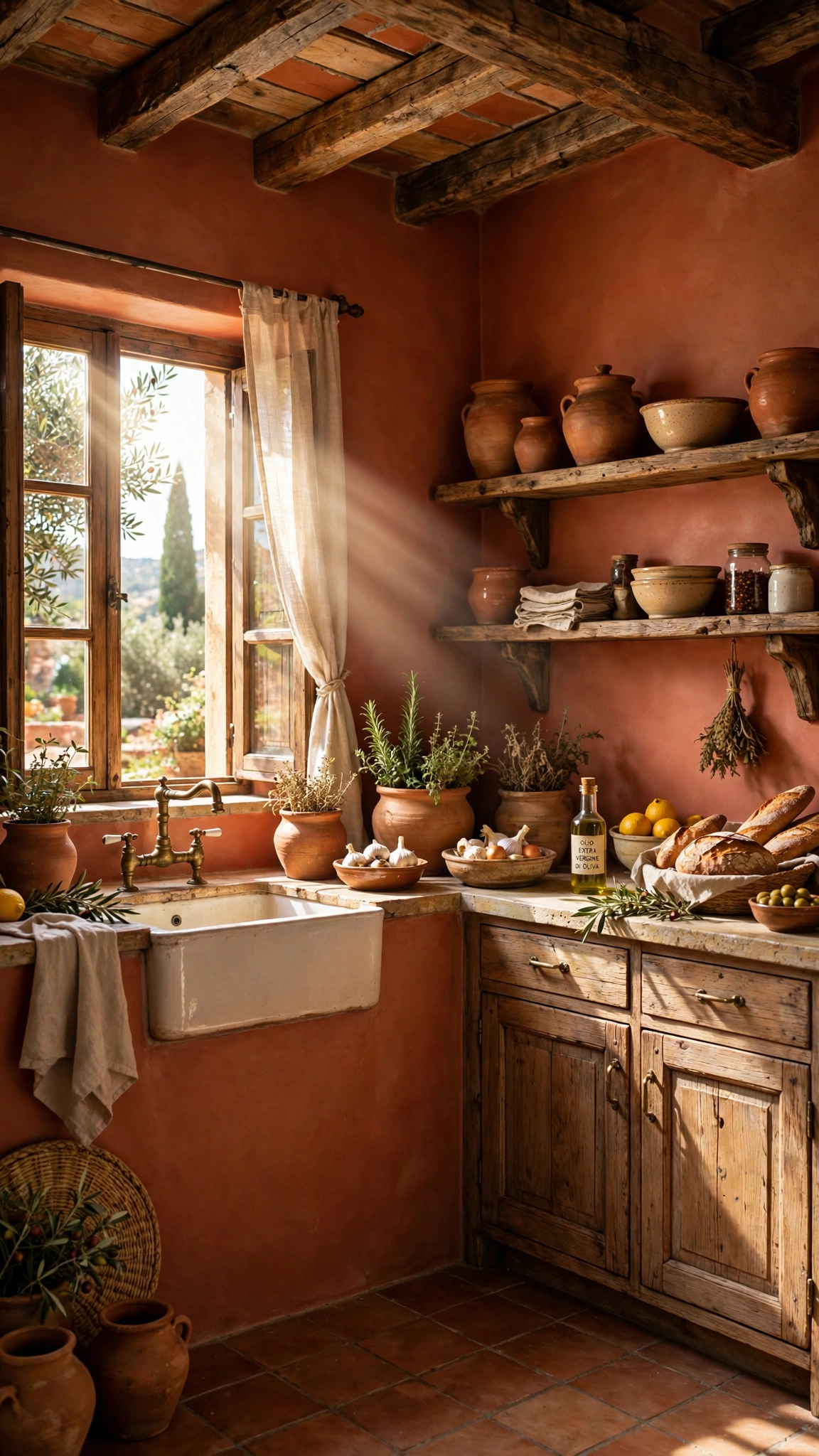
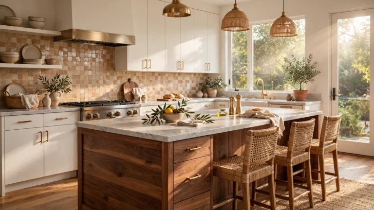
Terracotta brings a sun-baked warmth that makes a kitchen feel instantly welcoming. It is earthy, rich, and full of character, especially alongside wood, stone, and handmade textures.
This color shines in kitchens with a Mediterranean, rustic, or bohemian feel. Pair it with cream cabinets and natural wood shelving so the warmth feels layered rather than overwhelming.
Keep the rest of the palette simple: terracotta is a strong personality, so let it lead and keep countertops and textiles in quiet neutrals. One terracotta accent wall can be enough in a small space.
Tip: Terracotta creates a sheltered, cozy atmosphere, much like the inviting retreats in 20 Creative Balcony Privacy Screen Ideas That Create a Beautiful Small-Space Escape that turn an open area into a private escape.
5. Try a Two-Tone Wall Treatment
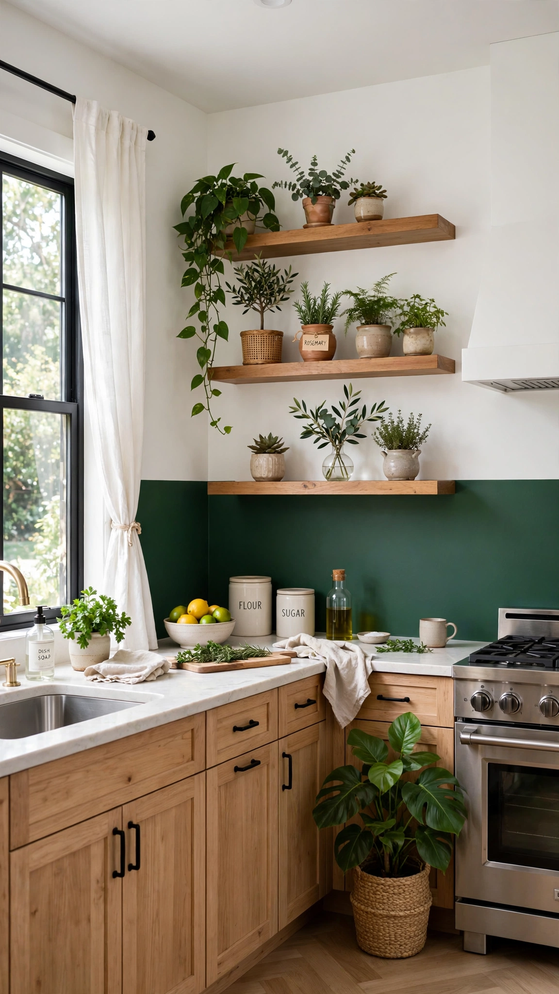
Two-tone walls give you the best of both worlds: a bold color below for personality and a light color above to keep the room feeling tall and open. A chair rail or simple painted line divides the two cleanly.
This approach works wonderfully in kitchens with low ceilings, because the lighter upper half draws the eye upward. It also lets you try a daring shade without committing every wall to it.
Pick colors with a clear relationship, such as forest green below and cream above, or navy below and soft white above. The contrast should feel intentional, not accidental.
Tip: A two-tone wall is all about smart layering, the same display logic behind 10 Stunning Balcony Plant Stand Ideas That Make Your Balcony Feel Bigger and More Inviting where staggered levels make a small space feel curated.
6. Create Drama with One Accent Wall
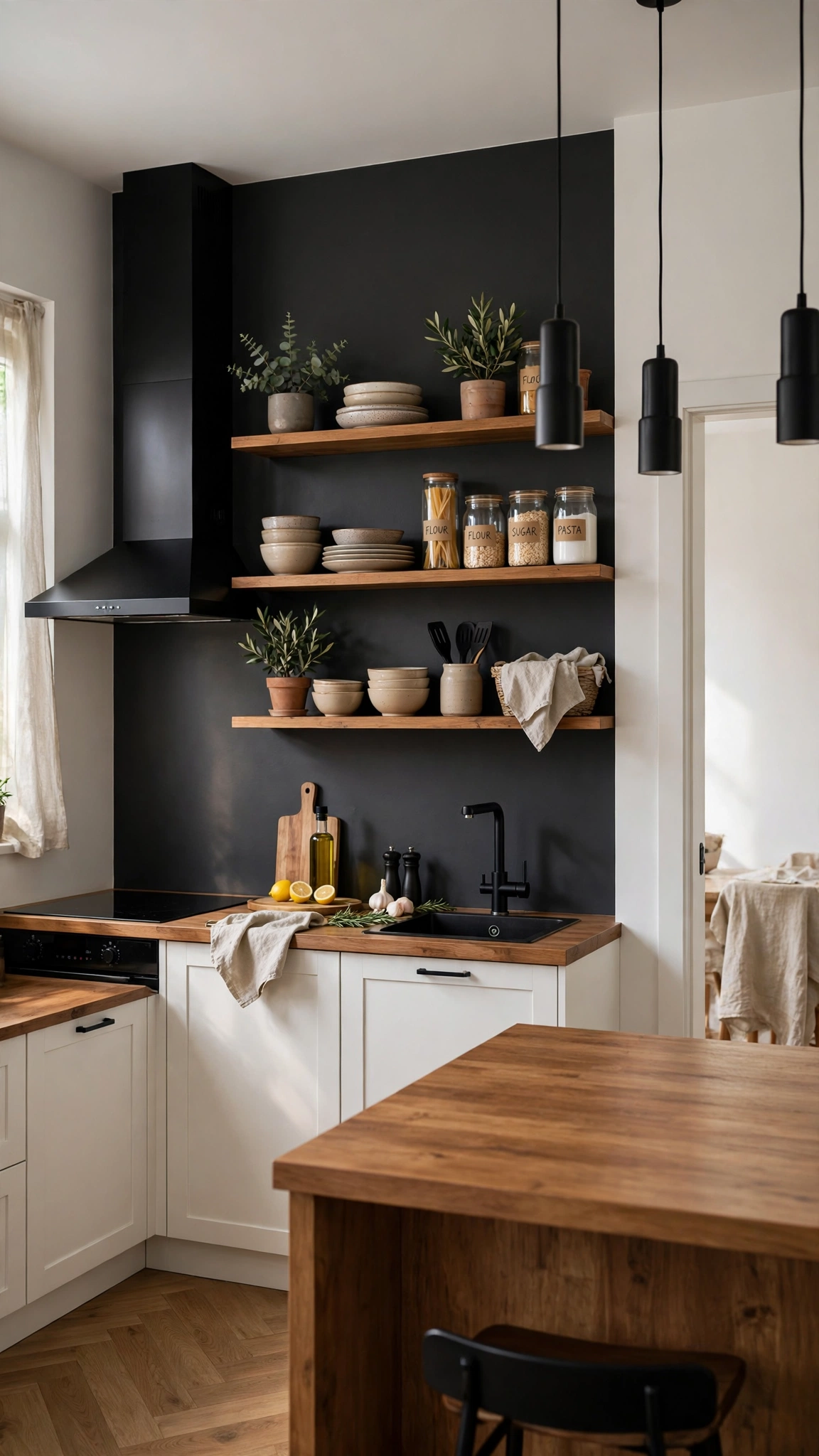
An accent wall is the easiest way to add drama without repainting the whole kitchen. One bold wall behind the stove, the dining nook, or open shelving becomes an instant focal point.
Choose the wall your eye lands on first when you walk in, and keep the surrounding walls neutral so the accent has room to breathe. Deep green, charcoal, or brick red all make strong choices.
Style the accent wall simply: a few open shelves, a piece of art, or a clock is plenty. Too much decoration competes with the color itself and dulls the impact.
Tip: An accent wall thrives on fresh, living detail, so finish it with greenery inspired by 14 Beautiful Balcony Vegetable Garden Ideas That Turn a Small Outdoor Space Into a Cozy Retreat like a small herb pot on the shelf.
7. Keep It Serene with Soft Gray
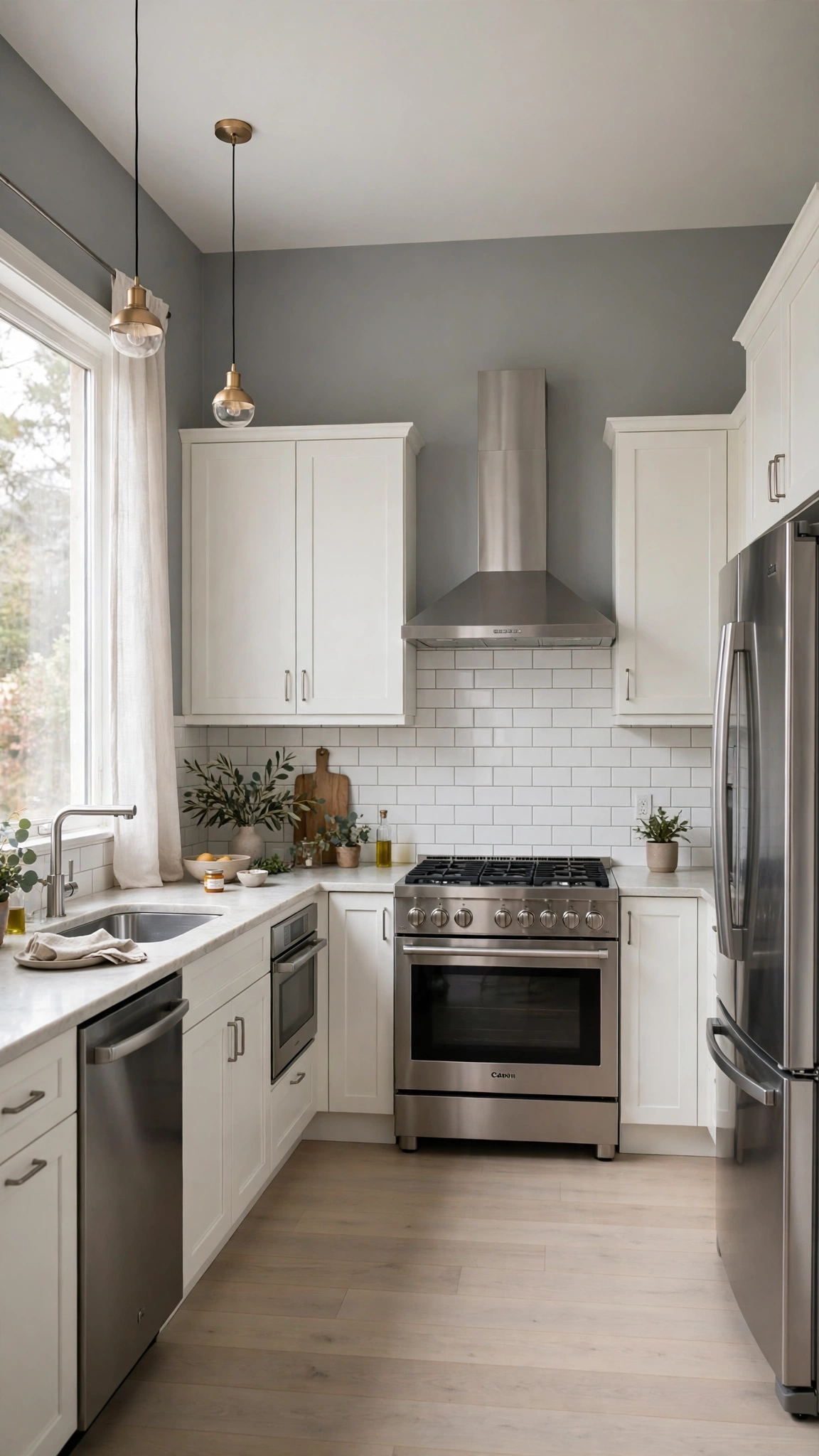
Soft gray is the modern neutral that goes with everything. It feels clean and contemporary, yet warmer than stark white, and it lets stainless steel and stone countertops take center stage.
The key is undertone: a gray with warm beige undertones feels cozy, while a gray with blue undertones feels crisp and modern. Match the undertone to your flooring and fixtures.
Gray also makes an excellent backdrop for colorful accessories. Swap in seasonal dish towels, artwork, or a fruit bowl and the whole room changes without repainting a thing.
Tip: Gray walls let you group accessories in neat clusters, a trick borrowed from 11 Stylish Balcony Container Gardening Ideas That Create a Beautiful Small-Space Escape where containers keep a display tidy and intentional.
8. Add a Touch of Blush Pink
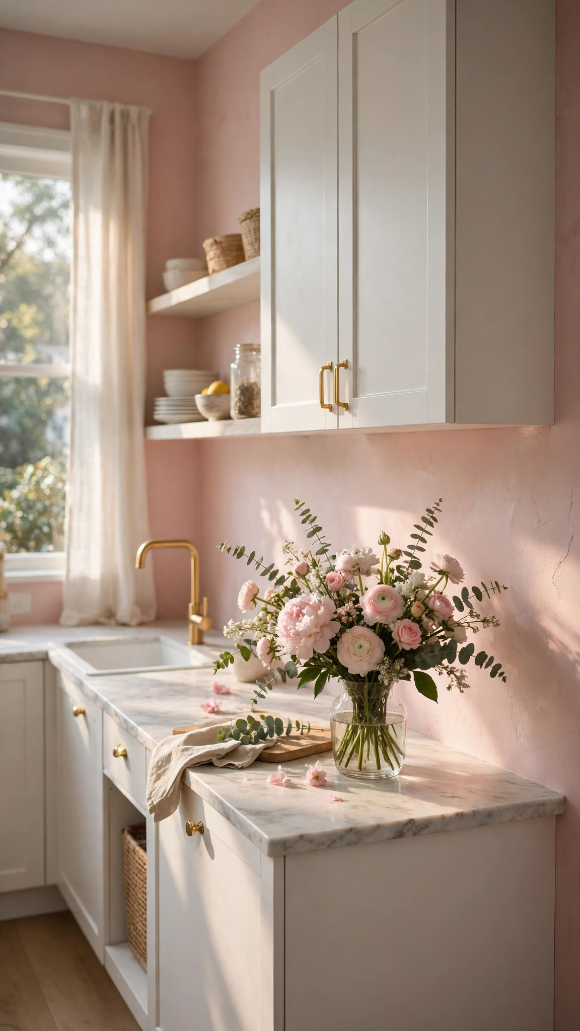
Blush pink is surprisingly grown-up in a kitchen when it is kept soft and muted. It adds warmth and a gentle glow, especially in rooms with white cabinets and gold or brass details.
This shade works beautifully in kitchens that need a little softness, such as a space with lots of hard surfaces and sharp angles. It rounds out the room without feeling sugary.
Keep blush pale and dusty rather than bright, and balance it with natural textures like wood, linen, and stone. The result feels romantic and refined, not childish.
Tip: Blush walls pair well with elegant decorative accents, the same finishing-touch thinking behind 12 Creative Chinese Decorations Home That Instantly Elevate Your Space where a few bold details lift the whole room.
9. Make a Statement with Charcoal
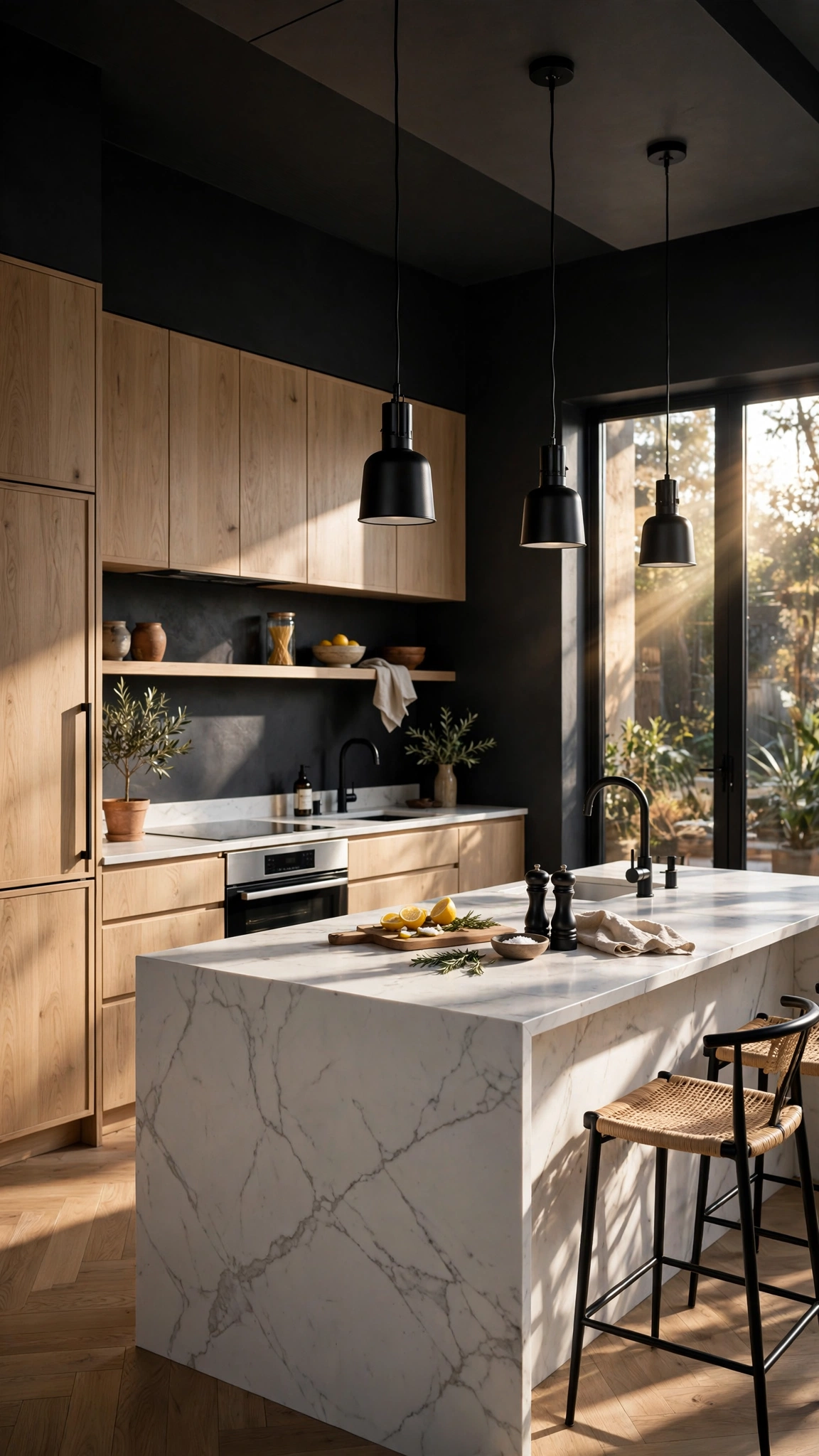
Charcoal walls give a kitchen a sleek, modern edge that feels more like a boutique restaurant than a workspace. Against light wood and white stone, charcoal looks striking and sophisticated.
Use charcoal where there is plenty of light or contrast to balance it: white cabinets, a light backsplash, or pale floors will stop the room from feeling closed in. Good lighting matters even more here.
Add texture to keep charcoal from falling flat — matte paint, wood grain, or a textured backsplash will give the dark walls depth and keep them interesting up close.
Tip: Charcoal creates a cozy, enclosed feeling like a well-designed outdoor nook, echoing 11 Stunning Terrace Design Ideas That Turn a Small Outdoor Space Into a Cozy Retreat where defined spaces feel intimate and inviting.
10. Cheer Up the Room with Butter Yellow
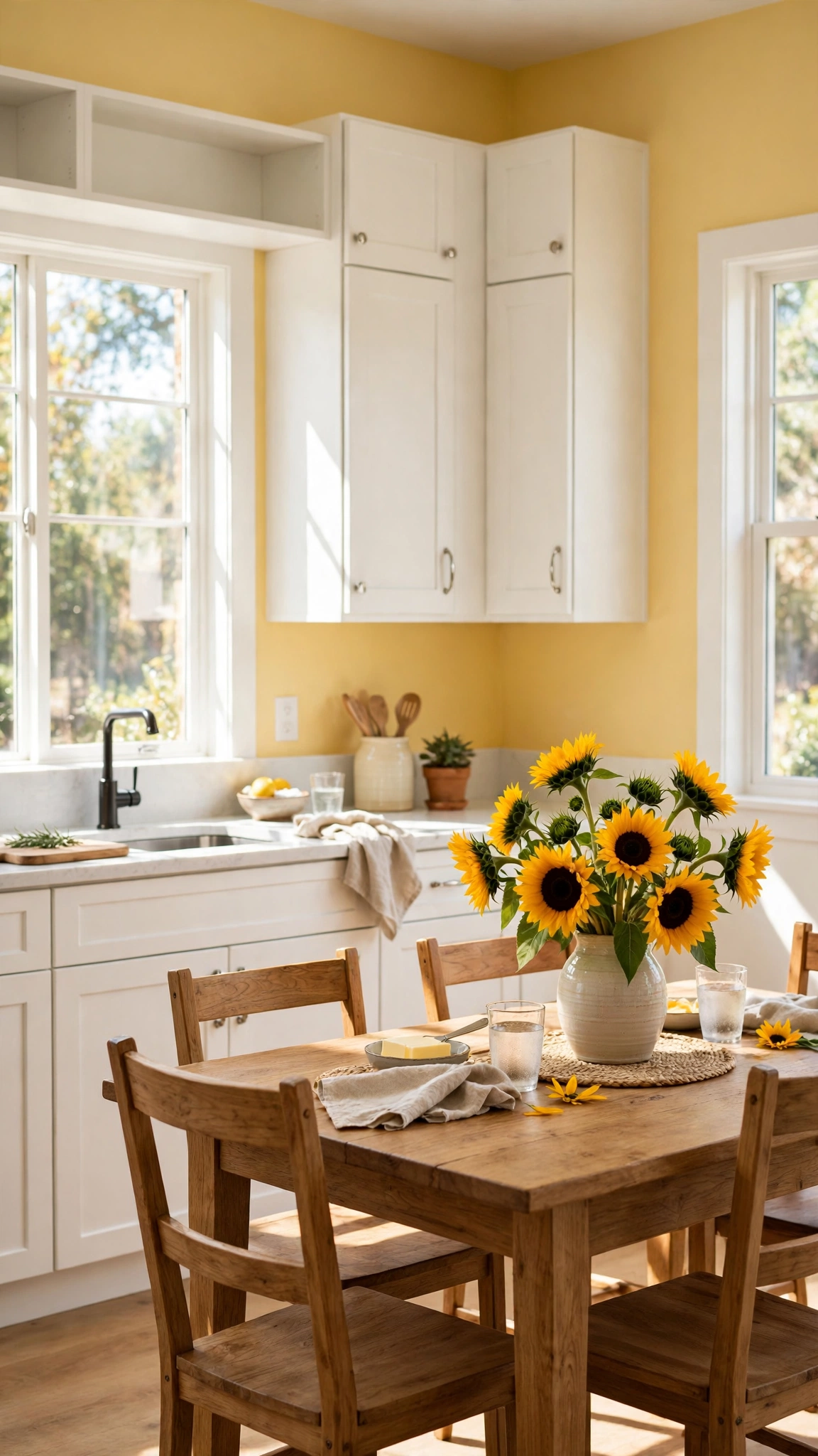
Butter yellow is sunshine in paint form. It brightens a kitchen instantly, lifts the mood, and pairs naturally with white cabinets, wood tones, and vintage or farmhouse details.
This shade is a lifesaver in kitchens that get little natural light. It warms up the room even on gray days and makes morning routines feel a little more cheerful.
Keep the yellow soft and buttery rather than neon, and let it be the main warmth in the room. Too many competing warm tones can turn cheerful into chaotic.
Tip: Butter yellow needs a solid base to shine, so anchor it with the same grounding choices in 17 Stylish Balcony Flooring Ideas That Create a Beautiful Small-Space Escape that keep a bright space feeling balanced.
11. Cool Down with Dusty Blue
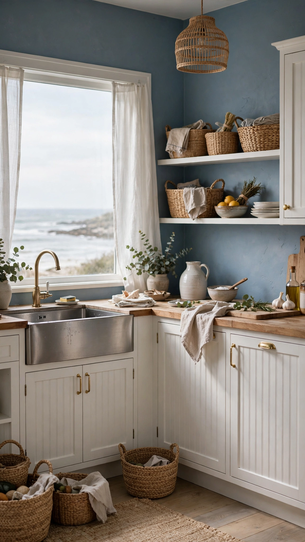
Dusty blue is calm, coastal, and endlessly versatile. It feels fresh in summer and cozy in winter, and it pairs with everything from white beadboard to dark walnut.
This muted blue works especially well in kitchens with a coastal, cottage, or farmhouse style. Add natural fibers, woven baskets, and white trim to complete the relaxed feel.
Avoid blues that are too saturated or too gray in a small kitchen, since they can read cold. Dusty blue with a touch of warmth is the sweet spot that stays inviting year-round.
Tip: Dusty blue walls invite playful seasonal styling, so have fun swapping accessories the way 17 Festive Halloween Costume Outfit Ideas That Are Fun, Easy, and Perfect for Halloween swaps a look for the season.
12. Go Classic with Crisp White Walls
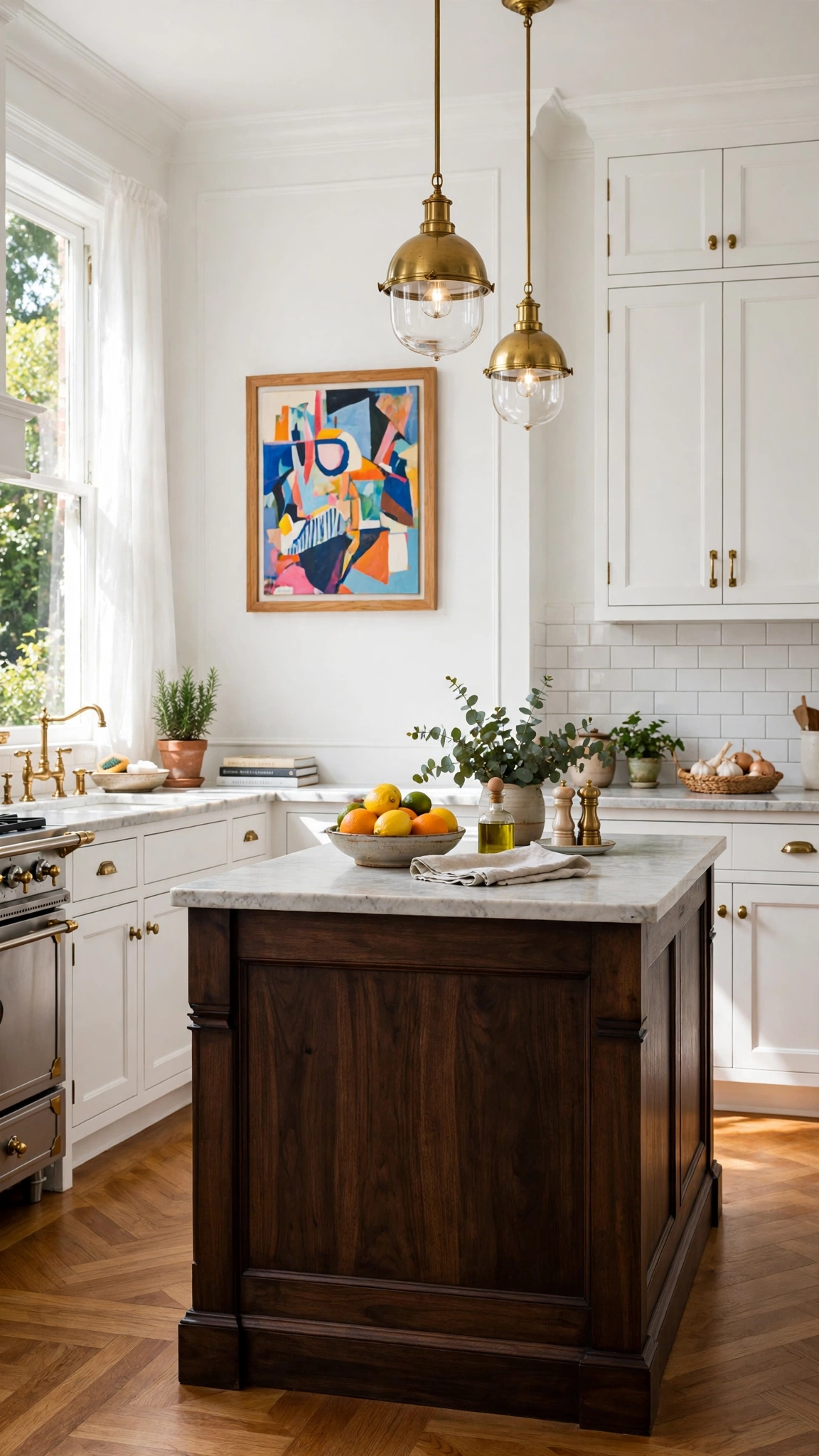
Crisp white walls never go out of style, and for good reason. They maximize light, make small kitchens feel bigger, and let your cabinets, artwork, and accessories do the talking.
White works best when it is not alone: layer in wood, black hardware, or a colorful rug so the room feels intentional rather than unfinished. Texture is your friend here.
Choose a white with the right undertone for your light. A pure white can feel clinical under cool light, while a slightly warm white feels welcoming in almost any kitchen.
Tip: White walls are a blank canvas for a shared, social kitchen, much like the coordinated fun in 18 Festive Halloween Costumes for Best Friends That Are Fun, Easy, and Perfect for Halloween where matching pieces make the whole group shine.
13. Add Depth with Forest Green
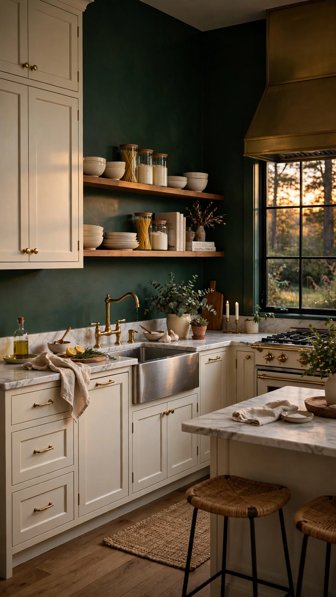
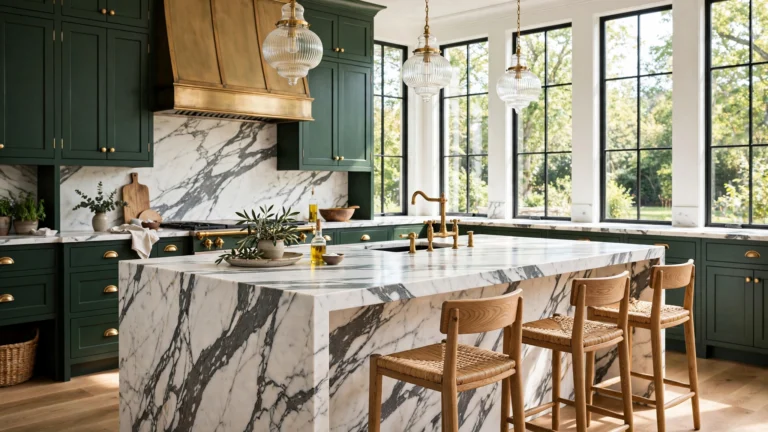
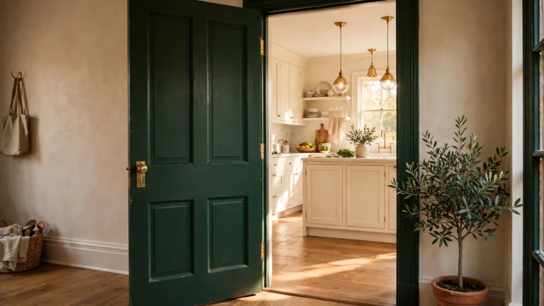
Forest green is rich, grounded, and quietly luxurious. It brings the outdoors in and pairs beautifully with cream cabinets, brass fixtures, and marble or butcher-block counters.
This deep shade works best on walls that get some natural light, where it reads as lush rather than dark. In a dim kitchen, use it on one or two walls and keep the rest light.
Forest green also ages gracefully: it looks just as good with traditional cabinetry as with modern flat-front doors, so it is a safe choice for a color you will live with for years.
Tip: Forest green pairs naturally with a partner shade, the way a duo look comes together in 17 Creative Halloween Couple Costumes That Make Dressing Up Way More Fun where two elements complement each other perfectly.
14. Soften the Space with Warm Taupe
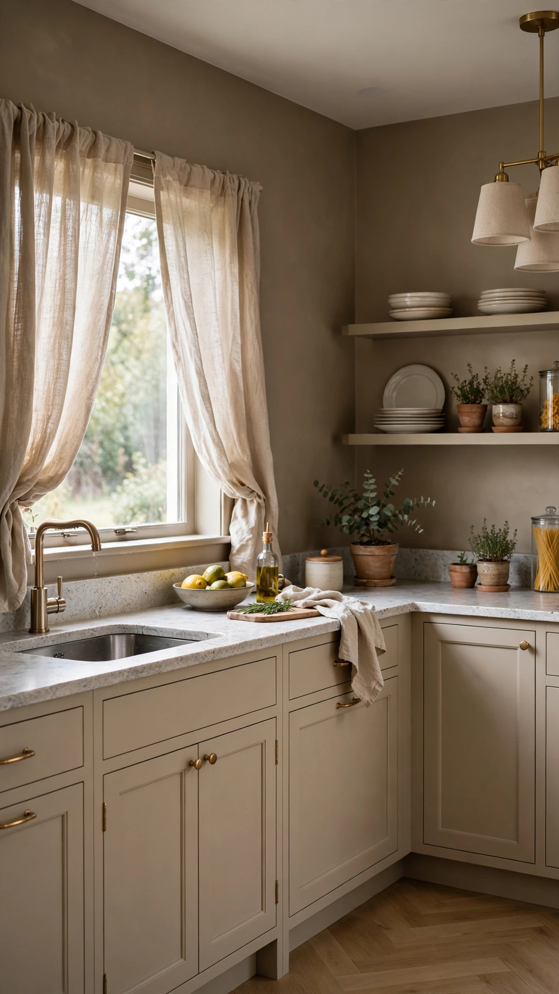
Warm taupe is the neutral for people who find gray too cool and beige too bland. It sits right in the middle, adding warmth and depth while still working as a quiet backdrop.
Taupe flatters stone countertops, wood floors, and both light and dark cabinetry. It is an excellent choice if you want a sophisticated room that does not demand constant attention.
Layer taupe walls with cream trim and warm metals to keep the palette cohesive. A few darker accents, like walnut cutting boards or black fixtures, will stop it from feeling flat.
Tip: Taupe brings the whole household together in one calm palette, similar to the family-friendly coordination in 12 Festive Halloween Family Costume Ideas That Make Dressing Up Way More Fun where every piece works as part of a set.
15. Refresh with Pale Mint
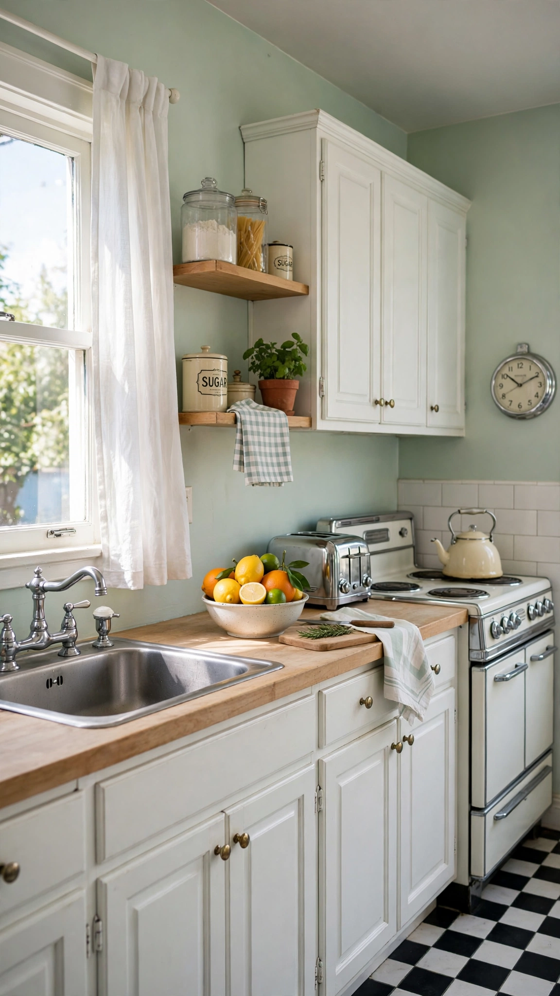
Pale mint is fresh, clean, and quietly retro. It adds a whisper of color without committing to a bold shade, making it perfect for renters or anyone nervous about color.
Mint pairs beautifully with white cabinets, chrome fixtures, and light wood. It also works with vintage touches like a retro fridge or patterned tile for a charming, nostalgic feel.
Keep mint pale and cool rather than saturated, and avoid pairing it with too many other pastels. One mint wall color plus white and wood is a complete, polished palette.
Tip: Pale mint is an easy, low-pressure color choice, the same stand-out simplicity behind 10 Creative Halloween Costume Ideas That Are Easy, Fun, and Made to Stand Out where simple ideas make the biggest impression.
16. Pair White Walls with a Bold Backsplash Color
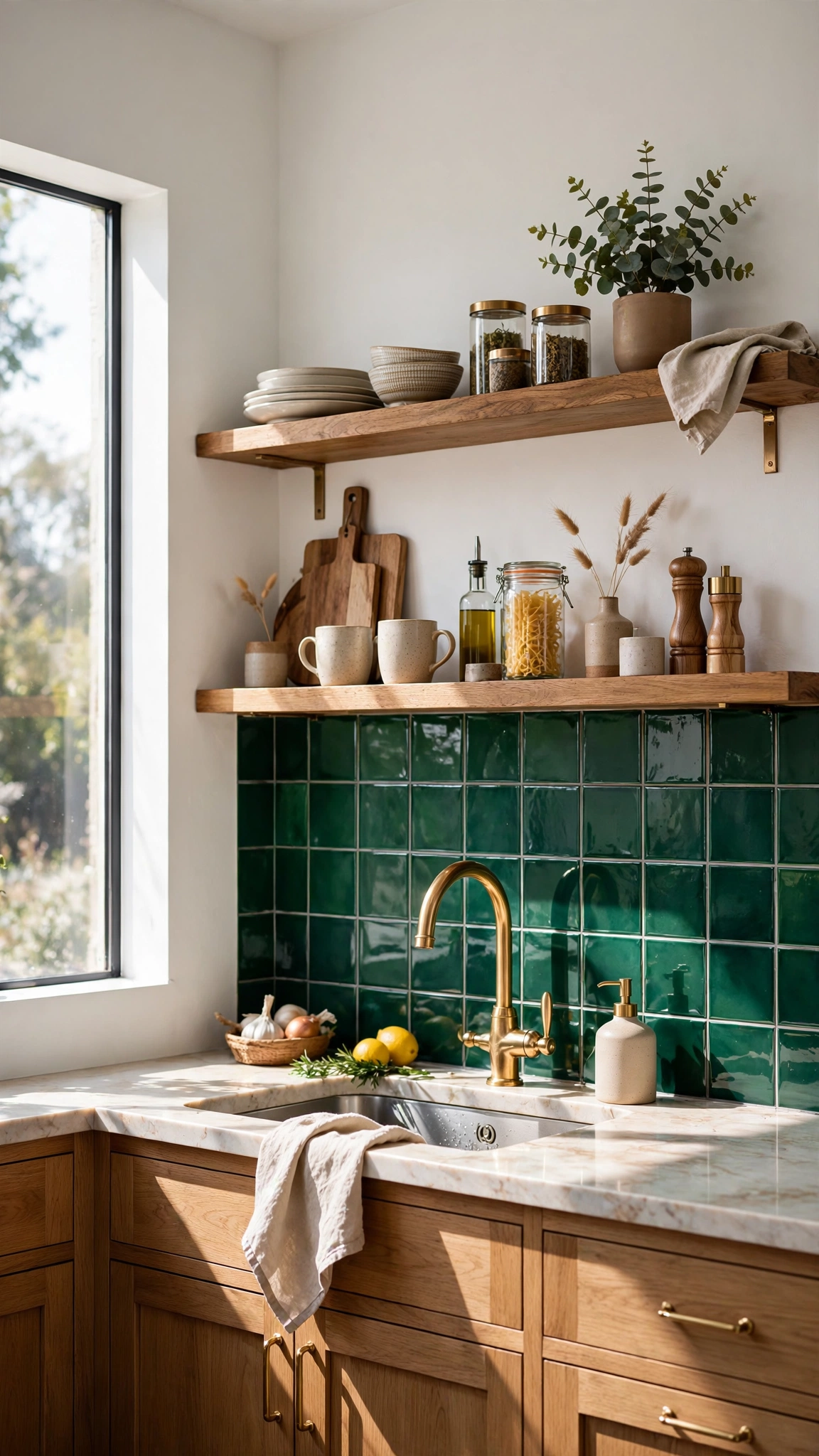
Sometimes the wall color is not the star — the backsplash is. Soft white or pale gray walls let a bold backsplash take center stage, giving you color and pattern exactly where the eye naturally goes.
This combination is practical too: the wall color stays timeless, while the backsplash can be the playful, trend-led element. If tastes change, swapping tile is easier than repainting everything.
Choose a backsplash color that echoes something else in the room, like a rug, artwork, or dishware, so the bold choice feels connected rather than random.
Tip: A bold backsplash is a grown-up statement piece, much like the confident choices in 12 Creative Halloween Costume Ideas for Adults That Are Fun, Easy, and Perfect for Halloween where a strong look still feels polished.
17. Finish with a Moody Black Accent
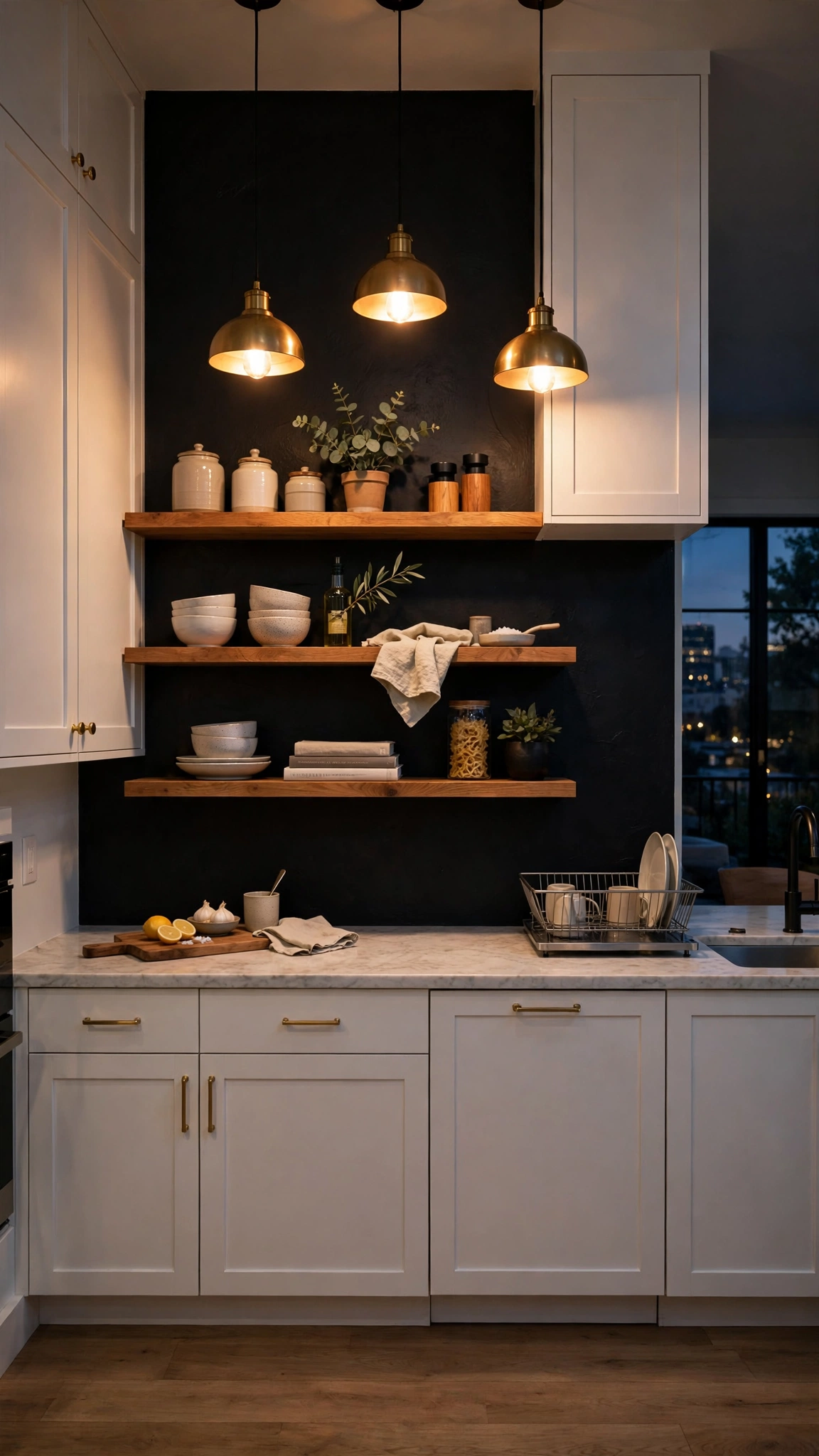
A single black accent wall is the boldest move on this list, and in the right kitchen it is also the most striking. Black adds depth, frames open shelving beautifully, and makes brass and wood glow.
Keep the rest of the room light and bright: white cabinets, pale counters, and warm lighting are essential partners for a black wall. Without that contrast, the room can feel heavy.
Use a matte or eggshell finish rather than high gloss, which can show every imperfection. Matte black reads as soft and velvety, especially under warm pendant lights.
Tip: A black accent wall makes a confident statement, the same bold-but-beautiful energy in 18 Clever Halloween Costume Ideas for Women That Are Fun, Easy, and Perfect for Halloween where a strong choice steals the show.
Conclusion
The best kitchen wall color is the one that makes your room feel like yours — brighter, warmer, calmer, or bolder, depending on what you need most. Pick a shade from this list, test it in your light, and let your walls do the designing for you.