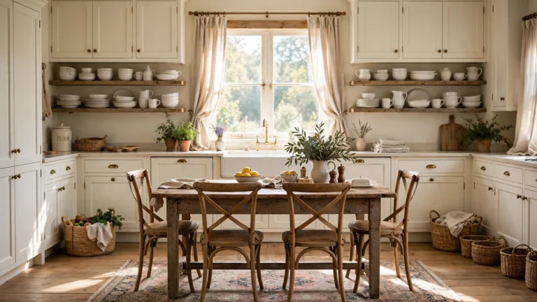
18 Stylish Kitchen Reno Ideas That Give Your Kitchen a Designer Look
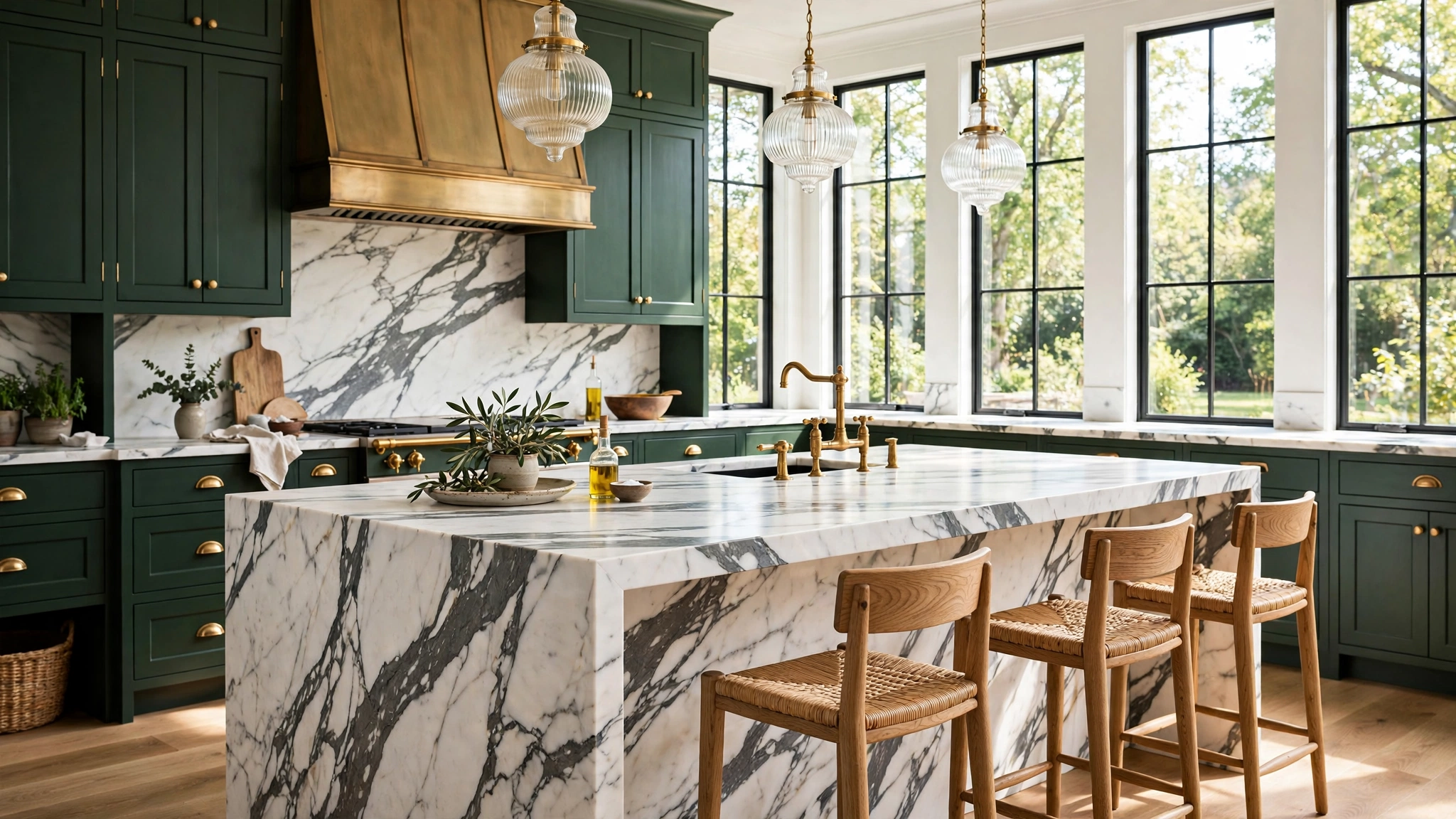
A kitchen renovation is the fastest way to change how your whole home feels, but the difference between a standard remodel and a designer kitchen rarely comes down to budget alone. It comes down to choices: bolder materials, layered lighting, hardware that feels like jewellery, and details that look considered rather than copied from a showroom package.
The good news is that most designer kitchens are built from repeatable moves that work in almost any space, from a compact galley to a sprawling open-plan room. Pick the ideas that suit your layout, commit to them fully, and your reno will look intentional from every angle. Ready to see which upgrades deliver that polished, high-end look?
1. Splurge on Statement Stone
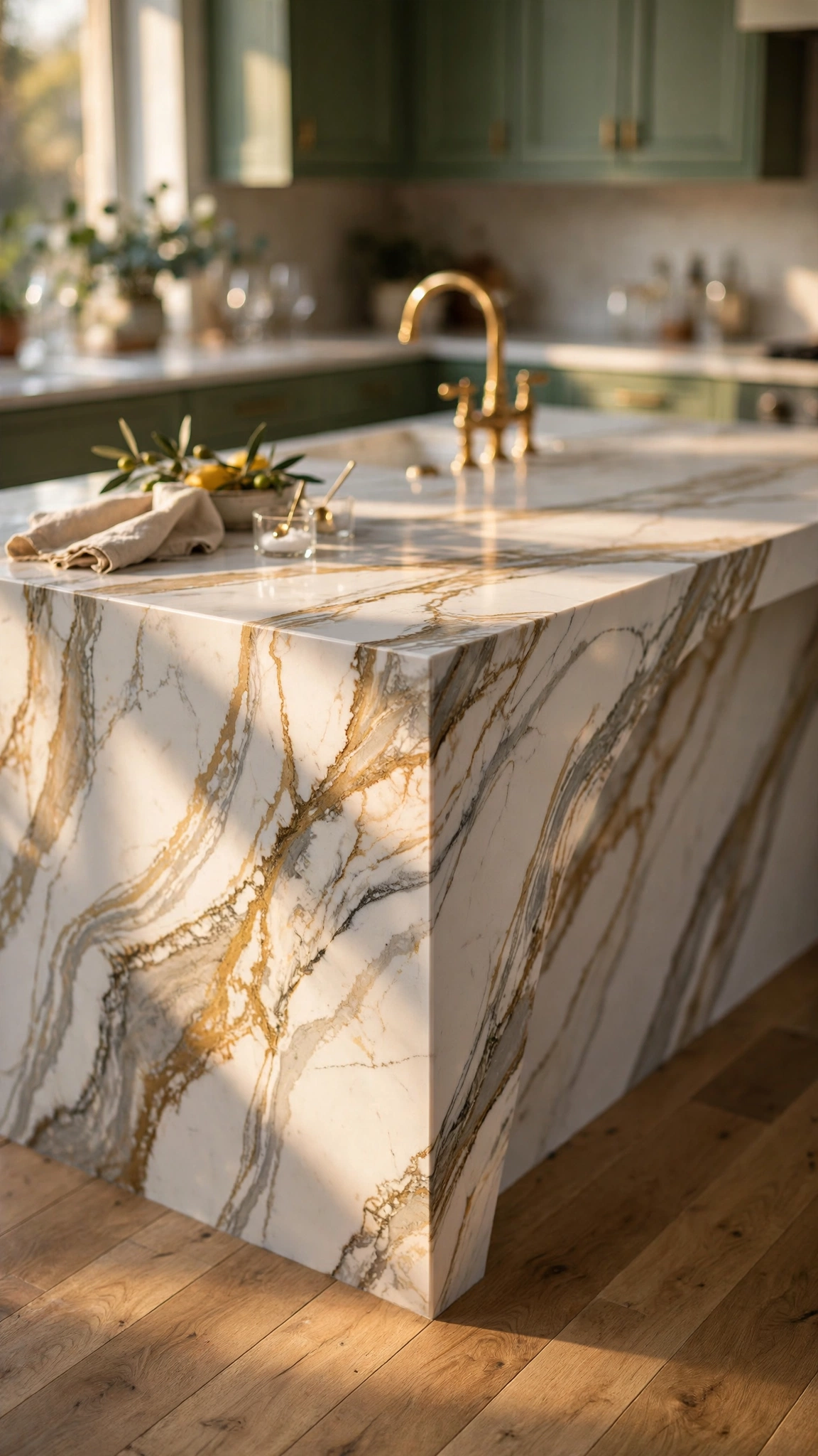
If there is one place designers spend first, it is the stone. A slab with bold, natural veining on the island or worktops instantly becomes the artwork of the room, giving even simple flat-front cabinets an expensive backdrop. Quartzite, marble-look quartz and honed granite all deliver that movement without two kitchens ever looking identical.
Choose one hero slab and let everything else support it. Keep cabinet colours, flooring and splashback tones pulled from the veining so the whole scheme feels woven together rather than assembled from separate shopping trips.
Real stone sits at the top of the budget, but a single island slab or a marble-look quartz usually lands in the mid hundreds per square metre installed. Book-matching the veining at seams is a small extra charge that makes a huge visual difference.
Tip: Decide your stone before you finalise a single other finish, and plan the rest of the spend around it — the same prioritising mindset behind these creative renovation ideas without overspending will stop the budget leaking into low-impact extras.
2. Paint Cabinets a Deep, Designer Colour
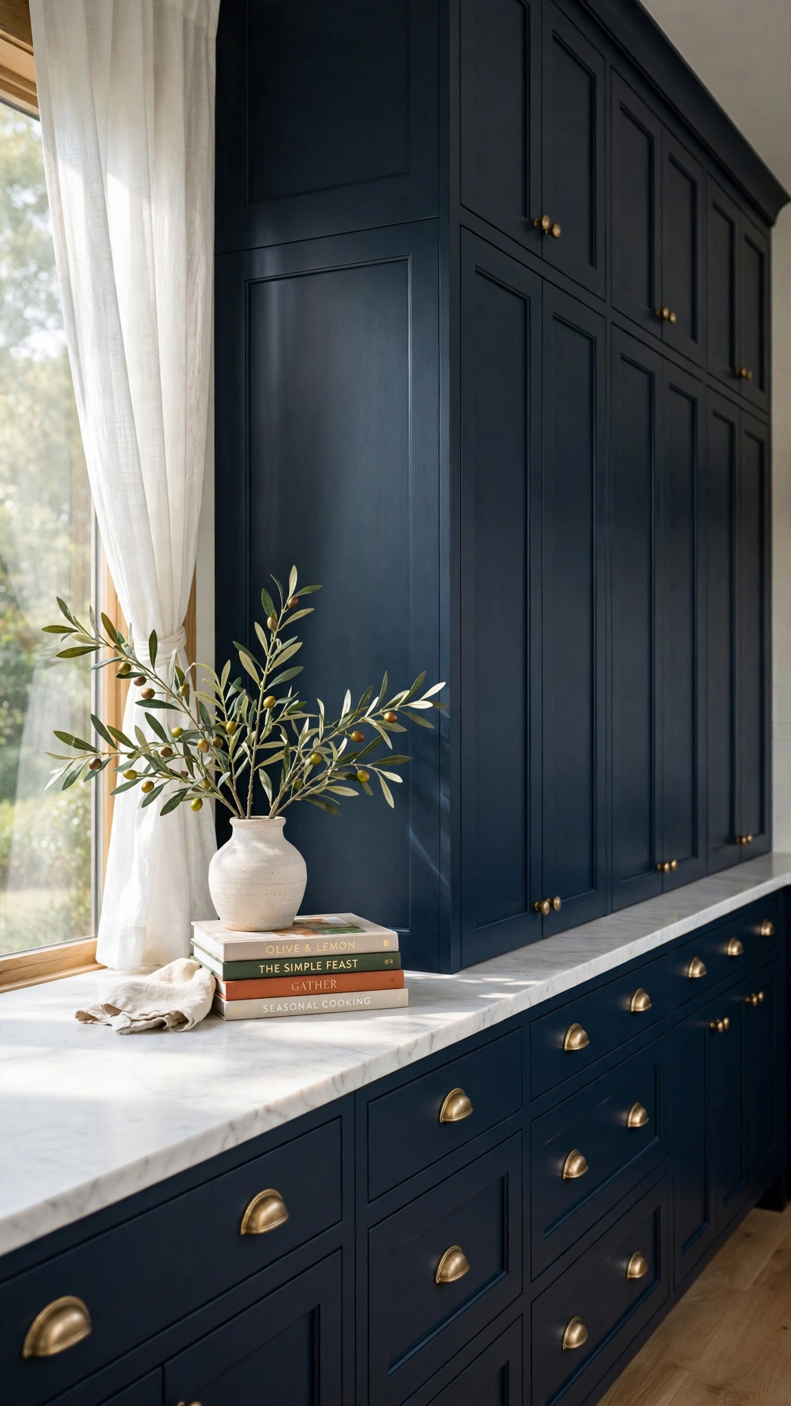
Nothing signals “custom kitchen” like cabinetry in a rich, saturated colour. Deep forest green, inky navy, oxblood and warm charcoal all read as bespoke, especially against pale stone and warm metal hardware. The colour does the heavy lifting, so even budget cabinet boxes look tailored.
If you are keeping existing cabinets, a professional spray finish is the designer route: doors are removed, sanded, primed and sprayed for that smooth, factory-level result. Pair the colour with a slightly lighter or darker island for a two-tone scheme that feels planned, not matched.
Spraying a medium kitchen typically costs far less than replacing units, and the transformation takes days rather than weeks. Order large sample boards and live with them in different lights before committing.
Tip: Test your cabinet colour at different times of day, because deep shades shift dramatically between morning and evening light — the colour-confidence advice in these gorgeous bedroom colour ideas applies just as well in the kitchen.
3. Layer Your Lighting in Three Levels
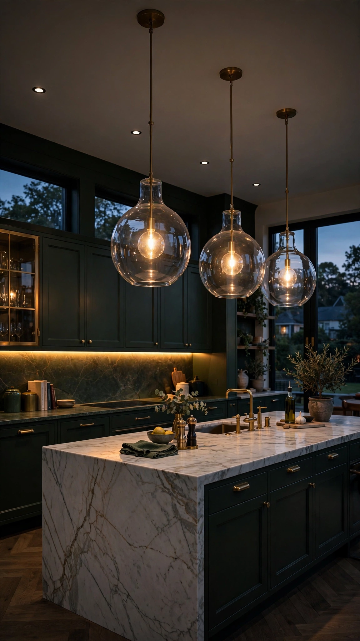
Designers never rely on a single ceiling light. They layer three levels: recessed or track lighting for general brightness, pendants over the island for focus and beauty, and under-cabinet strips for task light that also makes worktops glow after dark. The mix is what creates that expensive evening ambience.
Put each layer on its own dimmer so you can shift the room from bright prep mode to soft dinner-party mode in seconds. Warm-white bulbs around 2700K keep stone and wood looking rich rather than clinical.
Under-cabinet LED tape is inexpensive and can be retrofitted in an afternoon, while statement pendants are worth budgeting for properly — they are the chandeliers of the kitchen and the first thing guests notice.
Tip: Sketch your three lighting layers on the floor plan before the electrician arrives, and steal layering inspiration from these stylish lighting ideas for mixing pendants, strips and spots with confidence.
4. Swap Hardware for Unlacquered Brass
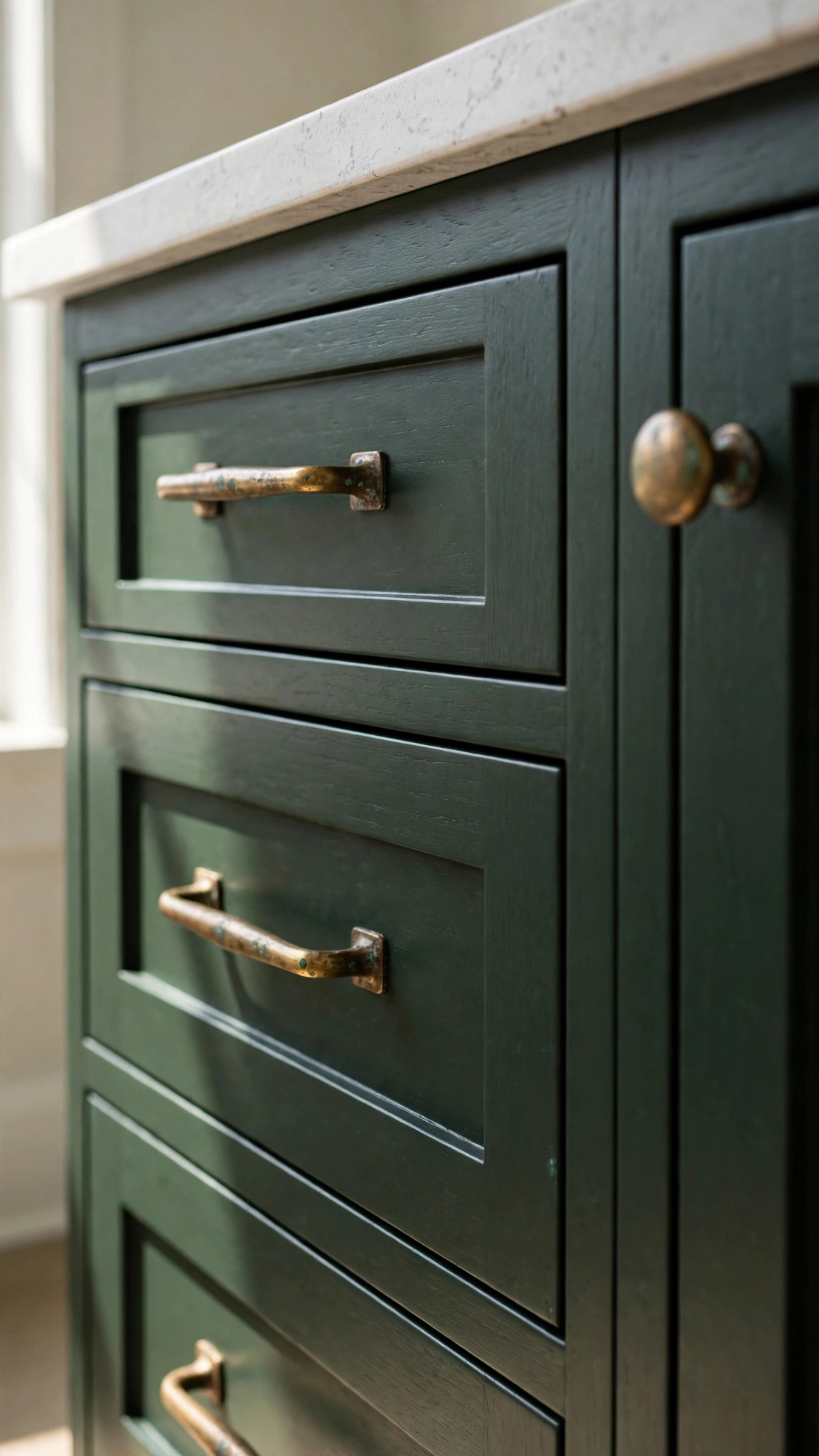
Hardware is the jewellery of the kitchen, and unlacquered brass is the finish designers reach for when they want a room to feel collected and lived-in rather than showroom-new. It starts bright and golden, then develops a soft patina on the pulls you touch most, which only adds character.
Keep the metal story consistent: pulls, knobs, faucet, pendant details and even appliance handles should share the same family. Mixing one warm metal with confidence looks far more expensive than timidly mixing three.
A full hardware swap is one of the cheapest reno moves there is — most kitchens need 20 to 40 pieces, and the whole changeover takes an hour with a screwdriver and a drilling template for new hole spacings.
Tip: Order one sample pull first and live with it for a week to watch the patina develop, then commit — small, high-impact swaps like this are the heart of any designer-inspired makeover, indoors or out.
5. Run the Backsplash All the Way Up
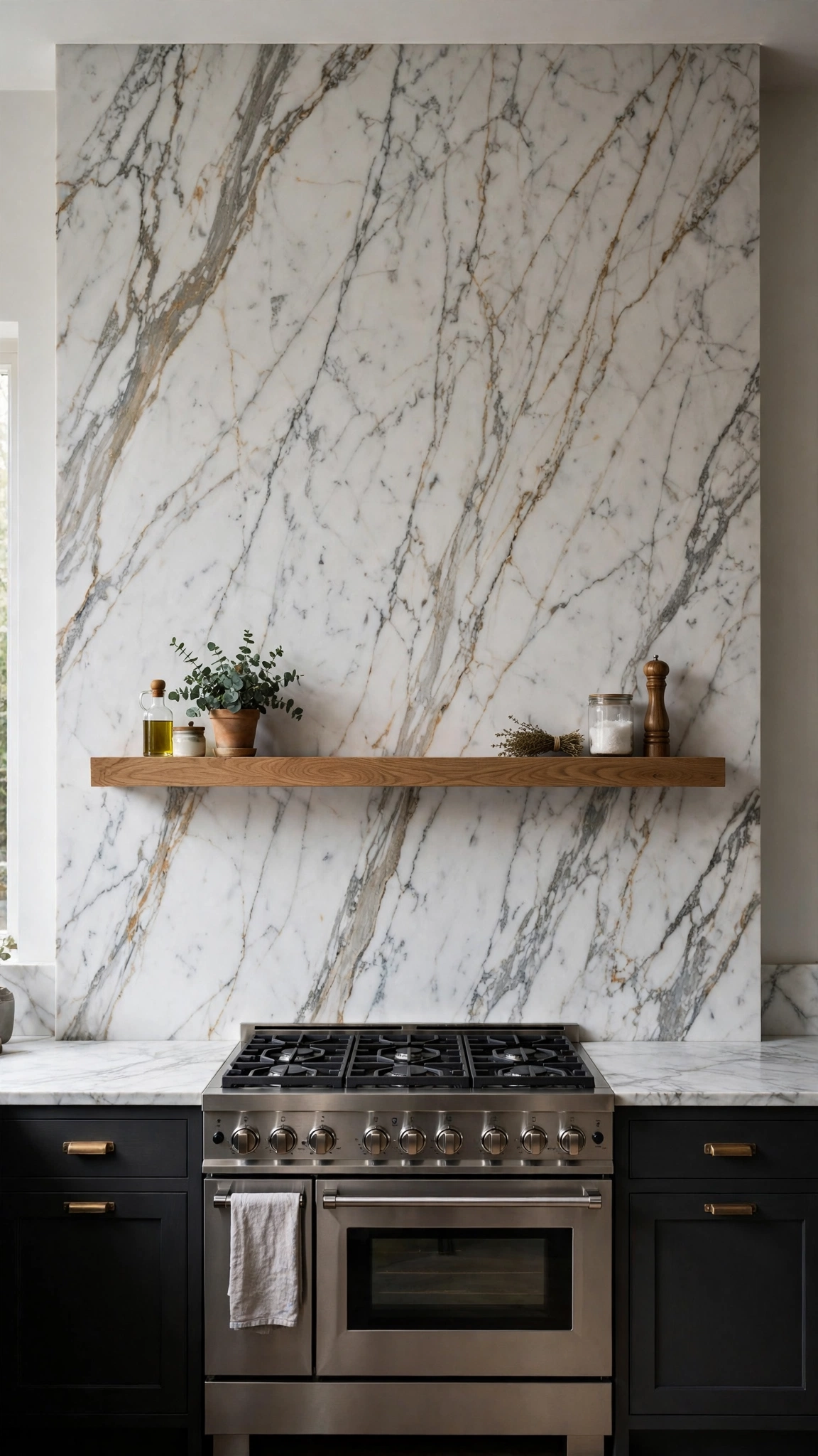
Stopping the splashback at the underside of the wall cabinets is standard; running it to the ceiling is designer. A full-height slab of the same stone as your worktops creates one sweeping, seamless surface that makes the cooking wall feel like a piece of architecture.
If a full slab is beyond budget, take large-format tiles or classic subway tiles all the way up instead — the height, not just the material, creates the effect. It also makes a small kitchen feel taller, because the eye travels up without a visual break.
Slab splashbacks are priced like extra worktop, so this suits mid-to-large reno budgets, but the tiled version costs little more than a standard splashback since the labour is nearly identical.
Tip: Treat the cooking wall as one tall canvas from counter to ceiling — thinking of walls as full-height statements, as in these gorgeous interior wall ideas, is what separates a reno from a refresh.
6. Add a Waterfall-Edge Island
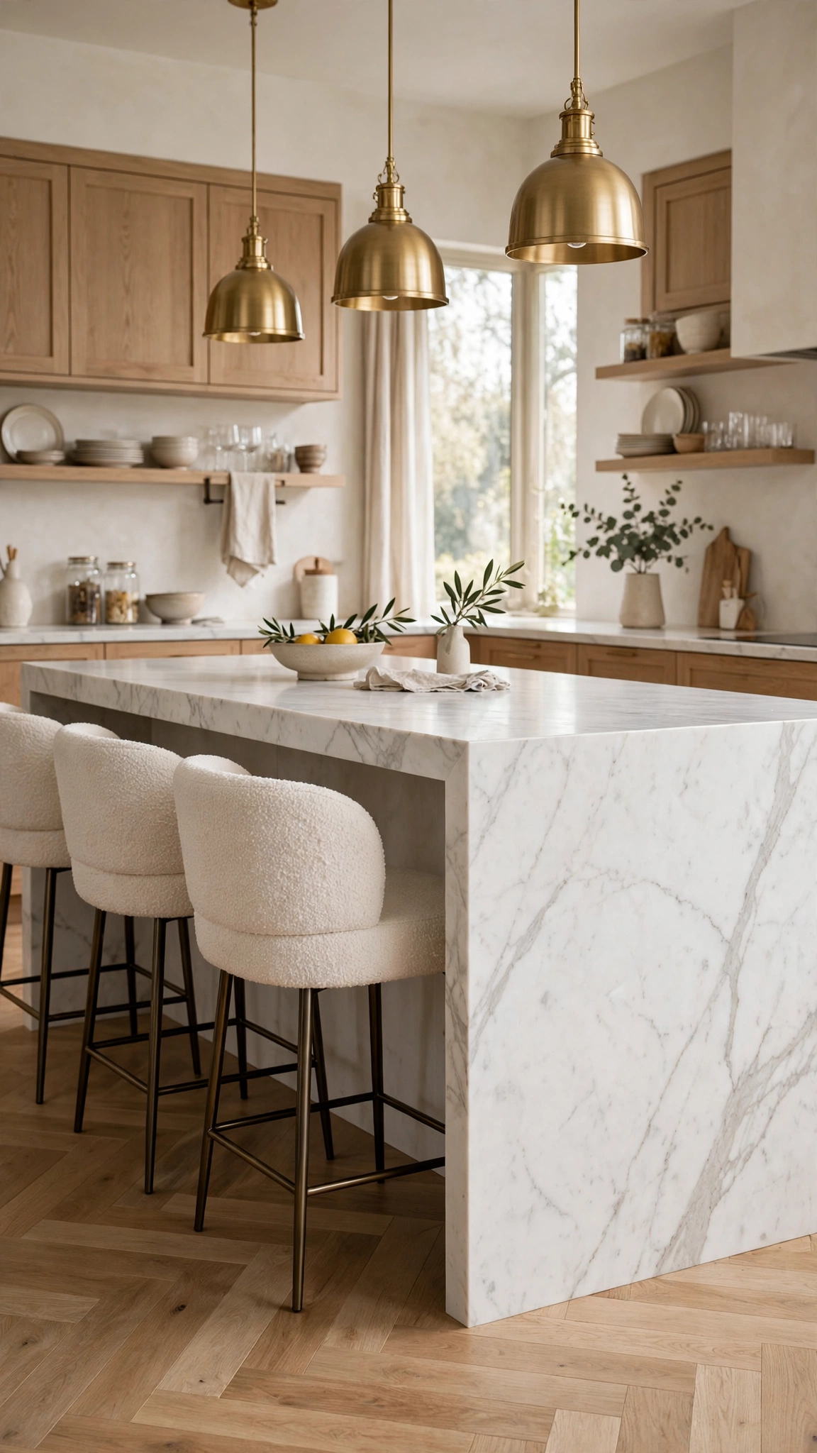
A waterfall edge — where the worktop material pours down the sides of the island to the floor — turns a block of cabinetry into a sculptural centrepiece. It is a signature of high-end kitchens because it shows off the stone and gives the island clean, furniture-like lines.
It works best with a stone that has flowing veining, mitred so the pattern wraps around the edge like a folded ribbon. Keep the island base simple and let the waterfall do the talking; busy cabinet fronts underneath fight the effect.
Expect to pay for roughly one extra slab’s worth of material plus mitring labour. If that stretches the budget, a single waterfall end on the most visible side delivers most of the look for less.
Tip: Size the island for real life — seating, prep and gathering space — because the island is now the social heart of the home, a shift explored in these creative kitchen living room ideas for open-plan spaces.
7. Hide Appliances Behind Cabinet Panels
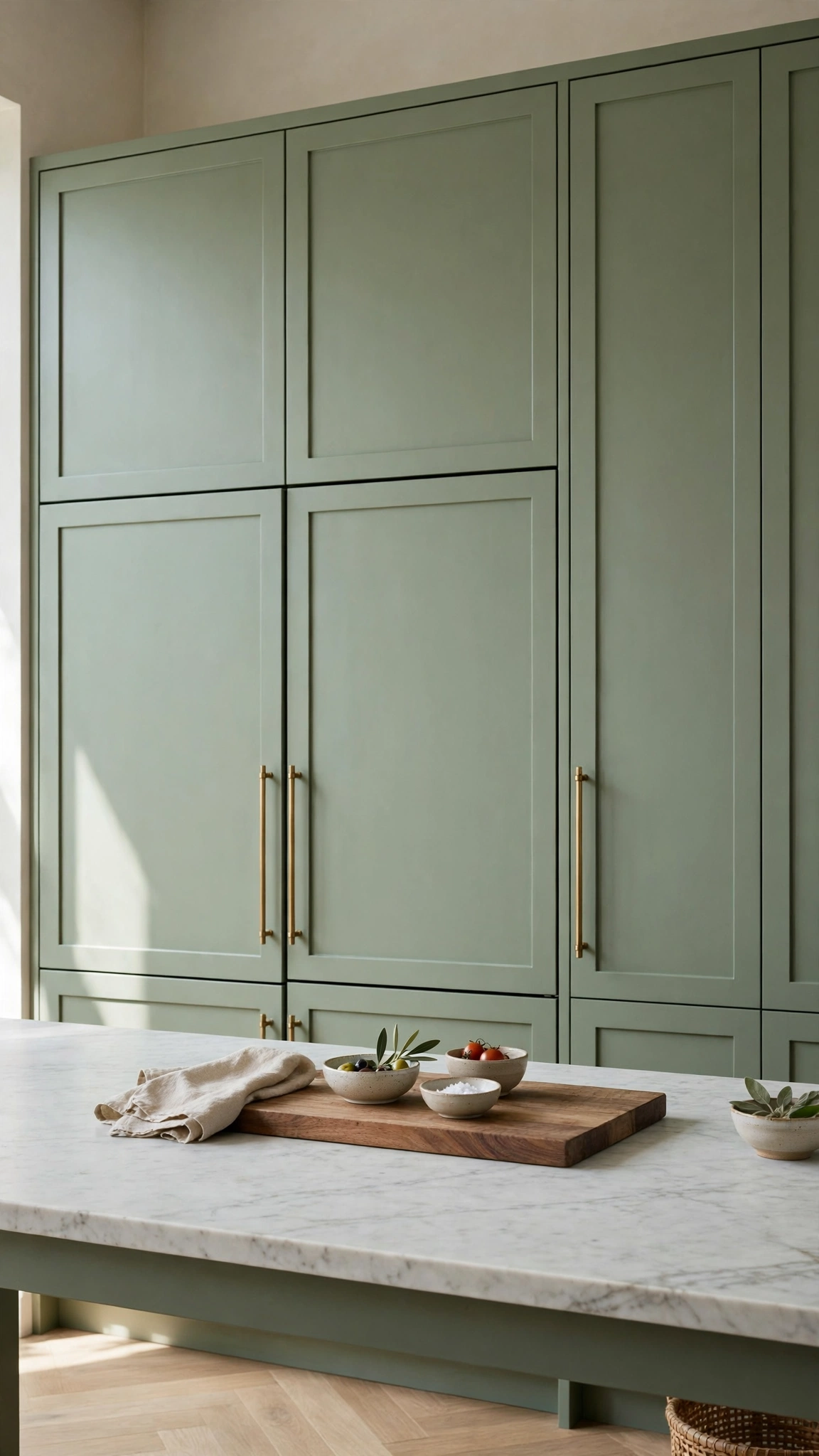
Nothing breaks the designer spell like a wall of mismatched stainless steel. Panel-ready dishwashers, fridges and freezers hide behind doors that match your cabinetry, so the whole room reads as one calm, continuous run of beautiful joinery.
Designers use this trick to make kitchens feel like living spaces — the eye sees furniture, not machines. It is especially powerful in open-plan homes where the kitchen is always on view from the sofa.
Integrated appliances carry a modest premium over freestanding models, and you will need cabinet doors sized for them, but no structural work is involved. Plan it early, because retrofitting panels is fiddly.
Tip: Measure appliance doors twice before ordering panels — the seamless look depends on millimetre-perfect alignment, the same precision that makes these creative cabinet ideas look so clean and built-in.
8. Style a Run of Open Shelving
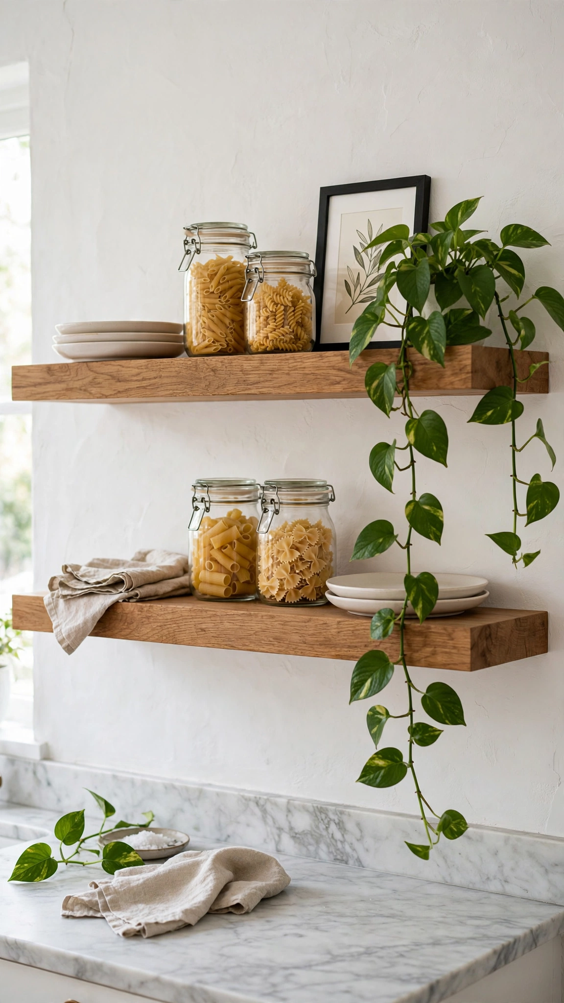
A short run of open shelves breaks up a wall of cabinets and gives a kitchen that relaxed, curated feel designers love. Thick floating oak or painted shelves, styled with everyday pieces — stacked plates, glass jars, a small print, something green — read as intentional rather than exposed storage.
The styling rules are simple: group in odd numbers, mix heights, leave breathing room, and keep only what you use weekly on display. Everything else stays behind doors. Two shelves is usually plenty; a whole wall can tip into clutter.
Shelves are one of the most affordable upgrades in this list — quality oak boards and hidden brackets cost little, and fitting them is an easy DIY afternoon once you find the studs or use proper wall fixings.
Tip: Edit ruthlessly and restyle seasonally to keep shelves looking curated, borrowing the grouping tricks used in these beautiful shelving ideas for turning storage into display.
9. Lay Wide-Plank Floors That Flow
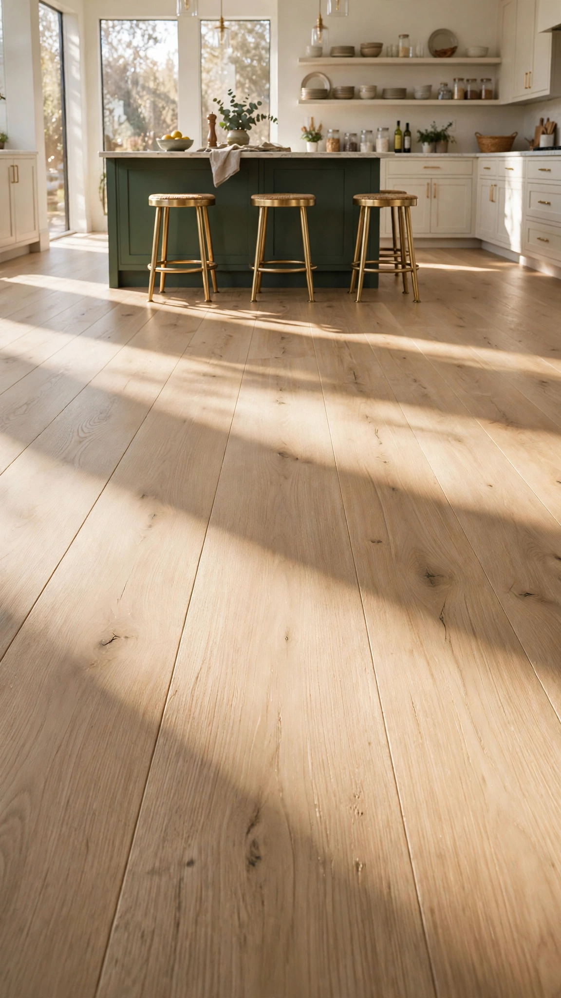
Flooring is the canvas under everything, and wide planks — 180mm and beyond — instantly make a kitchen feel calmer and more expensive than narrow boards or busy tiles. Fewer joints means fewer visual interruptions, so the whole room breathes.
Run the same floor through the kitchen and into adjoining living spaces without thresholds wherever possible. That unbroken flow is a hallmark of designer homes, and it makes open-plan areas feel twice the size.
Engineered oak handles kitchen spills and underfloor heating better than solid wood, and quality wood-look LVT now fools most visitors at a fraction of the price. Budget for proper subfloor preparation; even premium planks look cheap on a bouncy base.
Tip: Lay planks toward the main light source so the grain catches the sun and the room feels longer — spatial tricks like these run through all good beautiful interior design ideas, whatever the room.
10. Carve Out a Coffee and Drinks Station
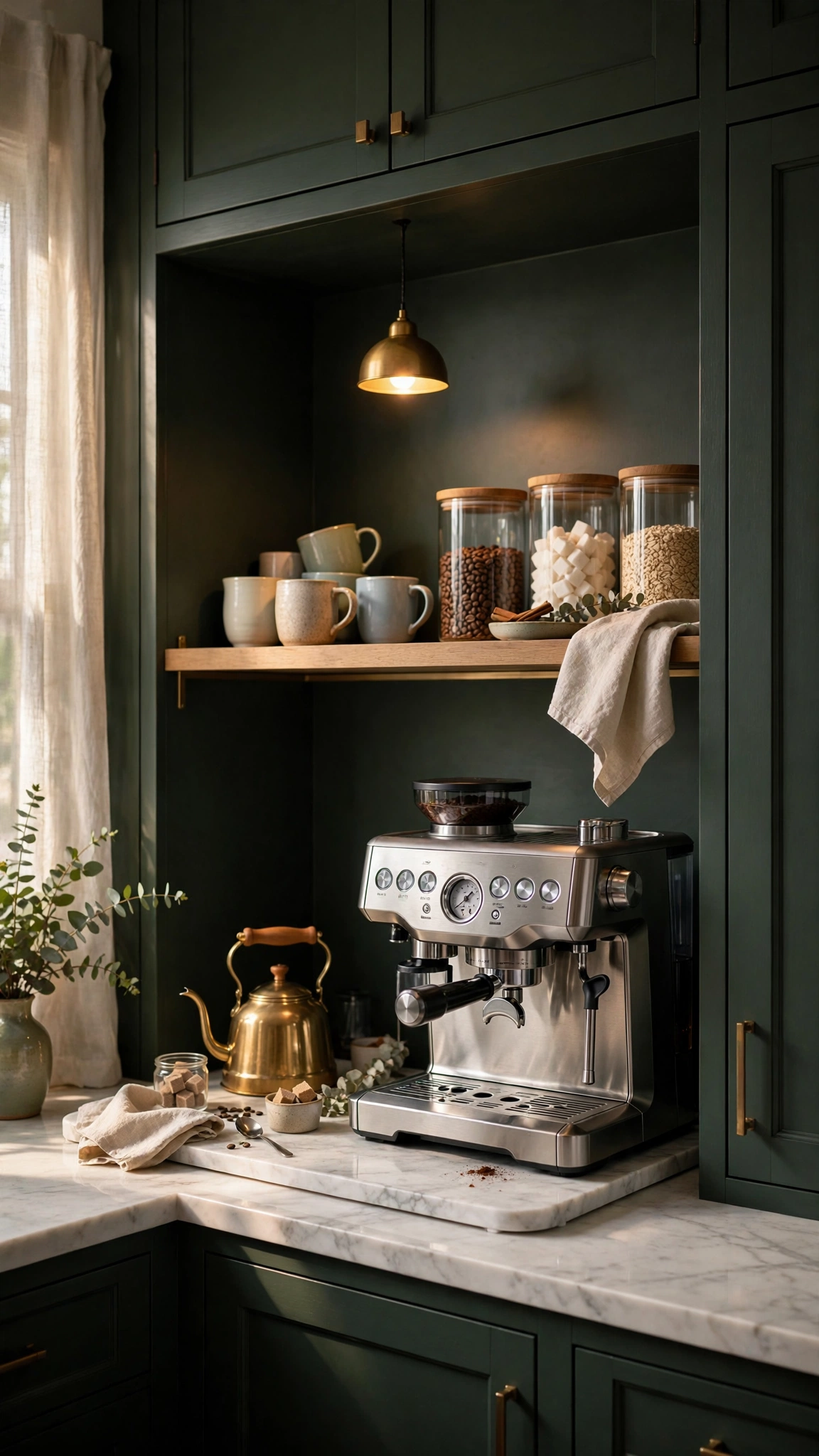
Designers love a dedicated station because it turns a daily ritual into a designed moment — and keeps kettles, pods and mugs from colonising the main worktop. A shallow alcove, a converted cupboard with the door removed, or a section of worktop with its own shelf and pendant can all become a coffee and drinks zone.
Add a small under-counter fridge for milk and cold drinks if space allows, and keep everything — machine, cups, beans, tray — within one arm’s reach. A contrasting paint colour or tile inside the alcove makes it feel like a little café built into the kitchen.
This is mostly a styling and organisation project: a shelf, a tray, a machine you probably already own, and an afternoon of arranging. Even renters can create the effect on a section of counter.
Tip: Treat the station like a drop zone with a home for every item, the way these creative mudroom ideas give every coat and bag its place — dedicated zones are what keep a whole home feeling calm.
11. Dress the Window Above the Sink
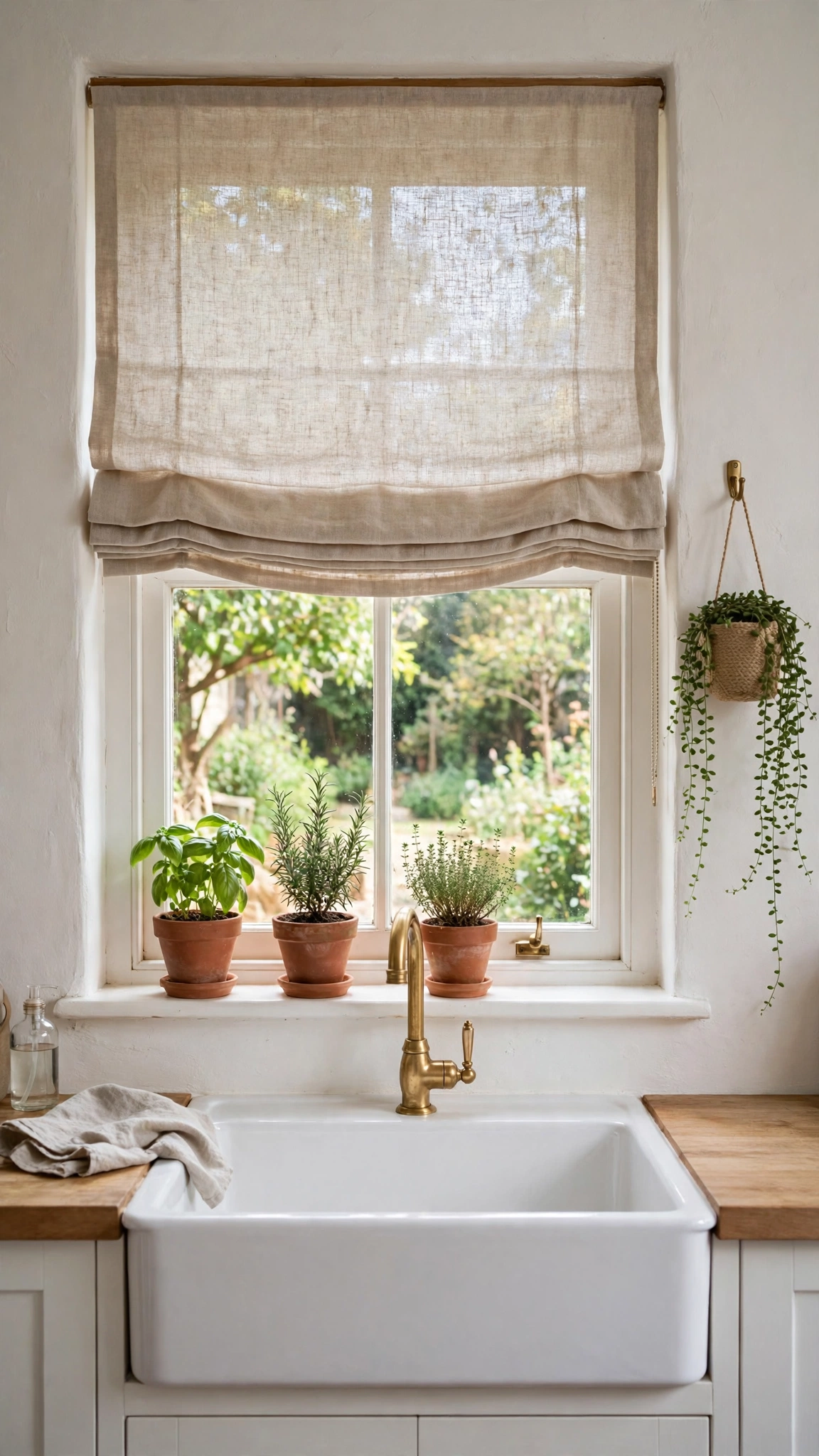
The window over the sink is the most-looked-at spot in any kitchen, and designers never leave it bare. A relaxed linen roman blind, a row of herbs in terracotta, or a slim shelf of small ceramics turns dishwashing into one of the prettiest views in the house.
Keep treatments practical: blinds mounted inside the frame, fabrics that tolerate steam, and plants that enjoy humidity. The goal is a layered little scene — textile, greenery, one or two beautiful objects — not a windowsill crowded with clutter.
Costs are tiny: a made-to-measure linen blind is the main spend, and pots and plants can be gathered for very little. It is the highest-impact-per-pound finishing touch in this entire list.
Tip: Group sill plants in odd numbers and vary the pot heights for that styled look, an approach borrowed from these stunning planter ideas that make any small ledge feel abundant.
12. Max Out Storage with Pull-Outs and Inserts
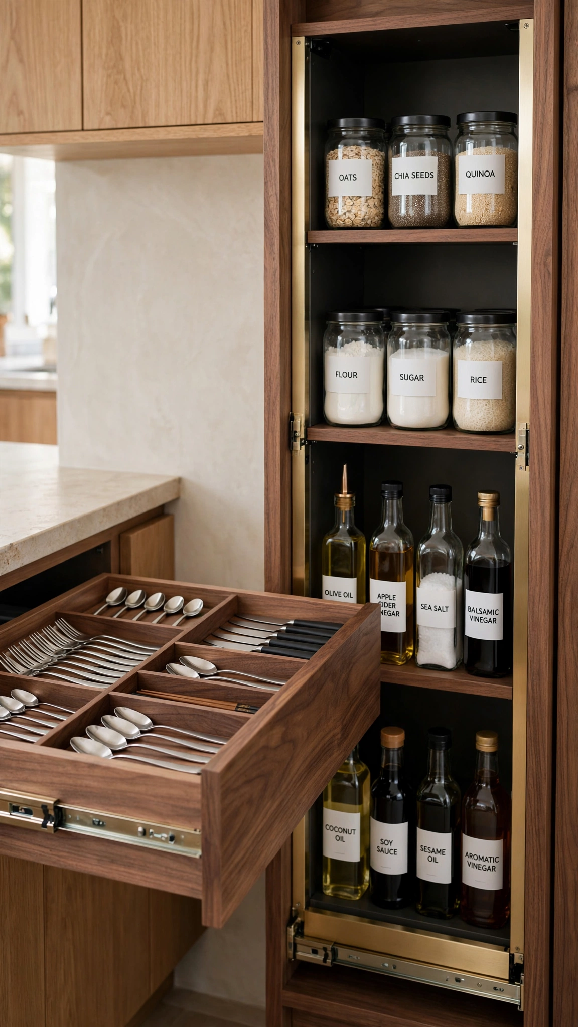
A kitchen only looks designer if it works like one, and that means interiors as considered as the fronts. Pull-out larders, deep drawers instead of cupboards, walnut cutlery inserts and hidden charging drawers remove the rummaging and visual chaos that make a reno feel cheap within a year.
Deep drawers beat cupboards almost everywhere below worktop height: you see everything at a glance and nothing gets lost at the back. Add a pull-out bin unit near the sink and a spice drawer near the hob, and daily cooking becomes noticeably smoother.
Inserts and pull-out mechanisms are a modest line item during a reno — far cheaper than adding extra cabinets — and many can be retrofitted into existing units over a weekend.
Tip: Audit what you own before ordering a single insert, then assign every category a home — the audit-first method behind these smart storage shelves ideas works in any room you are organising.
13. Grow a Windowsill Herb Garden
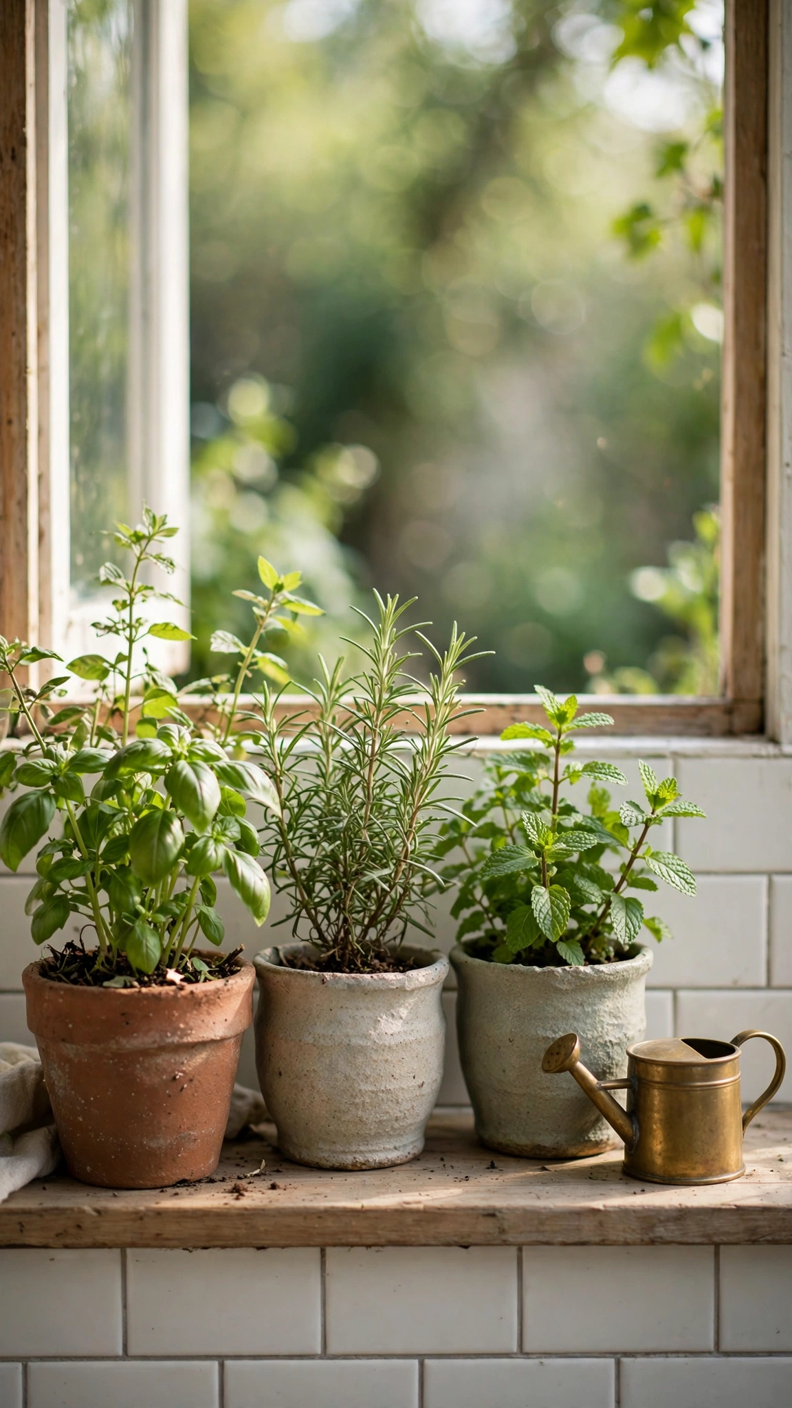
Fresh herbs are a designer’s secret styling weapon: living green softens all the hard surfaces of a kitchen, smells wonderful, and earns its keep at dinner time. A row of basil, rosemary, mint and thyme in beautiful pots makes even a brand-new kitchen feel settled and real.
Choose pots with as much care as the plants — handmade terracotta, aged stoneware or simple glazed ceramics in one tonal family. A small brass rail or narrow shelf keeps them tidy and off the work surface.
The whole project costs very little: supermarket herb plants re-potted into good containers outlast the plastic-pot versions for months. South or west-facing sills are ideal, but most herbs manage happily in bright indirect light.
Tip: Rotate pots a quarter-turn weekly so plants grow evenly toward the light — simple plant-care habits like these fill out the advice in these creative balcony garden ideas for small growing spaces.
14. Build In a Cozy Banquette
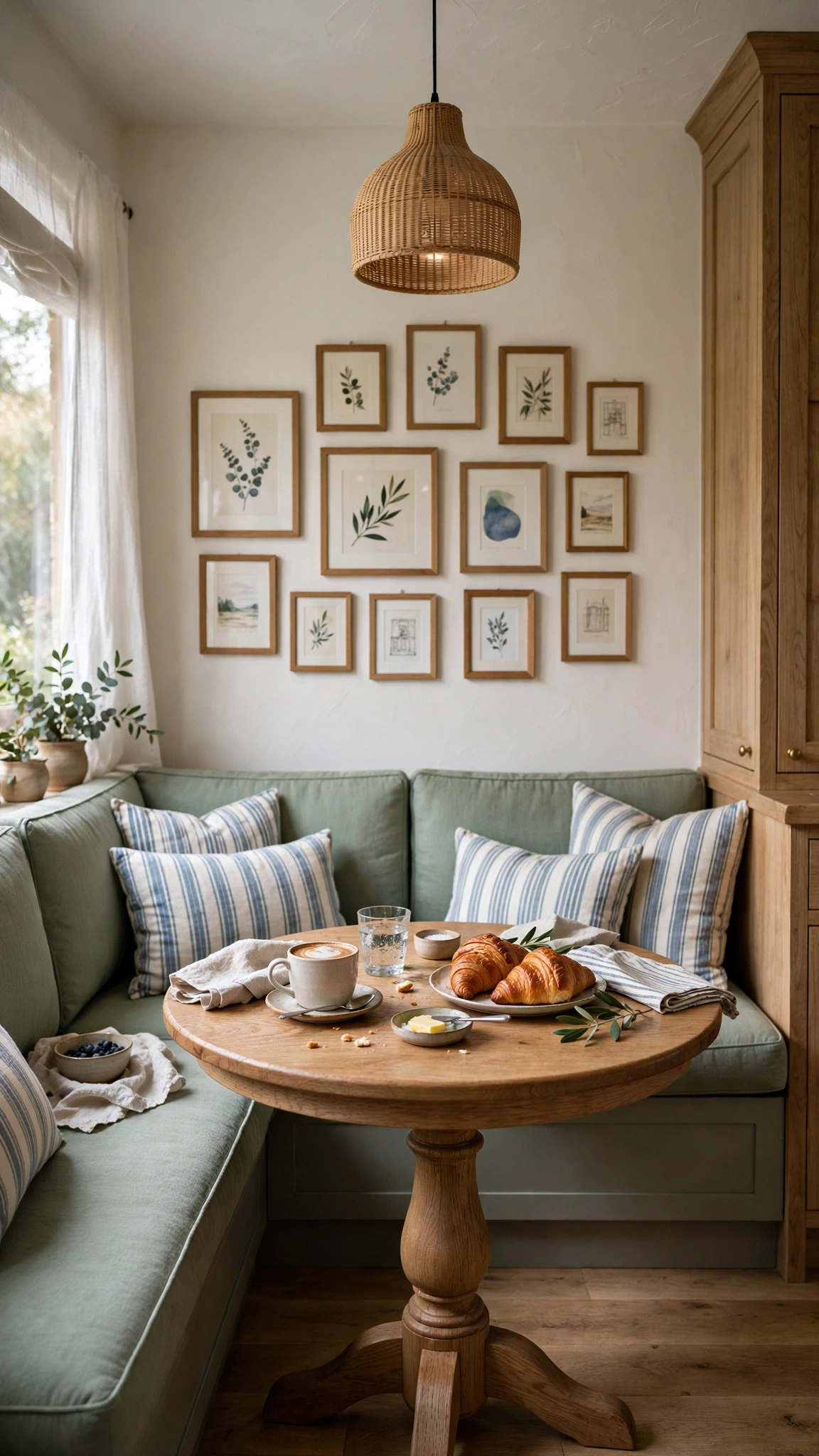
A built-in banquette gives a kitchen the bespoke, restaurant-booth feeling designers adore, while using space far more efficiently than freestanding chairs. Bench seating tucks more people around a table, hides storage inside the base, and creates the cosiest breakfast spot in the house.
Upholster in a wipeable fabric or leather-look vinyl in a tone pulled from your cabinets, then layer cushions in a stripe or small check for that collected café look. A round pedestal table keeps edges soft and traffic flowing in tight corners.
A carpenter-built banquette is a mid-range spend, but a simple version — bench boxes, foam cushions, a vintage table — is a very achievable DIY project over a couple of weekends.
Tip: Keep bench depth around 45–50cm and add one firm back cushion per person; comfort rules like these are what make the seating in these gorgeous balcony seating ideas work so well outdoors too.
15. Roll Out a Vintage-Style Runner
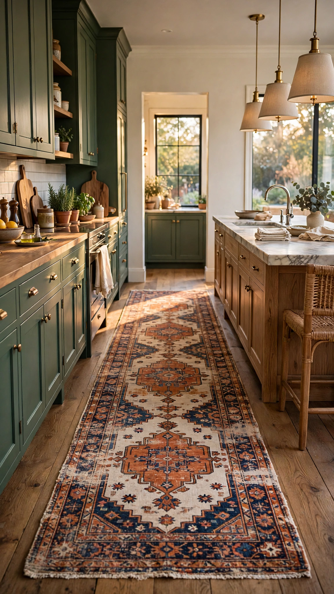
A faded, vintage-style runner is the fastest way to stop a new kitchen feeling like a showroom. The soft pattern and worn tones add age, warmth and colour in one move, and they hide the crumbs and splashes of real life far better than a bare floor.
Choose low-pile, washable versions woven for busy homes — many are now made from recycled fibres that shrug off spills. Anchor the palette to your cabinets or stone so the rug feels like part of the scheme, not an afterthought.
Good washable runners are inexpensive for the impact they deliver, and they protect high-traffic floorboards in front of the sink and hob. Use a non-slip underlay cut slightly smaller than the rug so edges stay invisible.
Tip: Let the runner be the one patterned piece in the room and keep surrounding textiles plain — this one-statement rule for warmth and texture runs through these creative balconies decoration ideas for cosy, expensive-feeling spaces.
16. Open the Kitchen to the Outdoors
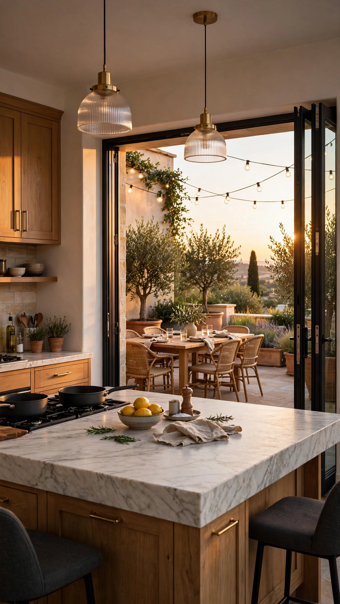
The most enviable designer kitchens blur the line between indoors and out. Wide bi-fold or sliding doors, a worktop that continues into a serving hatch, or simply matching floor tones inside and out makes the kitchen feel twice its size and built for long evenings.
Even without structural work you can strengthen the connection: dress the view with large potted olive or citrus trees, echo your indoor palette in outdoor cushions, and keep window treatments minimal so the garden becomes the kitchen’s living artwork.
Full door replacements are a bigger investment, but the styling version costs little and still transforms how the room feels. If you are already planning a reno, this is the upgrade guests remember most.
Tip: Style the terrace you see from the sink with the same care as the kitchen itself — these beautiful balcony outdoor ideas show how to make even a small outdoor patch feel like a retreat.
17. Tuck In a Bistro Table for Two
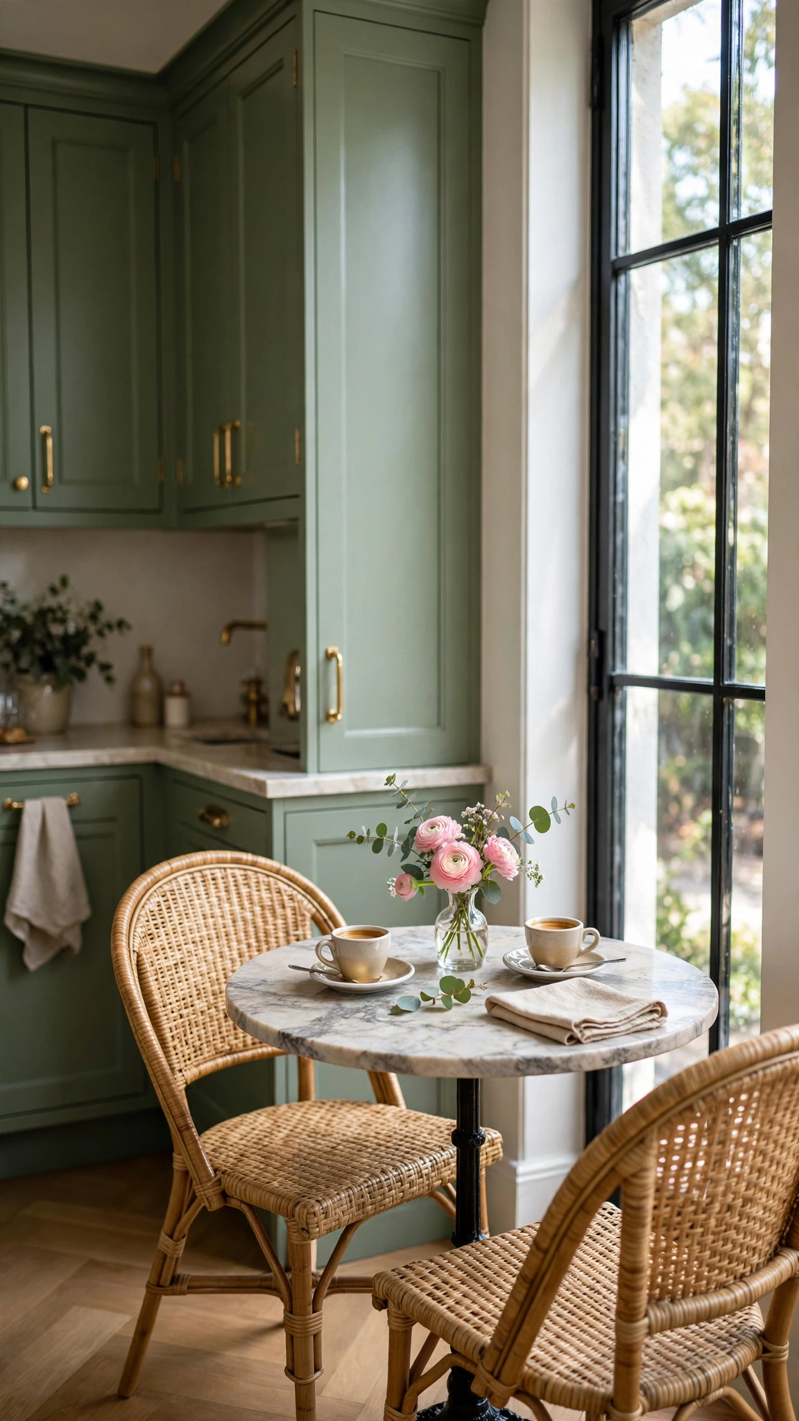
Not every kitchen has room for an island, but most have a corner — and designers turn that corner into a tiny bistro moment. A small round marble-topped table and two café chairs create a spot for morning coffee, laptop hours and late-night chats that feels straight out of a boutique hotel.
Round tables are the trick: no sharp corners, easy to slide around, and they soften all the straight lines of cabinetry. Hang a small pendant or picture light above to mark the zone as its own little room within the room.
Vintage bistro sets are plentiful second-hand, and new versions are affordable; the footprint needed is barely a metre square. Add a sheepskin or cushion to each chair and it becomes the most fought-over seat in the house.
Tip: Keep the table styled with just a tray, cups and something green so it always looks ready — the edit-down approach in these stylish balcony tables ideas keeps small tables charming, not cluttered.
18. Finish with Collected, Curated Details
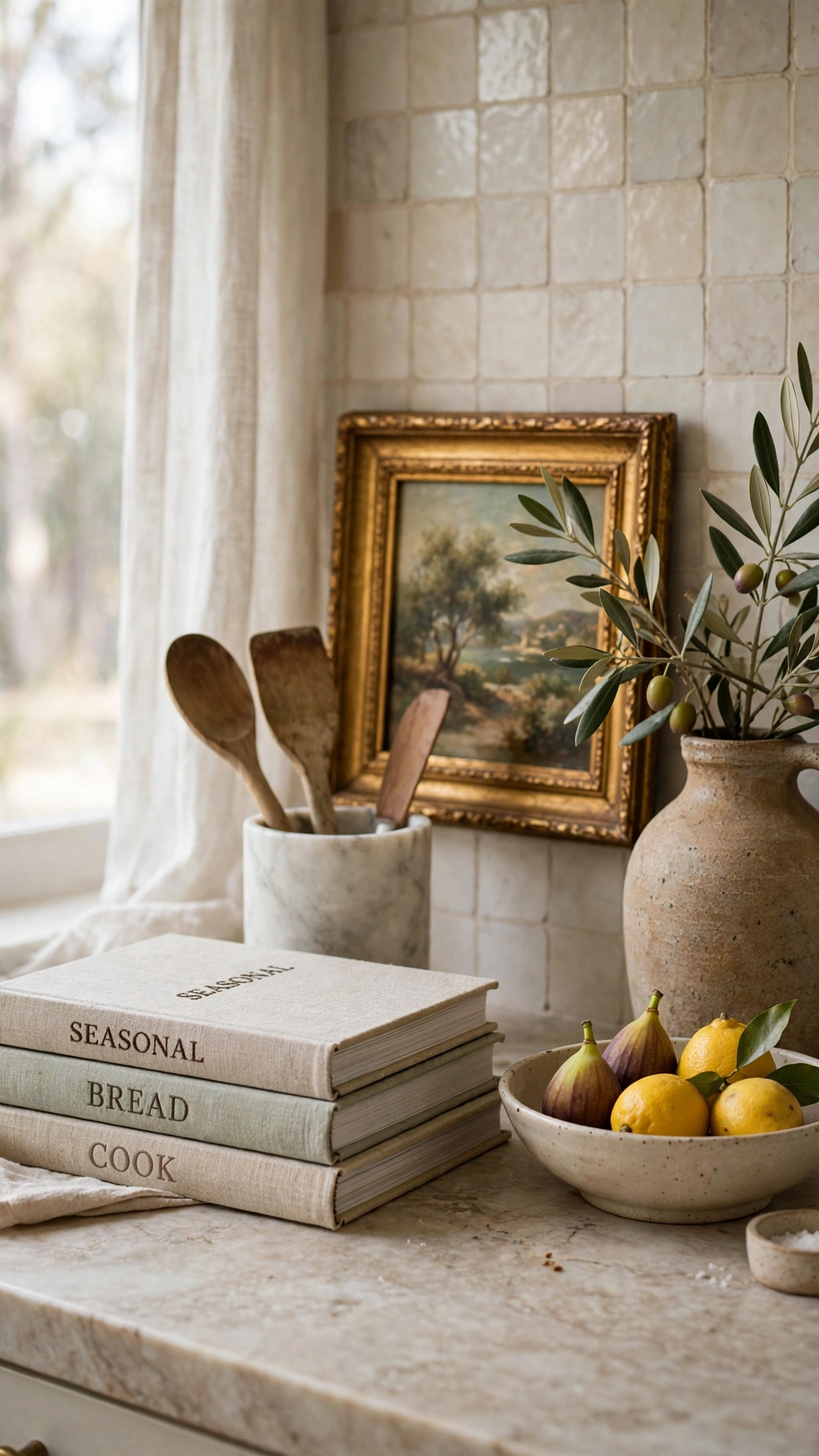
The final designer layer is not bought from a kitchen showroom at all: it is the collected details. A small framed painting leaning on the splashback, linen-bound cookbooks, a stoneware jug of olive branches, wooden boards worn smooth by use — these pieces give a new kitchen a soul and stop it dating overnight.
Work in vignettes of three: something tall, something stacked, something organic. Keep worktops two-thirds clear so the styling reads as intentional, and rotate pieces seasonally the way you would a mantelpiece.
Most of this layer costs almost nothing — shop your own cupboards, charity shops and market stalls before buying new. It is the layer that makes visitors say the kitchen feels like you, not like a catalogue.
Tip: Photograph your styled corners and edit from the photo — seeing a vignette flattened into a frame reveals clutter instantly, a trick worth pairing with the styling eye in these beautiful balcony inspo ideas.
Conclusion
A designer kitchen is rarely about one grand gesture; it is the sum of committed choices — stone with movement, colour with confidence, light in layers, and details that feel collected rather than copied. Start with the two or three ideas that excite you most, do them properly, and your reno will look like it was designed, not just installed.