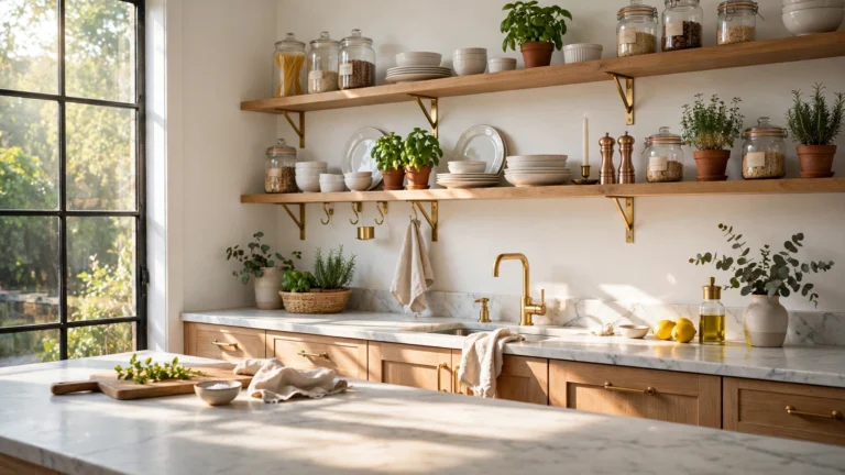
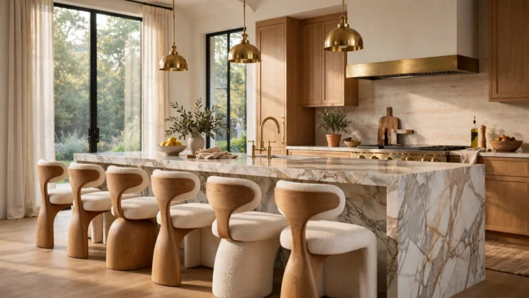
15 Inspiring Kitchen Colors Schemes That Give Your Kitchen a Designer Look
Color is the fastest way to change how a kitchen feels. Before you replace a single cabinet or countertop, the palette you choose decides whether the room reads warm and welcoming, crisp and modern, or rich and expensive.
The best designer kitchens rarely use just one color. They layer two or three tones — a grounded base, a soft neutral, and one confident accent — so the eye always has somewhere to land. Which combination will make your kitchen look like it was designed by a pro?
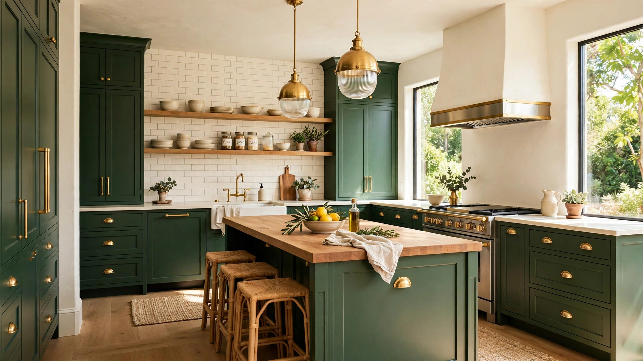
1. Pair Deep Green with Warm Brass

Deep green is the color designers reach for when they want a kitchen to feel grounded and grown-up without going dark and gloomy. It pairs beautifully with natural wood, cream stone, and warm metals.
Brass is what keeps the green from feeling flat. A few warm metallic touches — cabinet pulls, a faucet, pendant lights — catch the light and add instant polish.
This scheme works in both large and small kitchens, and it is surprisingly forgiving: green hides everyday wear far better than white. A gallon of quality cabinet paint and new hardware can deliver the whole look in a weekend.
Tip: Borrow the calm, layered palette logic from these gorgeous bedroom colour ideas for a calm and stylish retreat — the same restful tone-on-tone approach makes a green kitchen feel serene rather than heavy.
2. Go Classic with Navy and Crisp White

Navy and white is a classic for a reason: it is bold enough to feel designed, yet timeless enough that you will not tire of it in five years. Use navy on the island or lower cabinets and keep the uppers white to avoid closing the room in.
The contrast does the decorating for you. White countertops and a light backsplash bounce light around, while the navy grounds the space and hides scuffs near the floor.
Keep the rest of the palette quiet — warm wood stools, one metal finish, and a single accent color in small doses — so the navy stays the star. This scheme suits traditional, coastal, and transitional kitchens equally well.
Tip: Think of the island as its own room within the room, the way these creative kitchen living room ideas treat connected spaces — a distinct navy island anchors the kitchen while the white perimeter keeps everything feeling open.
3. Warm Up with Terracotta and Cream

Terracotta brings instant warmth to a kitchen that feels too cold or clinical. Paired with soft cream walls and natural wood, it creates a sun-baked, Mediterranean feeling that works beautifully in both old and new homes.
You do not need to commit to terracotta cabinets to get the effect. A tiled backsplash, a few clay pots, or a rust-colored runner can carry the whole scheme.
Balance is key: keep the cream dominant and let terracotta appear in two or three places so the room feels warm, not orange. Matte finishes suit this palette far better than glossy ones.
Tip: Let the wall color do the heavy lifting, just as these gorgeous garage interior wall ideas show how a single wall treatment can transform a whole space — a warm cream plaster or limewash wall makes terracotta accents glow.
4. Brighten Dark Corners with Layered Lighting
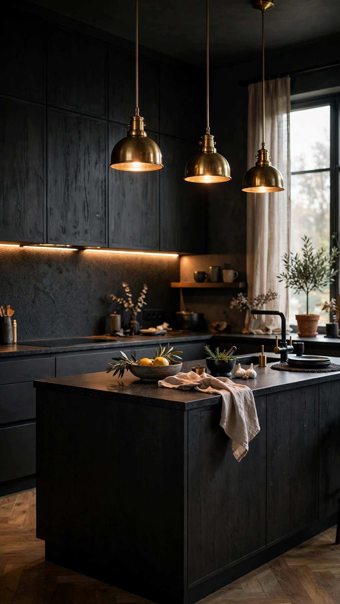
Even the perfect color scheme falls flat in bad light. Dark cabinets and deep wall colors need layered lighting — under-cabinet strips for tasks, pendants for atmosphere, and daylight wherever you can get it.
Warm white bulbs (around 2700K) flatter wood tones and warm palettes, while cooler light suits crisp whites and grays. Mixing the two in one room usually looks muddy, so pick one temperature and stick with it.
Lighting is also the cheapest way to test a color scheme: a $30 strip of LEDs can show you how your paint will actually look at night before you commit to a full repaint.
Tip: Plan your layers the way these stylish garage lighting ideas layer task and ambient light — the same principle that makes a workspace feel polished will make your kitchen colors read true after dark.
5. Let Cabinet Color Carry the Design

If you can only change one thing, change the cabinet color. Cabinets cover more visual area than any other surface, so their color sets the tone for the entire room.
Sage green, dusty blue, and warm greige are the current designer favorites because they read as color without shouting. They pair with almost any countertop and age gracefully.
Before painting, test three swatches on a single door and live with them for a few days — colors shift dramatically between morning and evening light. A semi-gloss or satin finish is easiest to wipe clean in a working kitchen.
Tip: Treat cabinet color like a storage decision too, as these creative garage cabinet ideas demonstrate — a well-chosen cabinet color organizes the eye the same way smart cabinetry organizes clutter.
6. Soften the Room with Sage and Buttery Yellow
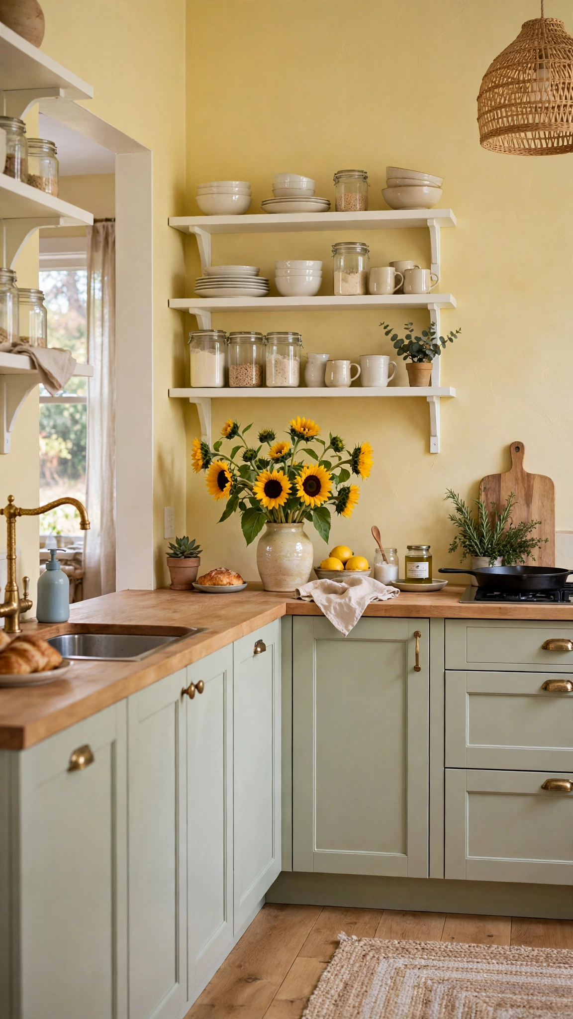
Sage and buttery yellow is a gentle, cheerful pairing that makes a kitchen feel sunny even on gray days. The green keeps the yellow from feeling childish, and the yellow keeps the green from feeling cold.
This scheme shines in kitchens with lots of natural light and white trim. Keep the yellow soft — think butter, not lemon — and use it on walls or a backsplash rather than every surface.
Add white dishes, pale wood, and a few green plants to complete the look. It is an easy palette to live with and a forgiving one if your kitchen is small, since both tones reflect light well.
Tip: Style open shelving in the same soft tones, taking a cue from these smart garage storage shelves ideas — matching shelf backings and containers to your palette makes open storage look intentional instead of cluttered.
7. Create Flow with One Color Through Connected Spaces
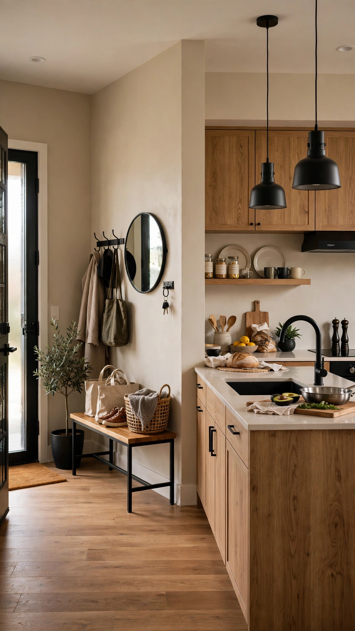
In open-plan homes, the kitchen color scheme should not stop at the kitchen doorway. Carrying one neutral through the kitchen, entry, and living areas makes the whole home feel larger and more intentional.
Choose a warm greige or soft white as your thread color, then let each zone add its own accent — a colored island in the kitchen, a bold rug in the living room, a painted door in the entry.
The trick is repetition with variation: the same wood tone on floors and shelves, the same black finish on hardware and light fixtures, and one accent color echoed in small doses throughout.
Tip: Plan the transition the way these creative garage mudroom ideas plan the passage from garage to home — a shared color at the threshold makes two very different zones feel like one designed space.
8. Show Off Color on Open Shelves
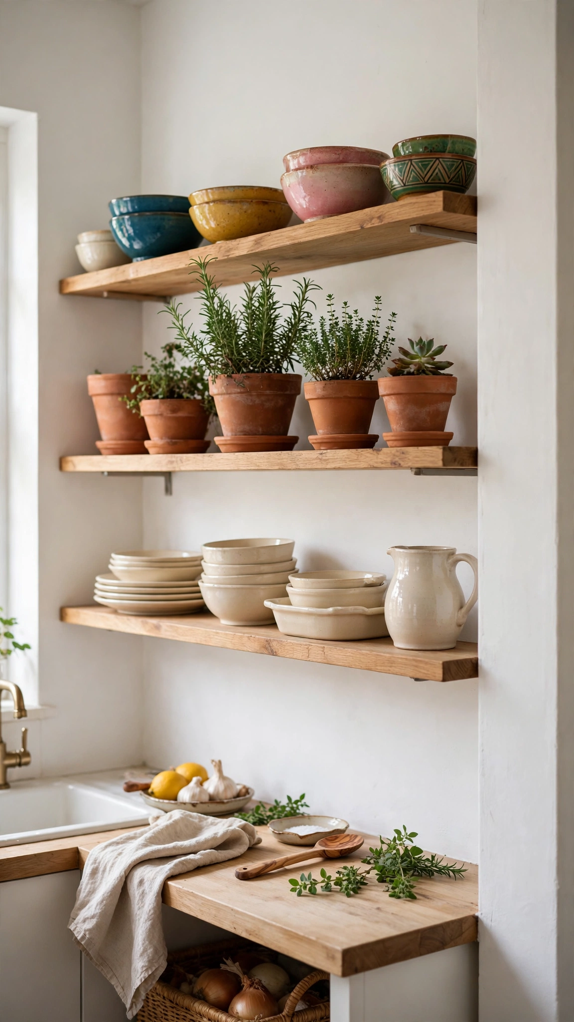
Open shelving is a low-commitment way to introduce color. Instead of repainting cabinets, let your dishes, bowls, and cookware supply the palette against a neutral backdrop.
Group items by color family — creams together, blues together, one warm accent shelf — so the display reads as curated rather than random. Leave breathing room between groups; crowded shelves look busy no matter the color.
If you are nervous about a bold palette, this is the safest place to experiment: swap a few pieces seasonally and your kitchen’s color story changes for almost nothing.
Tip: Keep the shelf styling disciplined, following the same logic as these beautiful garage shelving ideas — color-grouped, labeled, and evenly spaced shelves look designed, while random piles look like storage overflow.
9. Build the Scheme Around One Statement Color
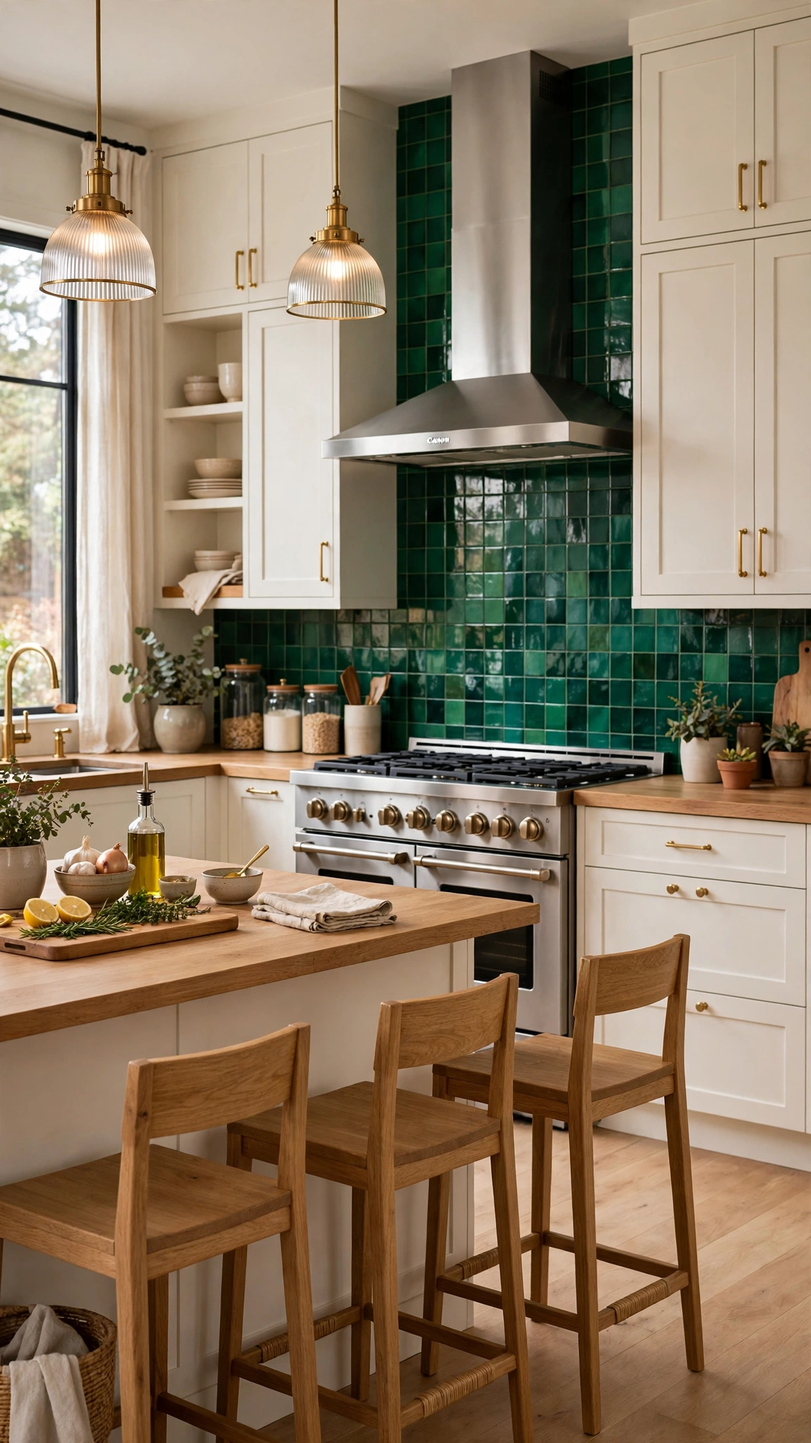
Designer kitchens often start with one brave choice — an emerald range wall, a cobalt island, a burnt-orange backsplash — and build everything else quietly around it.
The rule is simple: one statement, everything else neutral. If the island is bold, keep the walls, countertops, and uppers calm so the statement has room to breathe.
This approach is also budget-friendly, since you only need one dramatic element. A single painted wall or a tiled focal area costs far less than a full remodel but delivers most of the impact.
Tip: Anchor the statement the way these beautiful garage interior design ideas anchor a room around one strong feature — one confident focal point makes the whole space feel deliberately designed.
10. Zone with Color in a Busy Kitchen

In a large or multi-cook kitchen, color can quietly mark zones: a darker tone at the cooking wall, a lighter tone at the prep area, and a warm wood at the dining nook.
Zoning helps everyone find their place without walls or barriers, and it stops a big kitchen from feeling like one endless run of cabinets.
Keep the zones related — same color family, different depths — so the room still reads as one kitchen. A shared countertop material across zones ties everything together.
Tip: Map your zones before you paint, using the same planning logic as these stunning garage workshop layout ideas — a clear layout plan keeps color zones functional instead of decorative.
11. Refresh on a Budget with Paint Alone

Paint is the highest-impact, lowest-cost kitchen upgrade there is. Two-tone cabinets — light uppers, darker lowers — instantly mimic the look of a custom designer kitchen.
Preparation matters more than the paint itself: clean, sand, prime, and use a cabinet-grade enamel for a finish that survives daily use. Rushing the prep is the one mistake that shows.
Pair the repaint with new hardware in a single finish and you can transform a dated kitchen for a few hundred dollars, often in a single long weekend.
Tip: Stretch the budget the way these creative garage renovation ideas without overspending stretch theirs — spend on prep and paint quality, save on hardware swaps and styling, and the result looks far more expensive than it was.
12. Use Color Coding to Stay Organized

Color is not just decoration — it is an organizing tool. Assigning a color to each zone or category (baking in cream, spices in green, kids’ snacks in blue) makes a kitchen easier to use and tidier to maintain.
Keep the system simple: two or three colors, used consistently on bins, jars, and labels. Too many colors becomes visual noise instead of a system.
This trick works especially well in pantries and open storage, where color-coded containers look intentional and make it obvious when something is out of place.
Tip: Borrow the color-coding discipline from these stunning garage workshop ideas — a consistent color system for tools and zones is exactly what keeps a busy kitchen running smoothly.
13. Warm a Utility Corner with Color
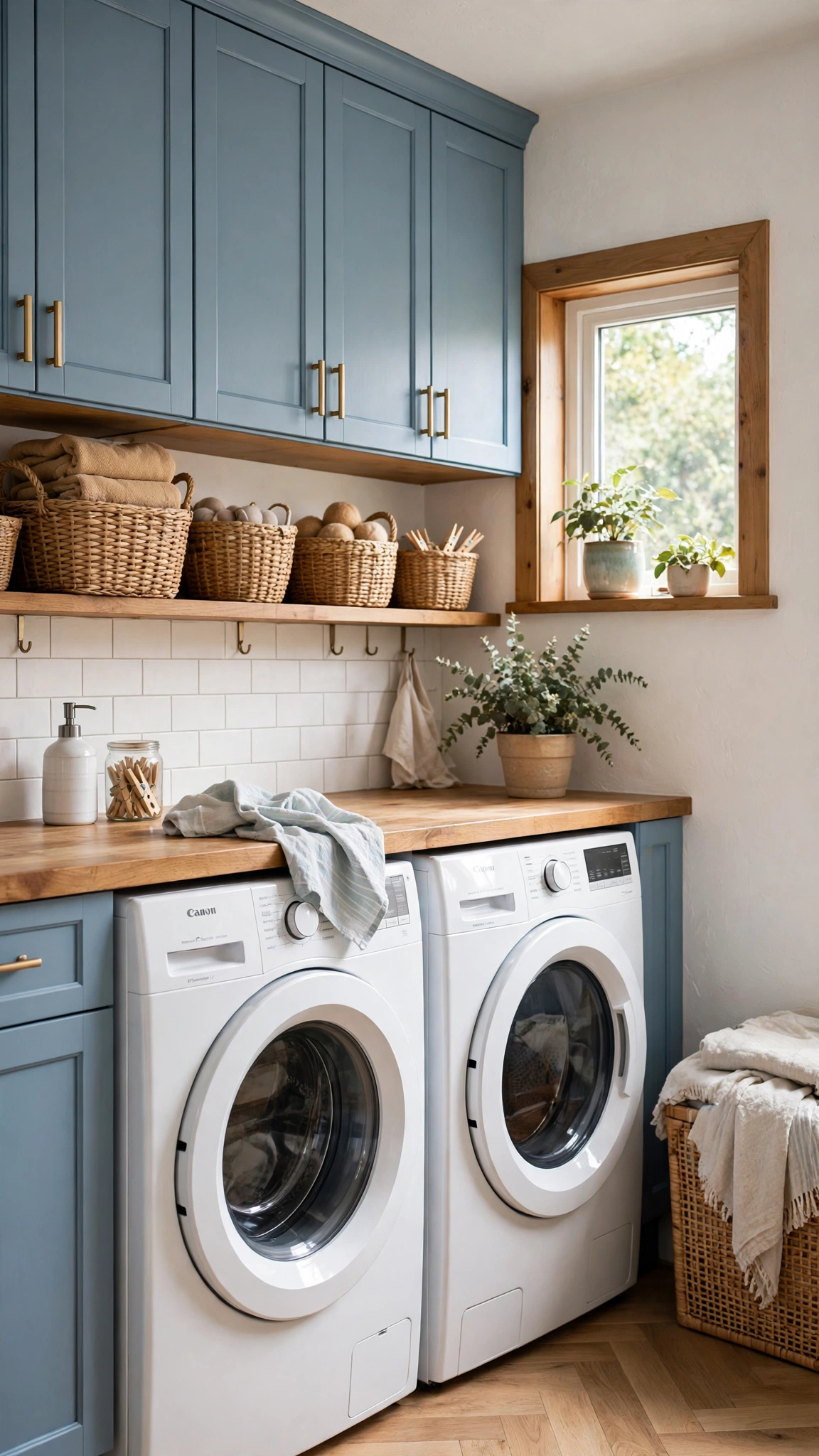
Utility corners — laundry nooks, broom closets, pet stations — are usually left white and forgotten, which makes them feel like an afterthought. Giving them their own soft color makes them feel like part of the design.
A pale blue, soft green, or warm cream on utility cabinetry ties the nook to the rest of the kitchen while still marking it as its own little zone.
Add matching baskets and one small plant, and a chore corner suddenly looks like a styled vignette instead of a leftover space.
Tip: Treat the nook like a mini-room, as these creative garage laundry area ideas treat utility zones — a deliberate color and a few matching accessories turn a functional corner into a feature.
14. Add Energy with a Bold Accent Wall

If an all-over bold color feels risky, paint one wall. An accent wall behind the dining table or on the far end of a galley kitchen adds energy without overwhelming the room.
Burnt orange, mustard, deep teal, or even black can work as an accent — the key is that the other three walls stay quiet and light so the accent reads as a choice, not an accident.
An accent wall is also the easiest color decision to reverse, which makes it the perfect place to be brave. One gallon of paint, one afternoon, one dramatic change.
Tip: Channel the bold-zone energy of these stunning garage gym design ideas — a single high-energy wall, balanced by calm surroundings, makes a kitchen feel alive without feeling chaotic.
15. Go Moody with Charcoal and Cognac

Charcoal and cognac is the most grown-up palette on this list: dark, warm, and quietly luxurious. Charcoal cabinets read softer than black, and cognac leather or wood warms them up beautifully.
This scheme needs good light to work — a window, warm pendants, and a light countertop keep it from feeling cave-like. In a dark kitchen, add a white backsplash to bounce light back into the room.
Keep metals warm (brass, copper, bronze) and avoid chrome, which can make charcoal feel cold. The result is a kitchen that feels like a private club: intimate, rich, and timeless.
Tip: Lean into the cozy, retreat-like mood the way these inspiring garage man cave ideas lean into theirs — dark tones plus warm leather and brass turn any room into a place people want to linger.
Conclusion
The right kitchen color scheme is not about following a trend — it is about layering a grounded base, a soft neutral, and one confident accent that suits your light, your cabinets, and your life. Pick one idea from this list, test it on a single wall or door, and let the color do the designing for you.